Directional Signs for Children | Read How to Make a Directional Sign for Children & How to Make a Business Sign for Kids
We change the interiors or simply redesign the entire building for various reasons. Along with these changes, tweaking your wayfinding signs is also necessary. Designing directional signs for children is slightly different than designing for adults. They shouldn’t only tell children directions but also make navigation fun. This blog post shares a few tips on how to make a business sign for kids fun and exciting.
Why Do You Need to Make Directional Signs for Children Exciting?
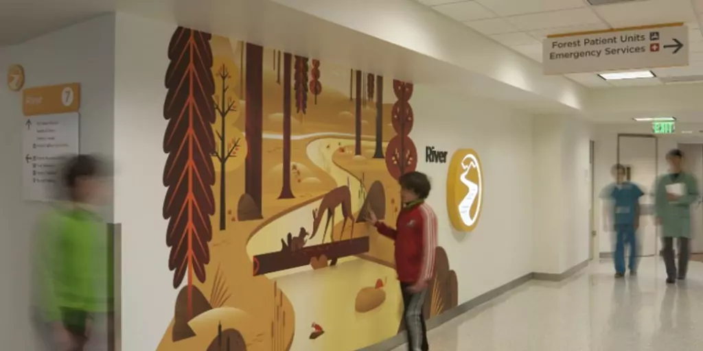
Pleasing signs tend to calm anxiety, offer amusement, and interesting distractions. Some children’s hospitals are already using creative directional signs for children. For example, the following signs are from Seattle Children’s Hospital.

(image source: seattlechildrens.org)

Graphics for Children
What Layout is Best for Directional Signs for Children?
Cartoons and animals are the most obvious choices to use on directional signs for children. But then you need to balance fun with functionality. Try design thinking; signage serves no purpose other than to guide people in the right direction.
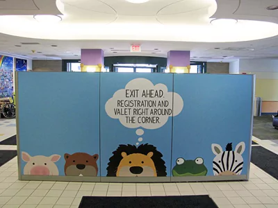
For example, you could use cartoons with speech boxes to indicate directions as shown in this picture:

(Image credit: impact-color.com)
Regardless of who you are making these signs for, the basics of design apply. The important aspects of the sign should stand out. You can do that with color contrast. Think from a child’s perspective.
Another creative way to design a directional sign for children is to follow a theme. Take a look at the picture below.

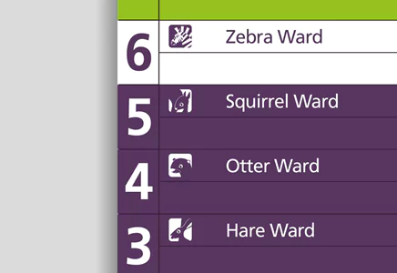
(Image credit: sableandhawkes.co.uk)
The example is from a Gt Ormond Street Hospital that has turned its wards into animal sanctuaries painted on the walls. Notice that despite making the signs appealing for children, they accurately assist in navigating the hospital premises.
Directional signs for children make sense in children’s hospitals for obvious reasons; children need to find their way around in a comfortable and friendly environment. But this doesn’t confine the concept to hospitals; schools, theme parks, and play areas can be made attractive to children with heartwarming signs.
Your Brand Should Shine Through Directional Signs for Children
Wayfinding signs should reflect your brand, even when the signs have cartoons on them. This, of course, requires collaboration between different departments of your business to come up with the look and feel that captures the brand.
A great example of how to make a business sign for kids is the Texas Children’s Hospital mantra of, “child-friendly, but not child-like”. It reflects pediatric values and the status of the organization. In addition, you should keep different cultural values in mind.
In the pursuit of creativity don’t lose sight of respect for other societies.
To conclude, there are many ways you can make wayfinding signs exciting for children. Choose engaging colors, cartoons, animals, superheroes, or anything that makes kids feel happy. Choose a theme that gets the job done. Ensure that the signage is easy enough to be understood by the majority as well as children with disabilities.