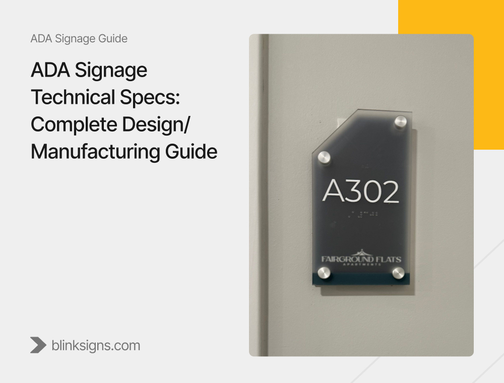
ADA Signage Technical Specs: Complete Design/Manufacturing Guide
Why Technical Specs Matter
ADA signage is one of those design details that quietly define the user experience of a space.
Get it right, and your building becomes more inclusive, compliant, and visually consistent.
Get it wrong, and you risk accessibility violations, expensive rework, and even legal fines.
The Americans with Disabilities Act (ADA) established clear rules for how signs must be designed, fabricated, and installed to ensure access for everyone, regardless of ability.
Over time, these standards have evolved, introducing tighter manufacturing tolerances, modern design flexibility, and updated enforcement measures.
This guide breaks down the complete ADA signage technical specs, covering tactile characters, Braille, contrast, pictograms, mounting height, and advanced fabrication considerations.
It’s a field-ready reference for architects, contractors, and facility managers who want signage that complies, communicates, and complements design aesthetics.
ADA Signage Overview: What Compliance Really Means
ADA Signage Overview_ What Compliance Really Means
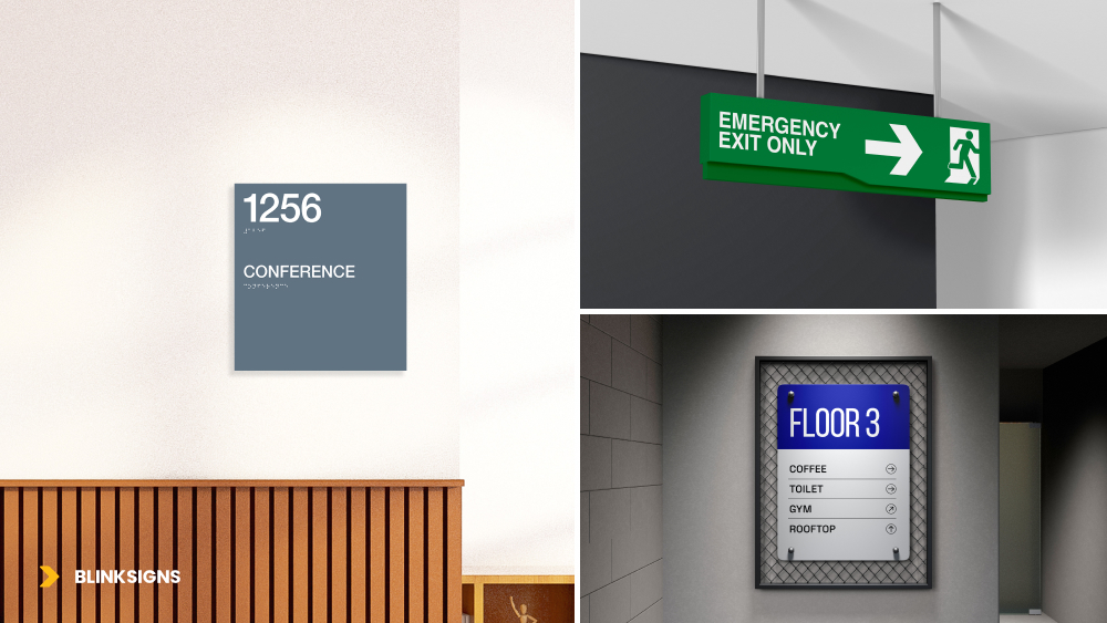
ADA signage standards, as defined in Section 703 of the 2010 ADA Standards for Accessible Design, apply to all permanent rooms and spaces that identify, direct, or inform users.
In simple terms, ADA-compliant signage ensures that:
- People with visual impairments can read and locate information through tactile and visual design.
- Every identification, directional, and informational sign within a facility follows consistent readability and accessibility standards.
Types of ADA Signs
The must have types of ADA signs are:
- Identification signs – Label permanent rooms (e.g., “RESTROOM,” “CONFERENCE ROOM”).
- Directional signs – Provide navigation guidance.
- Informational signs – Describe features, services, or restrictions.
Not every sign in a building must include Braille, but any that identify a permanent space must meet tactile and Braille requirements.
Tactile Signage Requirements: Raised Letters That Speak Through Touch
Tactile Signage Requirements
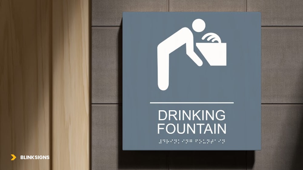
Tactile characters (raised letters) are the foundation of ADA signage. They allow visually impaired users to identify spaces by touch.
Here are the core technical specifications:
| Specification | Requirement |
| Character height | ⅝ inch (minimum) to 2 inches (maximum) |
| Raised depth | Minimum 1/32 inch from the background |
| Font style | Sans-serif, uppercase, non-decorative |
| Stroke width (uppercase “I”) | 10–15% of letter height |
| Character spacing | At least 1/8 inch between letters |
| Line spacing | At least 10% of the tallest character height |
| Finish | Non-glare matte surface for tactile area |
Font Matters
ADA regulations prohibit decorative or script fonts. Fonts must be simple, sans-serif, and easy to distinguish by touch, like Helvetica, Arial, or Futura.
Why Raised Height & Spacing Are Non-Negotiable
Characters raised at least 1/32 inch provide sufficient tactile feedback for finger recognition. Proper spacing ensures clarity without crowding.
Braille Requirements: Grade 2 Precision
Braille Requirements
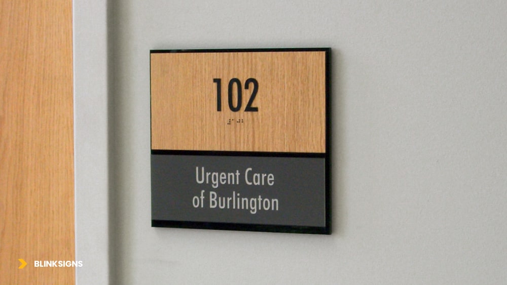
Braille is a legal requirement on ADA identification signs.
Technical Braille Specifications:
- Type: Grade 2 Braille (uses contractions for efficiency).
- Placement: Directly below the corresponding raised text.
- Spacing: At least ⅜ inch between tactile text and Braille.
- Dot Shape: Rounded domes, not flat or sharp.
- Dot height: 0.025–0.037 inch.
- Dot base diameter: 0.059–0.063 inch.
- Inter-dot spacing: 0.090–0.100 inch horizontally and vertically.
- Separation: At least ⅜ inch between tactile text and Braille
The Braille translation must exactly match the visible text, ensuring consistency between tactile and visual communication.
Placement Tip
On multi-line text, the Braille should be placed directly below the last line of tactile text. For example:
RESTROOM
⠗⠑⠎⠞⠗⠕⠕⠍
Visual Character Standards: Contrast and Readability
For users with partial sight, visual contrast and font clarity are critical.
Contrast & Finish
- Characters must contrast highly with their background, either light on dark or dark on light.
- Sign surfaces must be non-glare, typically matte or eggshell finishes. Glossy or reflective surfaces can make text unreadable under lighting.
Case & Typeface
Visual characters can use uppercase, lowercase, or mixed case, as long as readability improves.
Typeface must be conventional, no italics, scripts, or decorative fonts.
Proportions
The stroke-to-height ratio and width-to-height ratio must ensure visibility from expected viewing distances.
Pictograms and Symbols: Communicating Through Icons
When pictograms are used (like restroom or accessibility symbols) they must meet ADA technical standards for size and layout.
| Element | Specification |
| Pictogram height | Minimum 6 inches |
| Field area | Must have a clean background (no text within symbol field) |
| Tactile text | Placed directly below pictogram |
| Finish | Non-glare, high-contrast |
A classic example: the International Symbol of Accessibility (ISA) must appear on accessible restroom or parking signage with proper height and tactile labeling below.
Mounting Height and Placement: Getting It Right
Incorrect mounting is one of the most common ADA violations. Placement defines accessibility, especially for wheelchair users.
General Mounting Height
- Baseline of tactile characters: between 48” and 60” from the finished floor.
- This allows tactile elements to fall within the average reach range of both seated and standing users.
Door Signage Requirements
- Signs identifying a room should be installed on the wall adjacent to the latch side of the door.
- Where no wall space is available, mount the sign on the nearest adjacent wall.
Clear Floor Space
- Minimum 18” x 18” clear space in front of the sign.
- No obstructions or protruding objects allowed.
Overhead & Projected Signs
- Minimum 80” clearance from floor to bottom of the sign.
- Projected signs must not extend more than 4 inches into a circulation path.
ADA Interior Signage Requirements
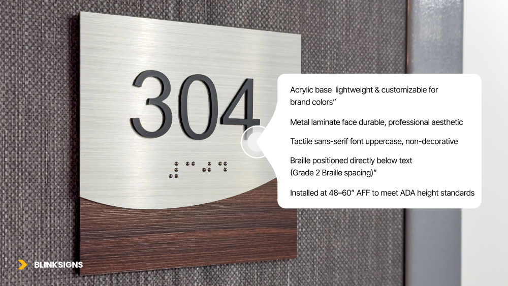
ADA Interior Signage Requirements
Interior signage carries its own set of compliance demands—especially for rooms that don’t change use.
Where Interior ADA Signs Are Required
- Restrooms
- Conference rooms
- Stairwells
- Electrical, mechanical, or storage rooms
- Exit doors and elevators
Material Choices for Interior Use
- Photopolymer signs (durable, seamless raised text and Braille)
- Acrylic (lightweight and customizable)
- Metal laminate (durable and professional aesthetic)
All must maintain matte finish and high contrast. Interior signs are often the most visually branded yet still must remain compliant.
Elevator and Door Signage Requirements
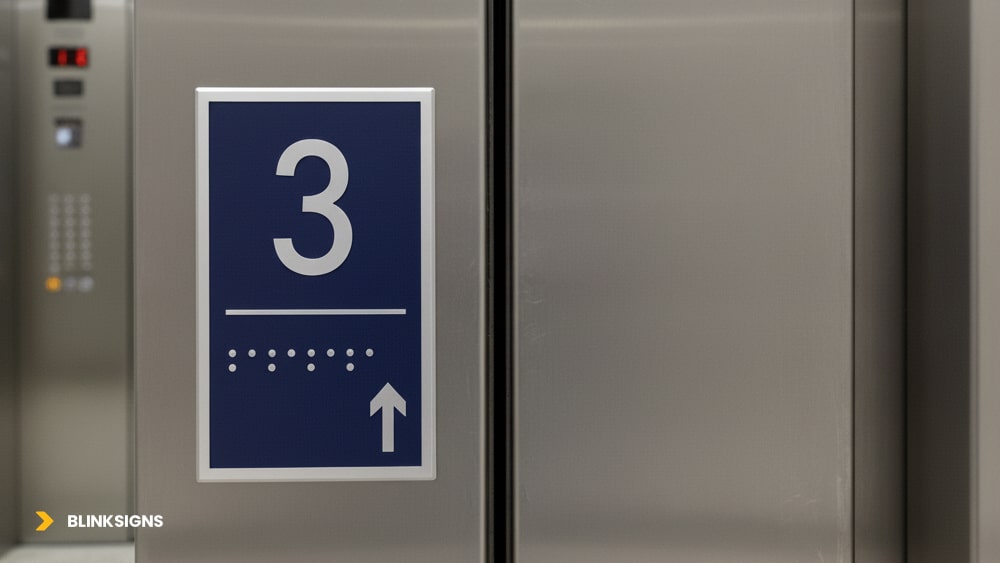
Elevator and Door Signage Requirements
Elevator Signage
Per ADA Section 407.2.3, elevator jambs require tactile floor designations:
- Raised floor numbers (minimum 2” high)
- Grade 2 Braille beneath each numeral
- Located on both sides of each door jamb
- Contrast between text and background for readability
Additional requirements:
- Up/Down arrows must be visually distinct.
- Audible signals are recommended for directional confirmation.
Door Signage
Each permanent door leading to an occupied space must feature:
- Tactile identification signage adjacent to latch side.
- Signs placed at consistent heights throughout facility.
- Non-glare finish and 70% contrast for maximum visibility.
Poor door sign placement is one of the most frequent ADA signage technical spec violations during audits.
Materials, Finish & Color Standards
Finish
- Surfaces must be non-glare matte or eggshell—essential for readability.
- Avoid reflective materials or glossy laminates.
Contrast
The ADA does not specify an exact contrast ratio, but a 70% or greater contrast between text and background is generally accepted as compliant.
Material Types
- Photopolymer: seamless tactile & Braille integration.
- Appliqué acrylic: layered raised letters.
- Metal or aluminum: often used in high-traffic or outdoor environments.
- Raster Braille: drilled holes with inserted Braille beads.
ADA Apartment & Facility Signage
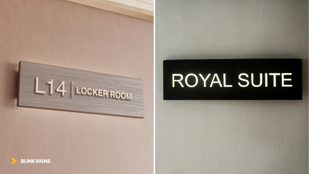
ADA Apartment & Facility Signage
ADA compliance extends beyond commercial buildings, apartment complexes, hotels, and multi-unit dwellings must also meet standards.
Apartment Unit Signage Requirements
- Unit numbers must include raised characters and Grade 2 Braille.
- Mounted 48”–60” above floor level, adjacent to latch side.
- Consistent typography and tactile depth across all units.
Facility Signage Consistency
- Common area identifiers (laundry, mail, lounge, gym) must meet ADA interior specs.
- Color contrast and font uniformity enhance visual hierarchy and wayfinding.
By standardizing these across properties, management reduces compliance risk and strengthens brand perception.
Common Compliance Mistakes
- Incorrect mounting height (too high or too low).
- Glossy finishes causing glare.
- Incorrect Braille spacing or translation.
- Decorative or serif fonts.
- Poor color contrast.
- Placement on the door instead of the wall.
A single error can make an entire signage system noncompliant—and replacing installed signs can be far costlier than designing them right the first time.
Manufacturing Accuracy & Design Process
Manufacturing precision is critical for ADA signage technical compliance — small measurement errors can result in legal nonconformities.
Fabrication Methods
| Method | Description |
| Photopolymer | Durable, seamless raised elements — ideal for interior ADA signs. |
| CNC Routing | Ensures sharp, consistent tactile character depth. |
| Raster Braille Insertion | Drilled holes with acrylic or metal beads for perfect Braille spacing. |
| Laser Engraving | High-contrast etching for fine detail and durability. |
Design-to-Production Accuracy
- CAD-based layout alignment ensures tactile text and Braille spacing precision.
- All measurements must adhere to 1/32” tolerance on raised depth.
- Signs must undergo quality control checks for contrast, spacing, and mounting specs.
Quality Control Checklist
- Verify character height (⅝”–2”)
- Confirm Braille translation and spacing
- Check non-glare finish
- Validate mounting location before installation
Confirm tactile spacing using precision gauge
ADA Signage Inspection Checklist
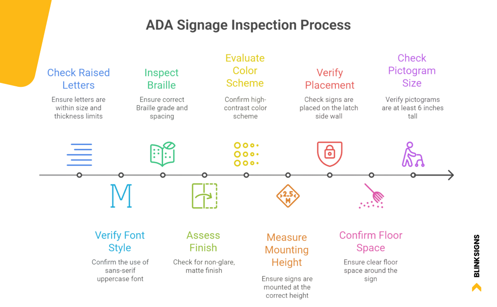
ADA Signage Inspection Checklist
A quick checklist before installation ensures every sign meets ADA code:
- Raised letters (⅝”–2”) and at least 1/32” thick.
- Sans-serif uppercase font.
- Grade 2 Braille with correct spacing.
- Non-glare, matte finish.
- High-contrast color scheme.
- Mounted 48–60 inches from floor.
- Placed on latch side wall.
- Clear floor space of 18” x 18”.
- Pictograms at least 6” tall.
Custom ADA Compliant Signage by BlinkSigns
Designing ADA-compliant signage isn’t just about meeting codes,
it’s about crafting accessibility that feels intentional and cohesive with your brand.
At BlinkSigns, our process blends precision manufacturing, code expertise, and design alignment.
Whether it’s a corporate interior, multi-family complex, or retail rollout, our team ensures that every tactile character, Braille cell, and mounting placement meets exact ADA specifications.
We produce ADA signage at scale and accuracy, providing both custom and wholesale ADA signage solutions for contractors and design partners.
Final Thoughts: Accessible Design is Smart Design
ADA compliance isn’t just a legal requirement, it’s a design principle that communicates inclusion, safety, and respect.
When executed properly, signage becomes a language of accessibility.
Each tactile letter, Braille dot, and color contrast reinforces a building’s commitment to universal design.
Whether you’re planning a new project or upgrading an existing facility, align with a partner who understands the ADA signage technical specs in depth, and crafts every sign to meet them perfectly.
BlinkSigns helps you design, produce, and deploy signage systems that are compliant, durable, and beautifully on-brand. Schedule a meeting now!⟶
FAQs: ADA Signage Technical Specs & Compliance
1. What are the ADA signage mounting height requirements?
ADA signage must be mounted so that the baseline of tactile characters is between 48 and 60 inches above the finished floor.
Signs should be installed on the latch side of the door to ensure visibility and reachability for everyone, including wheelchair users. For double doors, the sign should be placed on the right-hand door unless both are active.
2. What are ADA requirements for Braille signage?
All ADA-compliant signs must include Grade 2 Braille, with rounded domes placed directly below the tactile text.
The spacing between text and Braille should be at least 3/8 inch, and the Braille translation must exactly match the printed message. This consistency ensures readability for visually impaired users.
3. What fonts are allowed on ADA signs?
Only sans-serif, non-decorative, and uppercase fonts are permitted for tactile characters. Common compliant options include Helvetica, Arial, Futura, and Verdana.
Fonts must have a stroke thickness between 10%–15% of character height to ensure readability and comply with ADA visibility standards. Avoid italics, condensed, or script styles entirely.
4. What is the ADA height for signage?
For tactile ADA signs, the character baseline must fall between 48 and 60 inches from the floor.
When mounting near doors, the sign should be installed adjacent to the latch side, ensuring a clear approach path. Overhead signs (like directional or informational signage) must maintain 80 inches of clearance from the floor to the bottom edge to avoid obstruction hazards.
5. Where are ADA interior and facility signs required?
ADA-compliant signage is required for all permanent interior spaces, including restrooms, stairwells, elevators, mechanical rooms, and exits.
Facility signs in apartments, offices, and commercial buildings must maintain consistent contrast ratios, font type, and mounting height throughout the property. Temporary or non-fixed signs are typically exempt from ADA tactile requirements.
6. How do I know if my building’s signage is ADA compliant?
To verify ADA signage compliance, inspect tactile lettering height, Braille accuracy, color contrast, finish type, and mounting height.
Each element must align with ADA technical specs and local accessibility codes. A full compliance check also includes evaluating placement consistency across rooms, doors, and facility zones.
Professionally fabricated signs (like those engineered by BlinkSigns) are designed to meet both federal ADA standards and state-specific building codes, ensuring accessibility and long-term durability without rework or penalties.