Wayfinding Color Psychology: How Design Choices Influence Navigation
When Color Quietly Guides Every Step
People rarely arrive in a building thinking about signage. They come with something else on their mind: an appointment, a meeting, a class, a flight, a loved one in a hospital bed. If wayfinding fails, stress rises fast. Confused visitors ask for help, walk in circles, or arrive late.
Now, picture the opposite experience. Corridors feel clear. Departments are easy to separate visually. Exits and services stand out without being overly noticeable. Visitors move with confidence because color is doing most of the heavy lifting before they read a single word.
Research and facility audits indicate that color-coded wayfinding can significantly improve navigation success, increasing from approximately 55 percent with standard signage to above 90 percent once a consistent system is in place. Directional questions to staff drop, anxiety reduces, and overall satisfaction rises. When color psychology is applied purposefully within a wayfinding system, it becomes both a navigational tool and a subtle emotional script.
This guide focuses on that intersection. How wayfinding color psychology evolves from theory into a comprehensive color framework that supports navigation, aligns with brand identity, respects ADA and accessibility needs, and is applicable across various environments, including healthcare, corporate, education, retail, and transportation.
What Wayfinding Color Psychology Actually Means
What is wayfinding in the context of signage?
Wayfinding is the process people use to understand their location, their destination, and the route to get there. In built environments, wayfinding relies on four main cue types:
- Architectural cues: layout, corridors, openings
- Landmark cues: memorable features, artwork, distinctive spaces
- Graphic cues: directional signage, maps, icons
- Color cues: color-coded zones, routes, floors, and destinations
Color sits in that last group, but it interacts strongly with all the others. A corridor painted in a distinct color zone becomes a landmark. A colored stripe along the floor becomes a graphic path. A colored panel behind a sign improves legibility and draws the eye at critical decision points.
When we discuss wayfinding color psychology, we are not only talking about what red or blue typically symbolizes. We are talking about how those color choices affect:
- How quickly people notice information
- How confident they feel while moving
- How easily they remember routes
- How stressful or calm the journey feels.
How color is processed faster than text
The human visual system detects color and shape before fully processing words. This is why people can follow a colored line on a floor or recognize a red exit zone from a distance faster than they can read a directional sentence.
For wayfinding, this means:
- Color acts as a pre-attentive signal that prepares the brain for what comes next
- Since color is processed earlier, it can guide the eye toward the right sign before the visitor even consciously realizes it.
- Good color choices reduce cognitive load, while poor decisions raise it.
In confusing buildings, visitors often scan signs repeatedly and still feel lost. In well-designed environments, they absorb a color pattern almost subconsciously and start to anticipate where that color will appear next. That is wayfinding color psychology at work.
Color psychology versus color coding
Most general articles stop at statements like “blue means trust” or “red means danger”. That is the essence of color psychology at its most basic level. It is useful, but not enough to build a system.
Color coding is different. It is the systematic assignment of colors to specific functions, zones, or types of information, ensuring consistency in meaning throughout a facility.
Wayfinding needs both:
- Color psychology chooses hues that align with the emotional tone of the space
- Color coding assigns those hues to a structured wayfinding system.
For example:
- A hospital might choose calming blues and greens for patient areas because of their psychological effects
- The color coding system then decides which blue belongs to cardiology, which green belongs to imaging, and which accent color belongs to administration.
Without coding, the building becomes a collage. With coding, it becomes a map that visitors can learn and trust.
Color Psychology Basics For Navigational Signage
Culture, context, and personal experience always influence the meaning of color. Even so, specific patterns consistently appear in environmental graphics and navigational signage.
Here is a simple reference you can use inside the article as a table.
Color associations and wayfinding applications
| Color | Psychological association | Typical emotional effect | Best wayfinding use cases |
| Blue | Trust, calm, professionalism | Reduces anxiety, signals stability | Main entries, reception, corporate, and admin zones |
| Green | Health, nature, safety | Calming, reassuring, “everything is ok.” | Wellness areas, safe egress, healing environments |
| Red | Urgency, warning, high energy | Raises alertness, can increase tension | Emergency exits, alarms, and restricted zones only |
| Yellow | Attention, energy, optimism | Stimulates focus, feels bright and active | Information desks, check-in points, and caution notices |
| Orange | Friendliness, creativity, warmth | Energising, social, informal | Collaboration spaces, cafeterias, family zones |
| Purple | Specialty, dignity, reflection | Calming but more introspective | Specialised services, contemplative spaces |
| White | Cleanliness, simplicity | Neutral, highlights other colors | Backgrounds, healthcare corridors, high hygiene zones |
| Gray | Neutrality, professionalism | Quiet, non-distracting | Corporate backdrops, subtle background panels |
| Black | Authority, formality | Intense, heavy, serious | High-end branding accents, not full zones |
For wayfinding, you rarely use these colors at full intensity everywhere. The Art is in using them with restraint. Blue may become the dominant zone color for administrative areas, while yellow accents are reserved for key decision signs that require visibility.
Designing a Wayfinding Color System: The Framework
Most competitors talk about color at a surface level. The gap you fill is a clear, repeatable wayfinding color selection framework that any facility can apply.
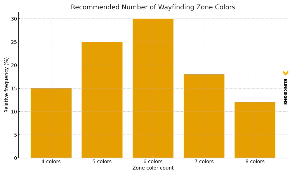
The 4 to 8 zone color rule
The 4 to 8 zone color rule
Research and project experience point toward a practical range:
- Fewer than four primary zone colors make it difficult to differentiate departments or wings
- More than eight primary colors overload the memory and start to confuse people.
In other words, most buildings should choose between four and eight primary zone colors.
Examples:
- A small outpatient clinic may require four zones: reception, examination, imaging, and administration.
- A mid-sized corporate office could utilize six areas: reception, client areas, focus zones, collaboration zones, meeting rooms, and support services.
- A large hospital campus might utilize eight departments: emergency, surgery, inpatient, outpatient, imaging, pediatrics, oncology, and administration.
Once that number is fixed, every design move supports that structure instead of introducing new random colors.
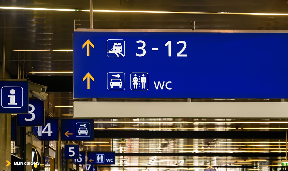
How to choose primary zone colors
Primary zone colors at Station
Good primary zone colors follow a set of criteria. They should be:
- High contrast from one another
Each zone needs to be visually distinct, even for visitors who are tired or stressed. Blues and greens that are too close in value can merge in low light. - Recognisable with color vision deficiency
About eight percent of men and half a percent of women have some form of color vision deficiency. It is wise to avoid pure red versus pure green as the only distinction between the two zones. Using blue, yellow, or different levels of lightness helps. - Appropriate for the function of the zone
- Calming tones for clinics and patient flows.
- Professional, cooler tones for corporate and administrative areas
- Warmer tones for social and hospitality areas
- Compatible with the brand palette
The brand identity system may already use specific Pantone or CMYK values. The wayfinding palette should sit alongside this, either by extending the brand palette or by pairing it with neutrals and supportive hues. - Viable in real lighting and materials
Colors that appear balanced on a monitor can look harsh under cold fluorescent lighting or fade into the background in dim corridors. Always test swatches in real conditions.
A practical method is to start with the brand palette, identify one or two hues that can carry essential zones, then extend the palette with additional colors explicitly chosen for wayfinding clarity rather than brand decoration.
Secondary and tertiary color coding
Once primary zone colors are in place, secondary and tertiary coding create hierarchy without exploding the palette.
- Secondary coding: Used for floors, levels, or subzones inside a central zone.
- Example: Cardiology is blue. Level three in cardiology uses a lighter blue tint, while level four uses a slightly deeper tint. The hue family stays consistent, so visitors know they are still in the same department, even when the level changes.
- Tertiary coding: Used for room numbers, arrows, icons, and supporting information.
- The safest method is to use high-contrast text (often white or very dark charcoal) on the primary zone color panels.
- Special accents, such as urgent notices, wet floor alerts, or “you are here” map markers, can use a consistent accent color that stands out from both the background and zone colors.
This layered approach keeps the visual system both organized and teachable. People do not have to memorize twenty different colors and meanings. They only need to understand a small language:
- Zone color family = where am I?
- Tint or shade variation = which floor or sub area?
- High-contrast arrows and symbols: Where do I go next?
Warm colors versus cool colors in wayfinding
Warm and cool colors have different psychological roles. In wayfinding, it is not about trends; it is about function.
Cool colors such as blues and greens:
- Support calm, focus, and trust
- Work well in patient areas, quiet zones, and corporate environments.
- Help long corridors feel more settled rather than agitated.
Warm colors such as red, orange, and yellow:
- Pull attention quickly
- Can make time feel more compressed, which is helpful in waiting zones
- They are valuable as accents and highlights, not always as full wall coverage.
Practical strategies:
- Use cool colors as the backbone of zone identification in healthcare and corporate spaces
- Use warm accents at key decision points such as reception desks, information hubs, and entry nodes.
- Reserve strong reds for accurate warnings or emergency-related flows so they retain meaning.
By combining the 4 to 8 zone rule, clear selection criteria, and warm versus cool strategy, a facility moves from “nice colors on walls” to a structured wayfinding color system that people can understand and rely on.
ADA Compliance and Accessible Color Use
ADA Signage color contrast and text.
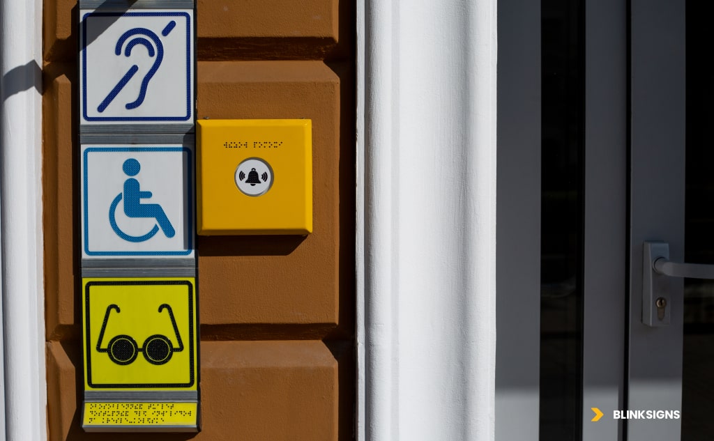
Color cannot be used alone to communicate direction or essential information. ADA accessibility standards require text, tactile cues, and symbols to be readable by people with limited vision, color vision deficiency, or low-light challenges.
Color Contrast Requirements for ADA
Two core ratios govern compliant contrast:
- Standard text and graphics require a 4.5 to 1 contrast
- Large text (18pt or 14pt bold) requires 3 to 1 contrast.
These ratios ensure legibility for the majority of users, including those with moderate visual impairment.
Practical color combinations for compliant wayfinding
Below is a simplified version of the ADA-compliant combinations from your research.
| Background | Text Color | Contrast Ratio | ADA Compliant | Notes |
| White | Black | 21 to 1 | Yes | Maximum clarity |
| Dark Blue | White | 8.6 to 1 | Yes | Ideal for corporate wayfinding |
| Yellow | Black | 19.6 to 1 | Yes | Attention-grabbing at long distances |
| Light Green | Black | 15.3 to 1 | Yes | Excellent for wellness environments |
| Red | White | 4.0 to 1 | Only for large text | Suitable for emergency areas |
| Light Gray | Medium Gray | 1.7 to 1 | No | Avoid directional cues |
Choosing the correct contrast is not optional. It defines whether users feel guided or frustrated.
Designing for Color Vision Deficiency
Eight percent of men and roughly half a percent of women experience some form of color vision deficiency.
The most common type is red-green confusion.
Effective strategies include:
- Use blue and yellow combinations rather than red against green
- Emphasize lightness and darkness rather than hue alone
- Support color with symbols, icons, and patterns.
- Test designs through digital simulators such as Color Oracle or Stark
- Avoid relying on subtle shade differences for zone boundaries.
The strongest wayfinding systems work for every user, regardless of visual ability.
Industry Specific Wayfinding Color Strategies
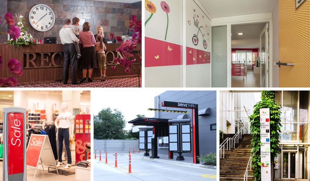
Industry Specific Wayfinding Colored signage and graphics
Color needs to change dramatically based on user intent, stress levels, building complexity, and decision pressure. Below are proven color frameworks tailored to specific facility types.
Healthcare Facilities
Hospitals and clinics benefit the most from color coding because stress levels are naturally higher in these settings.
Strategic choices for healthcare
- Cool colors in patient corridors reduce anxiety
- Warm accents near reception help with queue flow and time perception
- Pediatric areas benefit from friendly multi-color systems.
- Purple is often used for oncology because it communicates dignity and privacy
Measurable impact
- Directional inquiries drop by 40 to 60 percent.
- The time to the destination reduces by 30 to 45 percent.
- Patient independence increases significantly.y
- Satisfaction scores tend to rise by 25 to 35 percent.
Effective healthcare wayfinding is not merely decorative; it is a key tool for enhancing patient quality of experience.
Corporate Offices
Corporate environments require wayfinding that supports brand identity while keeping visitors confident and calm.
Strategic choices for offices
- Integrate primary brand colors into main zones
- Use cool, professional tones for focus rooms and meeting areas.
- Introduce warm tones only for the collaborative or social zones
- Apply neutral colors for quiet corridors and background panels.
Performance outcomes
- Visitors reach their destinations faster.
- Employee navigation improves, especially in large campuses.
- Perceived professionalism increases because visual consistency communicates control.
Educational Environments
Schools and universities require palettes that support different age groups and cognitive stages.
School-age Strategies
- Primary grades respond well to strong, simple color families.
- Middle and high schools tend to do better with more mature color schemes.
- Colleges and universities benefit from professional tones that incorporate school colors.
Measured impact
- Reduction in staff interruptions from lost students
- Improved independence for younger students
- Better flow between buildings and departments
Retail and Hospitality
Color strongly shapes movement, dwell time, and perceived service in these environments.
Strategic choices
- Warm colors near entrances create a welcoming feeling
- Cooler tones in browsing areas encourage longer dwell times.
- Neutral tones for exits and restrooms prevent visual overload.
- Seasonal or promotional zones can use brighter accent colors.
Measurable outcomes
- Dwell time increases by as much as 45 percent.
- Path clarity improves flow toward revenue generating areas.
- Customer satisfaction improves when navigation is simple.
Transportation and Airports
Large, complex environments rely heavily on color to handle stress, time pressure, and multilingual users.
Strategic choices
- Use universal color conventions for departures and arrivals.
- High-contrast backgrounds for enhanced visibility in crowded areas.
- Color-coded terminals and concourses simplify navigation.
- Test colors for cultural neutrality to avoid misinterpretation.
Performance impact
- Decreased missed waypoints
- Reduced staff load
- Better passenger satisfaction
The Practical Five-Phase Color Selection Process
Phase 1: Audit and Analysis
- Identify user demographics, stress points, and primary destinations
- Review the existing brand palette and its limitations.
- Document lighting conditions in key decision points
- Map cultural considerations based on the user base.
- Assess ADA and accessibility needs.
Phase 2: Zone Definition
- Define 4 to 8 zones based on building layout.
- Map traffic patterns and choke points.
- Assign hierarchy: primary, secondary, tertiary information.
Phase 3: Palette Development
- Assign high contrast hues to primary zones.
- Create tints and shades for sub-zoning.
- Select accent colors for alert or special information.
- Determine text color combinations that satisfy ADA standards.
Phase 4: Testing and Validation
- Test contrast ratios through WCAG compliance tools.
- Check readability under natural and artificial lighting.
- Simulate color blindness.
- Create real-world mockups.
- Conduct short user walk tests.
Phase 5: Implementation and Documentation
- Produce Pantone, CMYK, RGB, and HEX specifications.
- Provide rules for signage placement and color usage.
- Document maintenance instructions and fade expectations.
- Prepare handoff documents for vendors or multi-site operators.
This process becomes a repeatable method that protects brand consistency and ensures user confidence.
Digital Wayfinding Color Integration
Color consistency across physical and digital navigation is essential. Many visitors begin their journey on a screen before they see a sign.
Requirements for digital consistency
- Match RGB values precisely to physical signage hues.
- Confirm readability on bright backlit screens.
- Adjust dark mode and high contrast options for accessibility.
- Keep icon colors identical to physical directional symbols.
Integration with kiosks and mobile apps
- Ensure the path color visible on a kiosk map matches the zone color in the building.
- Use clear “you are here” indicators with strong contrast.
- Provide color blind accessibility settings in apps.
- Verify consistency in augmented reality overlays.
A modern wayfinding system seamlessly integrates physical and digital navigation into a cohesive experience.
Measuring the Performance of a Color-Coded Wayfinding System
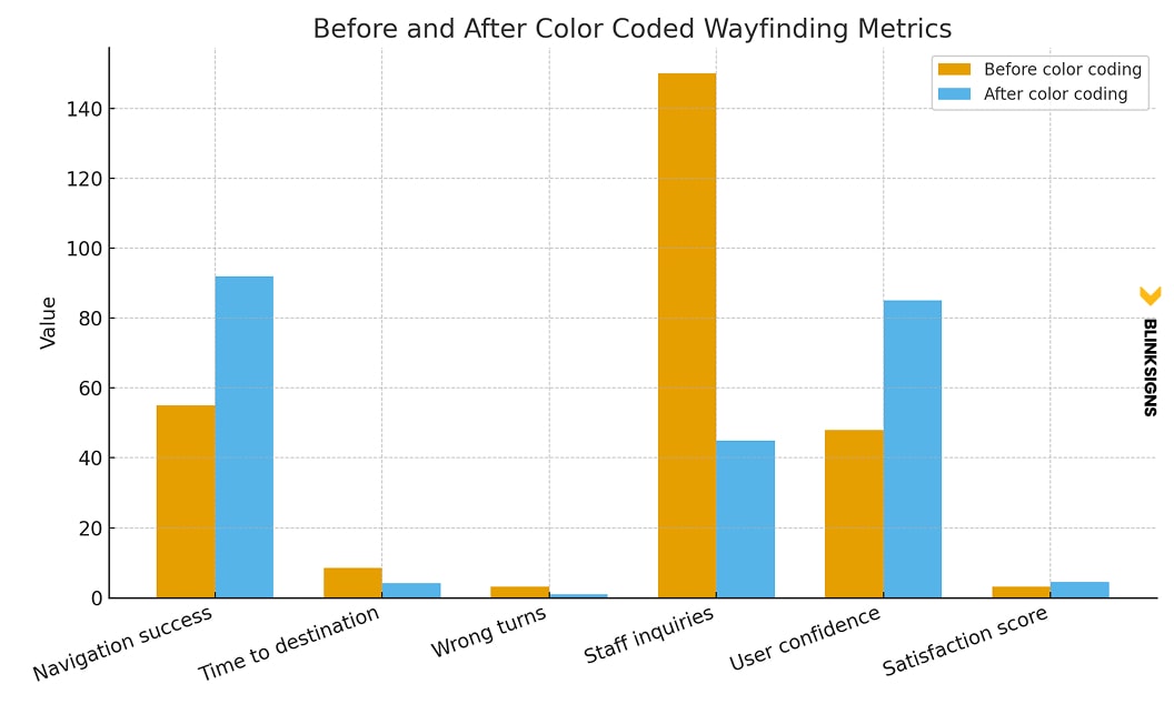
before and after color coded wayfinding metrics
Navigation success metrics
- Success rates increase from roughly 55 percent to between 85% and 98%.
- The time to reach the destination can fall from eight minutes to around four.
- Wrong turns typically drop by over sixty percent.
User experience metrics
- Visitors report increased confidence.
- Stress levels decrease significantly in healthcare settings.
- Satisfaction scores rise by twenty-five to thirty-five percent.
ROI metrics
- Staff save two to four hours daily by giving fewer directions.
- Facilities can save $15,000 to $30,000 annually in time costs.
- Hospitals can improve patient experience scores tied to reimbursements.
Wayfinding color is a measurable business asset, not a design step.
Frequently Asked Questions
How many colors should a wayfinding system use
Most facilities perform best with four to eight primary colors. Fewer than four creates poor differentiation, and more than eight overwhelms users. The ideal number depends on building size, complexity, and user demographics.
What contrast ratio meets ADA standards
Standard text and graphics must meet a contrast ratio of at least 4.5:1. Large text requires a minimum of three-to-one. This ensures legibility for users with visual impairments.
Are warm or cool colors better for wayfinding?
Both can work, but their purposes differ—cool colors, such as blue and green, support calm navigation in healthcare and corporate environments. Warm colors, such as yellow or orange, work well in attention areas or social spaces.
Can brand colors be used as wayfinding colors?
Brand colors can be integrated into the wayfinding palette if they meet contrast guidelines and do not cause confusion across zones. It is often best to use brand colors for primary entry areas and supportive hues for zone colors.
How do I accommodate color blindness in a wayfinding system
Use combinations that rely on lightness contrast rather than hue alone. Pair color with symbols, shapes, and text. Test color palettes through CVD simulators to ensure clarity.
Do digital wayfinding screens need different color rules
Digital displays require RGB values and specific contrast adjustments for backlit environments. The palette must still match the physical signage system for consistency.
Which industries benefit the most from color-coded wayfinding
Hospitals, corporate campuses, schools, airports, retail centers, and hospitality facilities all see measurable improvements in navigation clarity and user confidence.
How often should colors be refreshed?
Interior vinyl graphics typically last five to seven years, while painted walls have a lifespan of between five and ten years. Exterior colors exposed to UV light may need to be replaced every three to five years.
What is the biggest mistake in wayfinding color selection
Using too many colors or choosing hues that are too similar in value. A successful system feels intentional, organized, and easy to learn.
Conclusion
Color psychology is a scientific and emotional tool that shapes navigation in ways people feel immediately, even if they do not consciously notice it. A purposeful wayfinding color system reduces stress, improves movement, increases visitor confidence, and reflects the professionalism of the organization behind it.
BlinkSigns combines evidence-based design, ADA compliance expertise, material knowledge, and multi-site rollout experience to create color systems that perform beautifully and guide visitors with clarity.