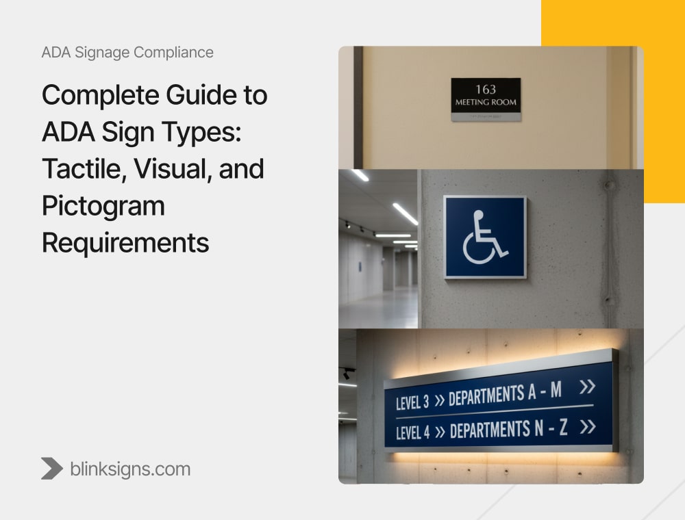
Complete Guide to ADA Sign Types: Tactile, Visual, and Pictogram Requirements
Why ADA Signage Compliance Matters
ADA signage doesn’t come up for many business owners until it becomes problematic. Maybe a customer points out that a restroom isn’t clearly marked in Braille. Perhaps a building inspector issues a citation after noticing that room numbers don’t meet mounting height rules. Or worse, a lawsuit lands because accessibility standards were ignored.
The pain points are real:
- Fines and penalties for non-compliance.
- Risk of lawsuits and damaged brand reputation.
- Customers or visitors who feel excluded because they can’t navigate the building safely.
- Costly retrofits when signage isn’t installed correctly the first time.
The truth is that ADA signs are not optional. They’re a legal requirement and vital to making your business inclusive and accessible. At BlinkSigns, we’ve worked with schools, hospitals, corporate offices, and retail chains to design and install signage that not only passes inspection but also makes customers and employees feel respected.
This guide explains the three critical ADA sign types—tactile, visual, and pictogram—and breaks down every business’s technical rules.
Overview of ADA Signage Requirements
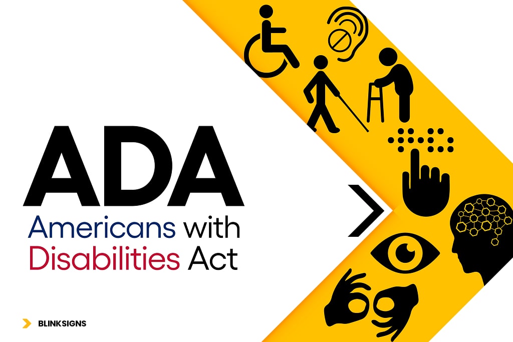
Overview of ADA Signage Requirements
Core Standards That Govern ADA Signs
ADA signage is guided by the Americans with Disabilities Act (ADA), the 2010 ADA Standards for Accessible Design, and supporting codes like ANSI A117.1 and ICC accessibility standards. Together, these rules ensure that signs are readable, consistent, and placed where people with disabilities can use them without barriers.
Where ADA Signs Are Required
Not every sign in your building falls under ADA rules, but many do. The following must comply:
- Room Identification Signs: permanent rooms and spaces such as offices, restrooms, and classrooms.
- Exit and Stair Signs: emergency routes, stairwells, and exits.
- Directional and Informational Signs: wayfinding systems for public spaces.
- Accessible Features: restrooms, elevators, ramps, and accessible parking.
Signs Exempt from ADA Rules
Some signs do not require ADA compliance:
- Temporary signs are used for seven days or less.
- Building directories or menus.
- Occupant name signs that change frequently.
- Company logos or branding graphics that are decorative.
Businesses often waste money by over-ordering ADA signs when some areas are exempt. BlinkSigns helps clients identify what needs to comply and what doesn’t, saving time and cost while keeping the property legal.
Tactile Signs—Raised Characters and Braille Standards
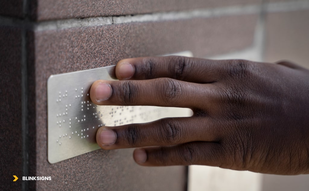
Tactile sign with raised characters
Character Height and Measurement Rules
The ADA requires tactile characters to measure between 5/8 inch and 2 inches, based on the baseline of the uppercase “I.” This avoids inconsistencies that come from measuring curved or decorative letters. Getting this wrong is one of the most common compliance failures.
Stroke Width and Spacing Standards
Characters must be thick enough to be legible but not so heavy that they distort readability. The stroke width cannot exceed 15% of the character height. Spacing rules are equally strict: tactile letters must have a minimum spacing of 1/8 inch and no more than four times the character stroke width.
These rules ensure that people with low vision or those reading by touch can easily distinguish letters without confusion.
Braille Placement and Geometry
Braille is not just an add-on—it’s a core requirement. All tactile signs must include Grade 2 Braille directly beneath the corresponding text. Braille must be domed, uniformly spaced, and placed with clear separation from tactile characters. Misplaced or flat Braille dots render a sign non-compliant and inaccessible.
Prohibited Type Styles
Prioritizing aesthetics over compliance often leads to design mistakes. ADA tactile signs prohibit italics, scripts, condensed, or decorative fonts because they reduce readability. Only sans-serif or simple serif fonts are permitted, ensuring clarity for all users.
Placement and Mounting for Tactile Signs
Placement is as important as design. Tactile signs must be installed on the latch side of the door, mounted with the tactile baseline between 48 and 60 inches above the finished floor (AFF). Exceptions apply for double doors or push-side entryways, and signs must be placed on the nearest adjacent wall.
Proper placement ensures that a person using a wheelchair or reading by touch can safely approach and interact with the sign.
Non-compliance with tactile sign rules is one of the most common reasons businesses fail ADA inspections. Errors in character height, Braille placement, or mounting height can lead to failed audits and costly reinstallations. At BlinkSigns, our team ensures your tactile signs meet every technical requirement while fitting seamlessly into your brand environment.
| Upgrade your facility with ADA-compliant restroom and accessibility signs—designed for clarity, inclusivity, and 100% compliance. ⟶ Shop it now.
Visual Signs — Contrast, Fonts, and Legibility
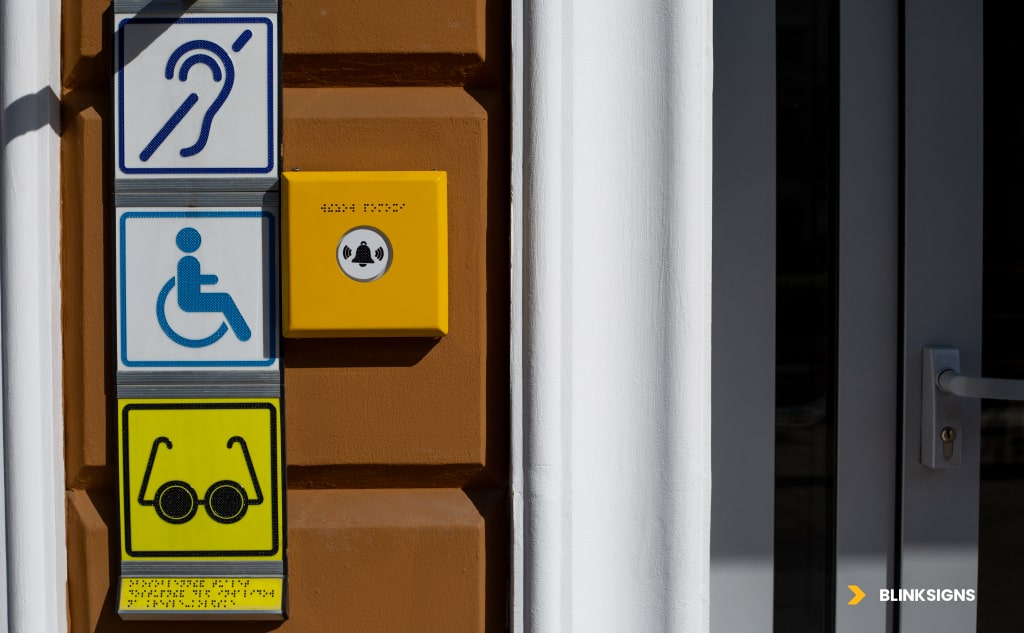
Visual Signs — Contrast, Fonts, and Legibility
While tactile signs serve those who read by touch, visual signs ensure accessibility for people with low vision or who rely on distance readability. The ADA is strict about visual character rules to prevent confusion, especially in directional, overhead, and exit signage.
Visual Character Size and Stroke Thickness
Character size depends on viewing distance. A sign’s intended reading distance dictates the size of its letters.
- The character size should range from 5/8 to 2 inches for room ID and nearby viewing.
- Larger letters for overhead or directional signs.
Stroke thickness must remain between 10% and 30% of the character height, ensuring readability without distortion.
Visual Character Spacing and Line Spacing
Spacing matters as much as size.
- Character spacing: 10%–35% of character height.
- Line spacing: at least 135% of character height to prevent crowding.
Contrast and Non-Glare Requirements
Visual signs must maintain a high contrast ratio between text and background. Light characters on a dark field or dark characters on a light field are acceptable.
All visual signs must use non-glare finishes to avoid artificial or natural light reflection. Matte or low-gloss finishes are recommended.
Fonts and Readability Standards
Only sans-serif fonts or simple serif fonts are allowed—no decorative, condensed, or italicized typefaces. Mixed-case lettering is encouraged for readability, but consistency is key.
Visual Sign Placement
Visual signs are critical for overhead signs, directional arrows, room ID, and exit identification. Placement must ensure tigns are visible from required approach distances and do not obstruct clear floor space.
Pictogram Signs — Symbols and Accessibility Icons
Pictogram Signs — Symbols and Accessibility Icons
Pictogram Field and Size Requirements
ADA requires that pictograms be placed within a minimum 6-inch high field. This field must be free of any additional text. Accompanying tactile text and Braille should appear directly beneath the pictogram field.
Common ADA Pictograms
- Restroom symbols (male, female, unisex, family).
- International Symbol of Accessibility (ISA).
- Elevator symbols.
- Stair symbols.
- Exit symbols.
Contrast and Background Rules
Like visual signs, pictograms must use non-glare finishes and maintain high contrast. A restroom icon, for example, must be distinguishable against its background regardless of lighting conditions.
Placement of Pictogram Signs
Pictogram placement follows the exact 48–60 inches AFF mounting rule as tactile signs, ensuring accessibility for all users. Directional pictograms must follow logical wayfinding patterns with consistent arrow use.
Placement and Mounting Rules for ADA Signs
Placement and Mounting Rules for ADA Signs
Placement errors are among the top compliance failures. A sign that meets all character rules but is mounted incorrectly is still non-compliant.
Standard Mounting Heights and Locations
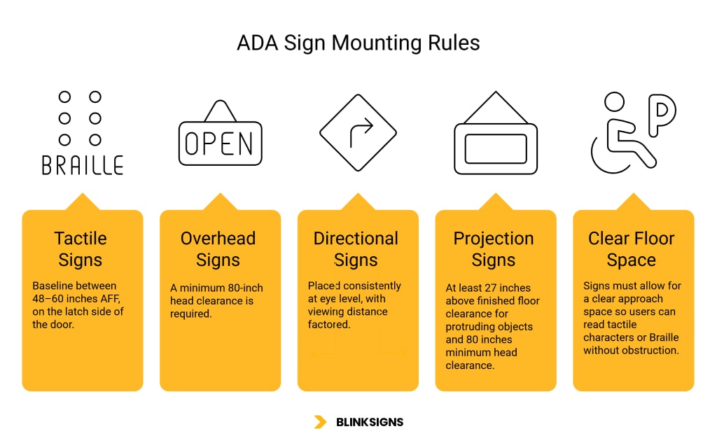
- Tactile signs: baseline between 48–60 inches AFF, on the latch side of the door.
- Overhead signs: a minimum 80-inch head clearance.
- Directional wall-mounted signs are placed consistently at eye level, with viewing distance factored.
Overhead and Projection Signs
Projection and overhead signs must not create safety hazards. Projection signs require at least 27 inches above finished floor clearance for protruding objects and 80 inches minimum head clearance.
Clear Floor Space Requirements
Signs must allow for a clear approach space so users can read tactile characters or Braille without obstruction. This includes unobstructed reach zones near doorways and hallways.
State and Local Variations in ADA Signage
Federal ADA standards are the baseline, but states can add rules. Two of the strictest are California and Texas.
| Jurisdiction | Key Variation | Example |
| California Building Code (CBC) | It requires two restroom signs (door and wall-mounted tactile sign) and additional contrast and shape requirements for restroom symbols. | A unisex restroom must display the ISA and geometric symbol with tactile/Braille. |
| Texas Accessibility Standards (TAS) | It closely mirrors the ADA but is often stricter in inspection and enforcement. | Inspectors may reject signage with incorrect Braille dot geometry even if tactile lettering is correct. |
| Other States | Some states adopt minor additions to ANSI or ICC codes. | Local inspectors may require additional wayfinding symbols in public facilities. |
Businesses operating across states should not assume one ADA package covers every location. BlinkSigns advises multi-location clients on state-specific overlays to prevent compliance failures during inspections.
Non-compliance is not always about what’s on the sign—it’s often about where it’s mounted, how it’s placed, or what state laws apply. Minor oversights lead to failed inspections, lawsuits, or costly reprints. BlinkSigns’ team ensures that visual signs, pictograms, and mounting rules align with federal and local standards, protecting businesses from risk.
Manufacturing and Material Considerations
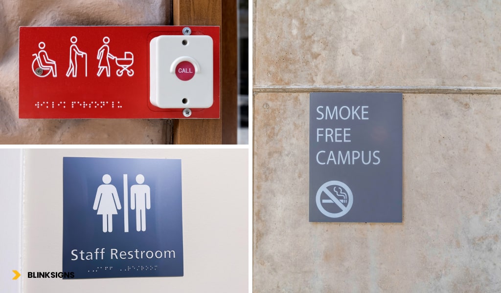
ADA Signs for Different Environments
ADA-compliant signage isn’t just about rules but also about durability, design, and functionality. Poor material choices can lead to fading, peeling, or glare, all of which cause compliance failures.
Common ADA Sign Manufacturing Methods
- Photopolymer Signs – one of the most durable and widely used methods, with tactile characters and Braille raised directly from the sign face.
- Routed and Inserted Signs – characters and Braille beads inserted into routed slots. Reliable but requires precision.
- Appliqué Signs – tactile characters applied to the surface. Flexible for custom colors and branding.
- UV-Printed ADA Signs – cost-effective but must maintain raised tactile depth and non-glare finish.
Material Durability and Finishes
- Acrylic and Polycarbonate – lightweight, durable, and easy to clean.
- Metal (aluminum, stainless steel, bronze) – highly durable, often used in healthcare and government facilities.
- Laminate and Composite Panels – cost-effective for large-scale projects.
All finishes must be matte or non-glare to comply with ADA readability requirements.
Choosing ADA Signs for Different Environments
- Healthcare facilities – antimicrobial finishes, easy-to-clean surfaces.
- Schools – durable photopolymer signs resistant to heavy use.
- Corporate offices – custom branding with compliant tactile/visual rules.
- Hospitality – sleek designs with pictograms and brand-consistent colors.
BlinkSigns works with various materials and methods, advising clients on the best fit for function, compliance, and brand identity.
Quality Assurance and Field Verification
Even perfectly manufactured ADA signs fail if installed incorrectly. That’s why quality assurance is critical.
Pre-Installation Submittals
- Finish samples (to verify glare and contrast).
- Tactile character depth verification.
- Braille cell verification using ADA Braille testers.
- Mock-up signs for inspector approval.
Field Checklist for Installers
| Checklist Item | Compliance Rule | Typical Failure to Avoid |
| Mounting height | 48–60” AFF baseline | Installed too high/low |
| Location | Latch side of the door, adjacent wall | Mounted directly on doors |
| Tactile character depth | 1/32” minimum | Shallow or printed-only letters |
| Braille placement | Below text, Grade 2 | Incorrect spacing or flat dots |
| Contrast | High contrast, matte finish | Glossy materials, low contrast |
| Viewing distance | Proportional letter size | Too small for overhead signs |
Common Mistakes to Avoid
- Mounting tactile signs on doors instead of adjacent walls.
- Using glossy metals or glass backgrounds that create glare.
- Printing Braille dots that are flat instead of domed.
- The placement of the Braille dots may be inconsistent across different rooms or floors.
BlinkSigns eliminates these risks by providing project-wide QA, ensuring consistency across multi-location signage rollouts.
FAQs About ADA Signs
How do you measure tactile character height?
From the uppercase “I” baseline, not the tallest letter or decorative features.
Where should Braille be placed on ADA signs?
Braille should be placed directly below the corresponding text, with adequate spacing to prevent confusion.
What is the minimum pictogram field size?
The pictogram field must be at least 6 inches high and should not contain any text.
Are temporary signs exempt from ADA rules?
Yes. Temporary signs used for 7 days or less are exempt.
What happens if a business fails ADA compliance?
Penalties range from fines and lawsuits to costly reinstallation. DOJ enforcement is strict under ADA Title III.
Do ADA signs have to be custom-made for each business?
Not always. Standard ADA signs can be used, but custom signage is often required for branding and to meet state-specific overlays.
BlinkSigns ADA-Compliant Signage Solutions
At BlinkSigns, we know that ADA compliance is more than checking a box. It’s about:
- Protecting your business from fines and lawsuits.
- Creating an inclusive, accessible space for every visitor.
- Ensuring brand consistency while meeting strict regulations.
Our team handles every step: consultation, design, manufacturing, installation, and compliance verification. Whether you’re upgrading one office or rolling out signage for multiple facilities, we provide custom ADA solutions tailored to your industry.
Contact BlinkSigns today to schedule a compliance audit and get a customized ADA signage package that protects your business and builds trust with every customer who walks through your doors.
Conclusion
Ignoring ADA signage compliance is a mistake businesses cannot afford. With strict rules around tactile lettering, Braille, visual contrast, pictograms, and placement, even minor errors lead to failed inspections and costly replacements.
BlinkSigns provides expert guidance and end-to-end solutions, ensuring every ADA sign type in your building is compliant, functional, and aligned with your brand.
? Take the proactive step today. Protect your business, meet compliance, and create an inclusive environment with BlinkSigns ADA signage solutions.