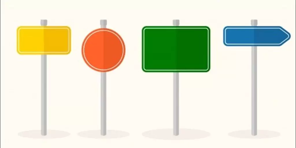
Color Psychology 101: How They Affect Your Signs
Color psychology is a natural phenomenon that we relate to with different feelings. The actual representation of a word or an image is enhanced when combined with colors.
Using the right combination of colors for signs that attract customers to your store is a part of color psychology itself. Let’s see how effective colors can be for your signs:
Color & Signs
These two things go hand in hand. You know your sign is good when it’s visible, impacts the eye, and defines your brand. It can be anything from channel letters to wall graphics, LED signs, directional signs for businesses, or banners and posters.
It’s about using colors to get good signs, and that comes from combining the right colors. We’ve collected a few tips to help you out in understanding how some colors work and how they can affect your signs.
Colors 101
White
In color psychology, white colors signify peace, calmness and a new beginning. White color combined with the right size will give a new, pure feeling. But too much use of white with the wrong size can take up the breathing space.
Black
Used against the right backdrop, any information, name or idea in black can seem mysterious, alluring and chic. Directional & wayfinding signs in bold, big and black letters are easier to spot and more helpful.
Red
Red signifies excitement. Red color used in interior signage types can bring out the latest information for customers. Red color can feel very overwhelming to some and if your business doesn’t have a variety of colors, balancing red can become confusing. In these situations, you can add red in the posters, banners and signage types that aren’t permanent.
Blue
Different shades of blue signify different emotions. From sky blue to aqua to royal blue, blues set the mood from slow and calm to energetic and vibrant. Having signs in blue can work more for the interior of businesses and offices and boost employees’ morale. Plus, visitors will feel more at ease with information in blue. It’s the color everyone likes.
Gray
Signs in gray are chic, modern and need a vibrant colored background to pop. Gray is a safe color, but signs in gray can get lost in places that don’t have anything else going on. For gray to stand out, you’ll have to add features like an image, elaborate scenery or lighting to make the sign visible.
Why Are Colors Important?
Visibility
Signs are all about standing about and registering. Like:
- Gray against a complex backdrop
- Red in a chic, simple background
- Black with lighting in any backdrop
All these combinations are visible at first sight for different signs. You can mix and match to find out the visibility of different colors and signs together.
Influence
Colors are related to moods and feelings in subconsciousness according to color psychology. Using influencing colors on signs can be another advantage.
Many people use colors to express themselves, and when using them with signs, things may go wrong if the mood is mismatched. Here are a few examples of mismatched signs to explain our point:
- Big and neon signs in a library – too overwhelming.
- Small, unreadable directional & wayfinding signs anywhere
Wrong signs are a failure and can negatively influence customers and visitors with your business.
Impression
Let’s be honest, customers remember a restaurant that has a good ambiance because it’s all about the experience. With signs, you should aim for the type that depicts the nature of your business. Interior signs should be welcoming, helpful and the exterior should display your brand, stand out and attract passersby. Colored signs do half the work with combination and contrast in creating a lasting impression for your business.