Do Not Enter Signs for Schools and Campuses: Best Practices
Effective use of ‘Do Not Enter’ signs on school grounds and campuses involves careful consideration of placement, design, legal requirements, and maintenance. We need to position these signs strategically based on student traffic flow and visibility, using bold, contrasting colors and clear, concise designs for easy recognition.
It’s also vital to adhere to local laws and ADA guidelines. Regular maintenance guarantees sustainability and effectiveness. Further, integrating these signs into our emergency response plans is significant. Navigate onward in your quest for knowledge and discover more about how signage plays a vital role in fostering a safe, welcoming educational environment.
Understanding ‘Do Not Enter’ Significance
In the bustling world of education, understanding the significance of ‘Do Not Enter’ signs is essential. These signs play a significant role in student protection, creating safety awareness among learners and staff. Their importance lies in visually communicating critical information, thereby influencing behavior and supporting order.
Signage importance goes beyond mere decoration; it’s a tool for effective visual communication, guiding individuals on where they can and can’t go.
‘Do Not Enter’ signs are essential in areas that pose potential hazards, or house sensitive information or equipment. By instilling this level of safety awareness, we can greatly influence behavioral practices, ensuring everyone’s well-being within the school premises.
Ideal Placement of Safety Signs

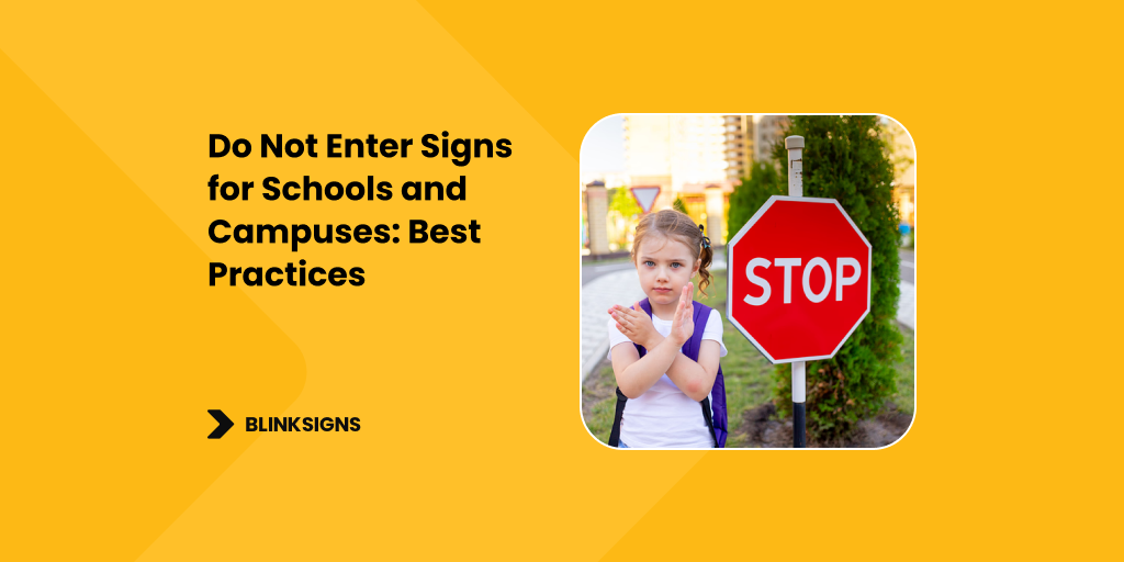
schoolgirl-girl-with-stop-sign-crosses-road-learns-rules-road
Having understood the significance of ‘Do Not Enter’ signs, let’s now focus on how to improve their placement for maximum effectiveness.
Sign placement strategies should consider student traffic flow, ensuring these signs are visible where it matters most. Visibility considerations include placing signs at eye level and in well-lit areas.
Signage color choices play a critical role in visibility too, with contrasting colors helping to catch the eye.
Always remember that sign placement must follow local and national compliance guidelines.
We can’t emphasize enough how important proper sign placement is. It’s a critical factor in preventing accidents and ensuring the safety of everyone on campus.
Get it right, and you’ll have a safer learning environment.
Designing Effective ‘Do Not Enter’ Signs
We recognize that an effective ‘Do Not Enter’ sign goes beyond mere words. Sign visibility is essential; it needs to be seen easily from a distance.
Color contrast plays a key role here. Bold colors, like red and white, rapidly capture attention and have widespread recognition.
Font readability is another critical factor. Simple, clear fonts ensure that the message is understood.
The duration of the sign is also important. It needs to withstand weather conditions and daily wear and tear.
Finally, we should consider cultural considerations to avoid misunderstandings.
All these elements combine to create an effective ‘Do Not Enter’ sign that serves its purpose well.
Legal Requirements for Signage

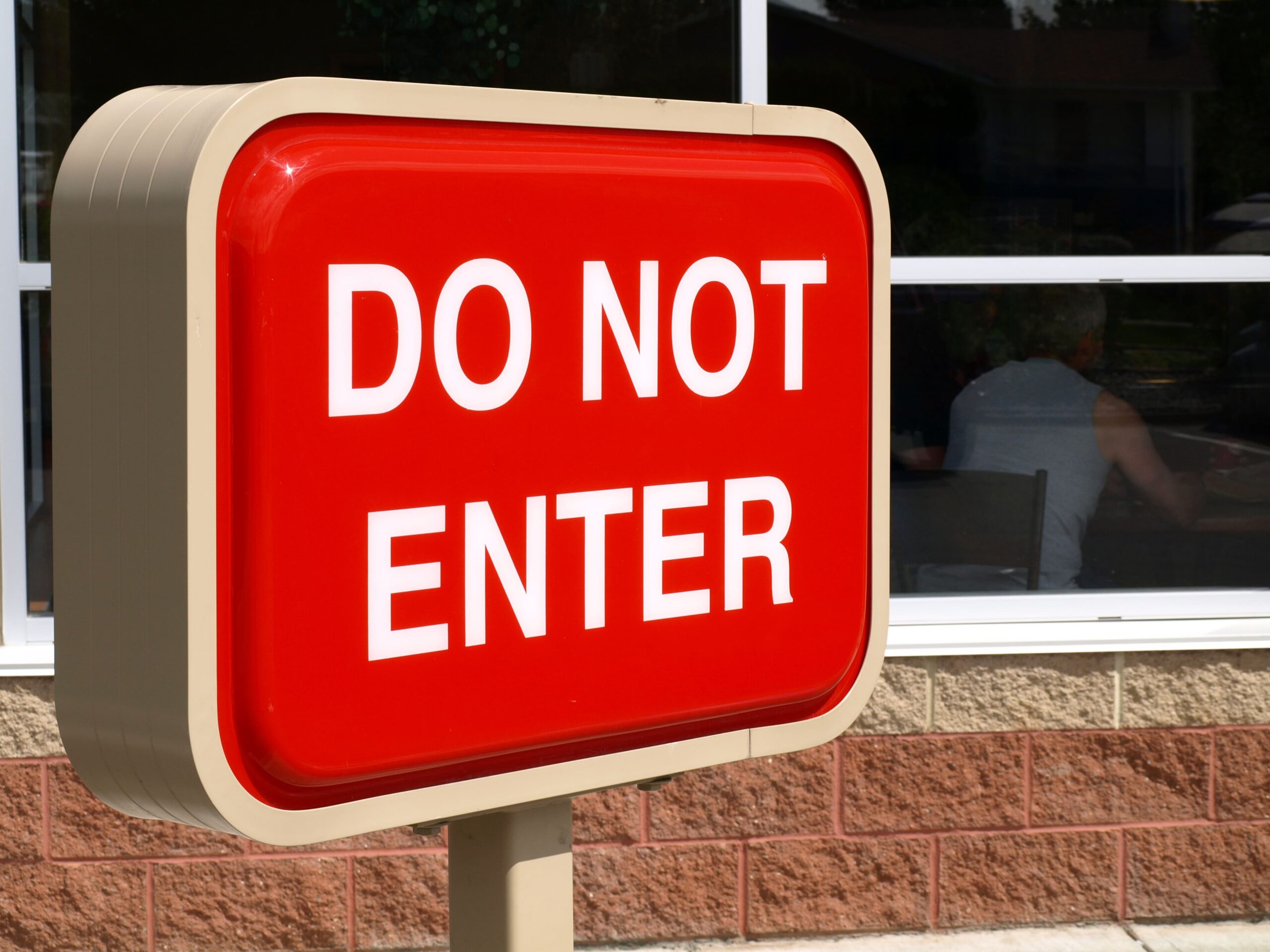
enter-sign
Maneuvering the legal maze of signage requirements can be tricky. But we’re here to guide you through signage regulations and legal compliance. Understanding the legal requirements can enhance signage effectiveness, meet accessibility standards, and reduce liability considerations.
We’ve summarized the key points in the table below:
| Signage Regulations | Accessibility Standards | Liability Considerations | |
| Do Not Enter Signs | Must follow local laws | Should be easily visible and understandable | Non-compliance can result in lawsuits |
| Schools | State education codes may apply | ADA guidelines must be followed | Regular inspections are fundamental |
| Campuses | Campus-specific rules may exist | Signs must be accessible to all | Risk management is vital |
| Public Areas | Local government regulations apply | Universal Design principles are important | Public safety is a primary concern |
| Private Institutions | Private rules may supersede some public regulations | Still must adhere to ADA | Liability insurance is necessary |
Understanding these requirements helps guarantee your signs are legally sound and effective.
Maximizing Impact with Signage Maintenance
Keeping your “Do Not Enter” signs in top condition is essential to their effectiveness. Signage durability plays a significant role in this effort.
Regular maintenance schedules help guarantee signs stay clean, visible, and unobstructed. Regular checks can also help find any damage early, prolonging a sign’s lifespan.
Visibility enhancements, such as the use of reflective materials, also increase a sign’s effectiveness, especially in low-light conditions.
Whether resistance is critical to prevent fading or other damage because of exposure to the elements.
Integrating ‘Do Not Enter’ Signs with Emergency Response Plans
Considering the importance of emergency response plans in schools, the integration of “Do Not Enter” signs plays a critical role. These signs, when properly positioned and visible, enhance the efficiency of our emergency protocols.
We can’t stress enough the need for regular staff training. This ensures that everyone understands where these signs are found and their significance during emergencies.
It’s also essential we promote student awareness about these signs, integrating this knowledge of safety education. The key is to effectively blend the use of “Do Not Enter” signs into our emergency response plans.
This way, we bolster both our preparedness and response efficiency, safeguarding the safety of everyone within our educational institutions.
Digital vs. Traditional ‘Do Not Enter’ Signs: Which Is Right for Your Campus?
Maneuvering the choice between digital and traditional ‘Do Not Enter’ signs for your campus involves several key considerations.
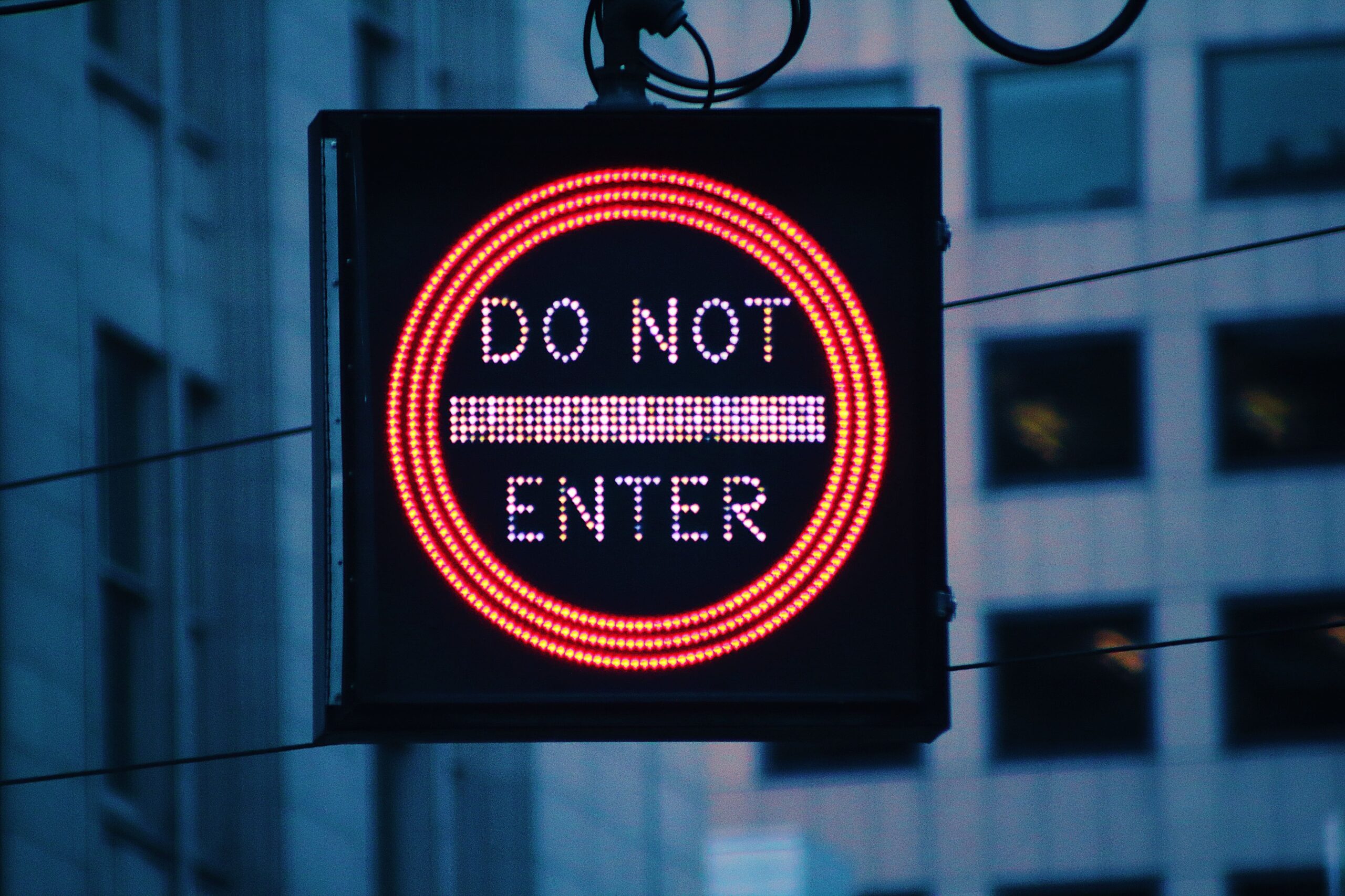
Digital signage benefits include dynamic content and user engagement strategies, offering real-time information updates. They’re interactive, catching attention and fostering compliance.
However, we must not underestimate the importance of traditional signage reliability. They’re less dependent on power sources and technology, making them more stable in certain situations.
A cost comparison analysis shows digital signs can be more expensive initially, but may offer long-term savings because of reduced maintenance.
Visibility considerations are essential too. Digital signs shine in low light, but traditional signs can be more visible in bright light.
Ultimately, understanding your campus’ unique needs will guide this decision.
The Role of Signage in Creating a Safe and Welcome School Environment

do not enter signs for schools
We recognize the importance of creating a safe and welcoming environment within schools. Signage effectiveness plays a pivotal role in this. Properly placed signs increase student awareness, enabling them to navigate the campus securely.
They also contribute to effective visitor management, ensuring guests understand where they can and can’t go. This fosters a safety culture, underscoring that everyone’s security is a priority.
Additionally, signs are communication strategies that convey messages with no personal interaction. Let’s not underestimate the role of signage. It’s more than just decoration; it’s a key part in creating an environment where students, staff, and visitors can feel secure and welcome.
Conclusion
Research has proven that strategically placed ‘Do Not Enter’ signs can reduce unauthorized access by up to 60%. This statistic underlines the importance of investing in such signage. With the Blinksigns‘ right design, placement, and maintenance, these signs can greatly enhance campus safety. Let’s work together to create an environment that promotes learning while protecting everyone. Remember, a safer school isn’t just a benefit—it’s a necessity.