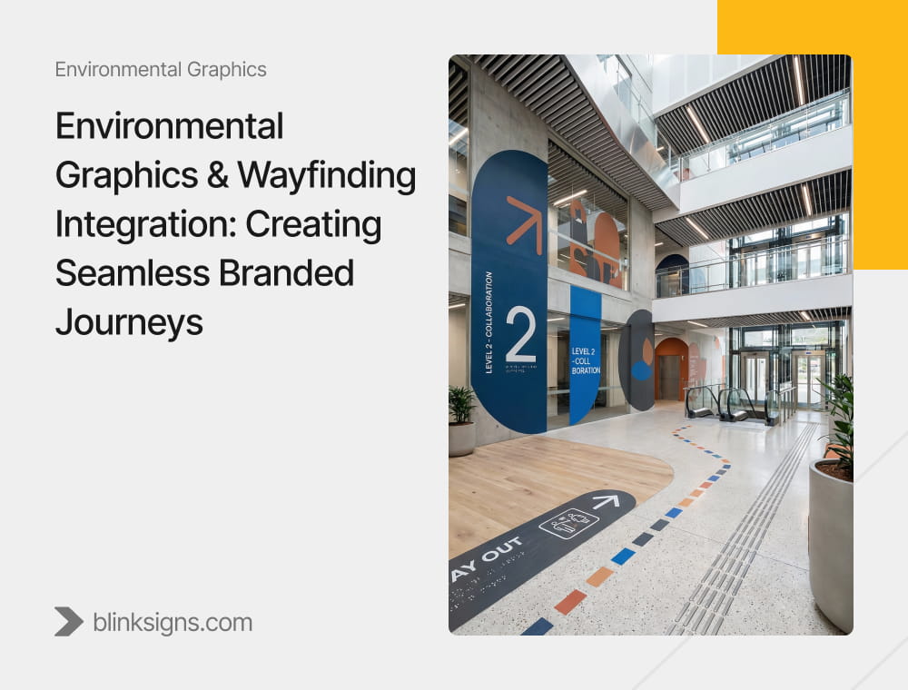
Environmental Graphics & Wayfinding Integration: Creating Seamless Branded Journeys
People rarely get lost because a building is not perceived as complex. They get lost because the space fails to communicate clearly.
A visitor enters, slows down, scans the surroundings, and hesitates. That hesitation signals a breakdown between Environmental Graphic Design (EGD), wayfinding signage, and brand identity. When these elements operate in isolation, even the most visually striking space creates confusion.
Integrated environments work differently. They guide people without instruction. They reduce decision fatigue. They align environmental graphics, wayfinding systems, and visual language so navigation feels natural and predictable.
This guide explains how to create that experience through a structured integration of environmental graphics and wayfinding, designed around the human journey through space. The focus remains on practical, accessible, and measurable solutions, allowing teams to plan, implement, and maintain systems that actually work.
What integration really means and why most spaces feel inconsistent
Many projects separate responsibilities too early.
Design teams handle environmental graphics to convey a brand’s personality. Facilities teams handle wayfinding signage to move people from point A to point B. Each piece may work on its own, but together they often clash.
This disconnect leads to common problems:
- Decorative wall graphics that distract from directional messages
- Inconsistent naming across directories and identification signs
- Intense brand colors that reduce contrast and legibility
- Wayfinding was added late as a corrective measure rather than a system.
Proper integration means treating navigation and brand expression as a single system from the outset.
An integrated approach:
- Uses brand elements to reinforce orientation, not compete with it
- Applies message hierarchy consistently across all sign types
- Supports readability, contrast, and viewing distance at every location
- Maintains continuity across entrances, corridors, decision points, and destinations
The goal is not to add more signage. The goal is to remove uncertainty.
The Branded Journey Model: Arrival to Exit
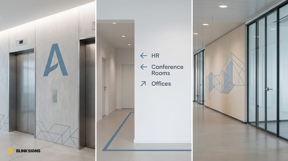
Branded wayfinding guiding movement with clarity.
People navigate spaces in predictable stages. Effective wayfinding aligns environmental graphics and signage with these stages so each moment answers a specific question.
This model provides the foundation for integration.
Arrival: confirming people are in the right place
Upon arrival, visitors seek immediate confirmation. They want to know they entered the correct building, floor, or department.
Clear identification signage, visible brand cues, and simple spatial landmarks reduce anxiety quickly. At this stage, clarity matters more than decoration. High contrast typography, legible letter heights, and straightforward placement support users with visual, cognitive, or mobility differences.
Arrival cues set expectations for everything that follows.
Orientation: helping people understand the space
Once inside, visitors form a mental map before moving forward.
Orientation tools include directories, overview maps, and zoning systems. Environmental Graphic Design plays a crucial role in this context by utilizing color, patterns, icons, and landmarks to delineate zones and destinations.
Practical orientation avoids overloading users. It combines text, symbols, and spatial cues, allowing navigation to work even when language, lighting, or familiarity vary. Relying on color alone creates accessibility risks. Integrated systems strike a balance between brand expression and inclusive design.
Decision points: where navigation succeeds or fails
A decision point is any location where a visitor must choose a direction to take. Intersections, elevator lobbies, and corridor splits all qualify.
At these moments:
- Directional signage must appear before the turn
- Primary destinations must dominate the message hierarchy.
- Terminology must match the directories and identification signs exactly.
This is where many wayfinding systems break down. Brand creativity should never override clarity at decision points. Legibility, contrast, and placement matter more than visual flair.
Reassurance cues: confirming the correct path
After a decision, people look for confirmation.
Reassurance cues repeat destination names, zone identifiers, or subtle environmental graphics that signal progress. These cues prevent backtracking and reduce reliance on staff for directions.
They also build confidence. Visitors move faster when the environment consistently confirms their choices.
Destination confirmation and next steps
Reaching a destination should require no interpretation.
Clear identification signage, consistent naming conventions, and visible brand language confirm arrival instantly. Visitors should understand their surroundings and know what to do next without needing to ask questions.
This moment reinforces trust. Confusing or inconsistent destination signage undermines the entire journey, even if earlier steps worked well.
Exit: completing the experience
Exit paths deserve the same attention as entry routes.
Clear exit cues help visitors leave without retracing steps or creating congestion. They reduce frustration and maintain a consistent brand experience through the final interaction with the space.
A complete wayfinding system closes the loop from arrival to exit.
Why this journey-based approach works better than the traditional wayfinding
Traditional wayfinding focuses on sign types, while integrated systems emphasize human behavior.
By designing environmental graphics and wayfinding around the Arrival to Exit journey, teams:
- Place fewer signs with greater impact
- Reduce visual clutter while improving clarity.
- Support accessibility naturally, rather than retrofitting ADA signage later
- Create intuitive environments that require less explanation.
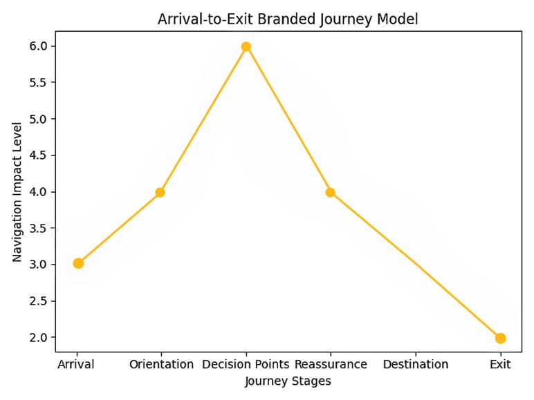
Arrival to Exit Branded Journey Model
This journey model establishes the strategic foundation for the organization. The next step breaks down the fundamentals of the wayfinding system, including sign families, message hierarchy, and naming conventions, and shows how to apply them without compromising brand consistency.
Download↴ our free Arrival-to-Exit Branded Journey Map Worksheet.
Wayfinding system fundamentals (built for real environments)
A functional wayfinding system relies on structure before aesthetics. Every sign, graphic, and message must serve a defined role within a hierarchy.
At its core, the system uses sign families. Each family exists for a specific purpose and appears at particular moments in the journey.
Core wayfinding sign families
| Sign Type | Primary Purpose | Where It Appears | Key Rules for Effectiveness |
| Identification Signs | Confirm destination | Room entrances, department doors, zone thresholds | Must match naming conventions precisely; high contrast; readable at close range |
| Directional Signs | Guide movement | Corridors, intersections, elevator lobbies | Appear before decision points; limit destinations per sign; prioritize primary routes |
| Informational Signs | Provide context | Lobbies, waiting areas, public zones | Support orientation without overloading; integrate icons and maps |
| Directories | Establish spatial understanding | Main entrances, elevator cores | Use consistent terminology; align with zoning logic; update-friendly |
| Regulatory Signs | Communicate rules | Throughout facility | Secondary hierarchy; never compete visually with directional messages |
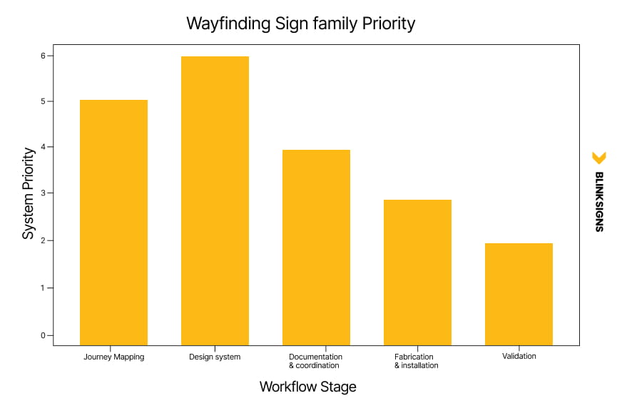
Wayfinding Sign family Priority
This structure ensures people see the correct information at the right moment, not everything at once.
Message hierarchy: what to say first and what to leave out
Message hierarchy controls cognitive load. When every sign tries to say everything, none of them work.
A clear hierarchy follows three levels:
| Hierarchy Level | Purpose | Content Characteristics |
| Primary | Directional certainty | Short destination names, arrows, zone identifiers |
| Secondary | Contextual support | Room ranges, sub-departments, confirmation cues |
| Tertiary | Supplementary detail | Hours, notes, secondary instructions |
Primary messages require the highest contrast, the most significant type, and the clearest placement. Secondary and tertiary messages can convey more brand expression, but should never compromise readability.
This hierarchy also supports accessibility. Users with visual or cognitive differences rely on fast recognition, not interpretation.
Naming conventions: the hidden backbone of navigation
Wayfinding fails more often due to naming issues than to design flaws.
Inconsistent naming creates friction across:
- Directories
- Directional signs
- Identification signs
- Digital wayfinding systems
A strong system establishes naming rules before design begins:
- One official name per destination
- No abbreviations unless used everywhere
- Zone names that reflect spatial logic, not internal politics
- Consistent capitalization and language structure
These conventions must apply to every future sign, not just the initial rollout.
Environmental graphics that support navigation
Environmental Graphic Design should guide behavior, not distract from it.
Zoning through visual cues
Color, patterns, textures, and landmarks help people quickly recognize zones. Effective zoning uses:
- More than color alone
- Repeating visual elements tied to destinations
- Clear transitions between zones
This approach enhances wayfinding for users who cannot rely solely on color perception.
Supergraphics and brand elements
Large-scale graphics, murals, and dimensional brand elements work best when they:
- Reinforce location or direction
- Mark key destinations or transitions
- Avoid visually competing with directional signage.
When brand graphics overpower wayfinding, confusion increases even if the space looks polished.
Accessibility is integrated into the system
Accessibility should not be relegated to a late-stage checklist.
Integrated systems account for ADA signage and inclusive design at every stage:
- Adequate contrast ratios for text and backgrounds
- Tactile characters and Braille were required.
- Logical mounting heights and consistent placement
- Clear pictograms paired with text
When accessibility is built into the message hierarchy and material selection, compliance becomes natural rather than a corrective measure.
The integration workflow: from discovery to long-term performance
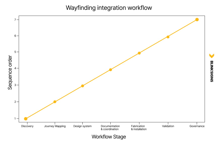
wayfinding integration workflow
This workflow integrates strategy, design, execution, and governance into a single process.
1. Discovery and audit
Teams begin with a site walkthrough to identify:
- Traffic flow and desire lines
- Confusion points and repeated questions
- Existing signage inconsistencies
This forms the basis of a wayfinding audit.
2. Strategy and journey mapping
Destinations are defined, grouped, and prioritized. Decision points are mapped. Zones are established. The Arrival-to-Exit journey becomes the planning framework.
3. Design system development
This stage defines:
- Typography and icon systems
- Color and contrast standards
- Sign family templates
- Environmental graphics guidelines
Everything ties back to brand standards without sacrificing clarity.
4. Documentation and coordination
Clear documentation prevents errors:
- Sign schedules
- Location plans
- Elevations and placement notes
These documents align designers, fabricators, installers, and facility teams.
5. Fabrication and installation sequencing
Installation follows operational realities. Phasing prevents disruption and ensures signage appears in the correct order to support navigation.
6. Validation and success metrics
Systems must prove performance.
Success indicators include:
- Fewer “where is” questions at reception
- Reduced staff time giving directions
- Faster time-to-destination observations
- Lower signage-related maintenance requests
These metrics answer the operational question most teams ask: Did this work?
7. Governance and ongoing consistency
Wayfinding breaks down when rules disappear.
Governance defines:
- Who approves new or changed signage
- How new rooms or zones get named
- When audits occur
- What triggers updates
Without governance, one-off signs slowly erode the system.
Why this operational approach outperforms competitors
Most competitors document what signage exists. Very few document how signage survives change.
By connecting environmental graphics, wayfinding systems, accessibility, governance, and measurement, this approach creates:
- Consistency across locations
- Lower long-term maintenance costs
- Better visitor confidence
- Fewer operational interruptions
This is not decorative signage. It is an infrastructure for human movement.
Frequently Asked Questions
What is environmental graphic design, and how does it relate to wayfinding?
Environmental Graphic Design (EGD) creates branded spatial experiences through murals, color systems, dimensional graphics, and architectural elements, thereby enhancing the overall visual appeal of a space. Wayfinding signage provides directional guidance and spatial orientation, helping individuals navigate their surroundings effectively. Integration means designing both as one system, so brand expression reinforces navigation clarity rather than competing with it.
What’s the difference between wayfinding and directional signage?
Directional signage is a key component within a comprehensive wayfinding system. Wayfinding includes identification signs that confirm destinations, directional signs that guide movement, directories that establish spatial understanding, informational signs that provide context, and regulatory signs that communicate rules. All types must work together using consistent naming conventions and message hierarchy.
How do you integrate branding into wayfinding without reducing legibility?
Brand integration succeeds when visual elements support the navigation function. Use brand colors for zoning systems rather than primary text, apply typography standards that meet contrast requirements, and position decorative graphics to mark transitions or destinations instead of competing with directional signs. Message hierarchy determines where brand expression appears and how prominently.
What makes a wayfinding system accessible?
Accessible wayfinding incorporates adequate contrast ratios, tactile characters and Braille where required, consistent mounting heights, pictograms paired with text, and navigation logic that works without relying on color alone. Accessibility works best when built into message hierarchy and material selection from the start, not added later as compliance.
How often should wayfinding systems be audited?
Wayfinding audits should be conducted annually or whenever significant changes occur in the space, such as renovations, departmental relocations, expansions, or rebranding initiatives. Regular audits identify naming drift, one-off signage that breaks consistency, and recurring points of confusion. Governance protocols define clear triggers for updates, ensuring consistency across the organization.
Can environmental graphics improve wayfinding, or do they compete with it?
Environmental graphics enhance wayfinding by reinforcing spatial logic through zoning, landmark creation, and clear destination identification. They compete with wayfinding when they overpower directional information, reduce contrast at decision points, or introduce ambiguous spatial signals. Integration planning determines which graphics support navigation and which remain decorative.
What’s the most common reason wayfinding systems fail?
Inconsistent naming conventions across directories, directional signs, identification signs, and digital systems cause the most persistent failures. Even well-designed signage breaks down when destinations use different names in different locations. Governance that controls naming rules and prevents unauthorized additions to signage protects system integrity.
Ready to map your branded journey?
If your space feels polished but confusing, the problem is usually not with the signs themselves. The problem lies in the absence of a cohesive system to support them.
A structured Environmental Graphics and Wayfinding Integration approach aligns brand, navigation, and accessibility into one coherent experience from arrival to exit.
The next step is evaluation. A focused audit of your current environment reveals where clarity breaks down and how to address the issues before confusion becomes the norm.
👉 Contact us to review your wayfinding and environmental graphics system.
📋 Download↴ the free Wayfinding & Environmental Graphics Audit Checklist.