The Rise of Minimalist Signage: A Modern Approach to Branding
Minimalist signage redefines how brands communicate, offering an elegant, refined way to make lasting impressions. It has become essential for companies wanting to express their values through clean, impactful visuals. By stripping designs to the essentials, this approach elevates brand experiences. Minimalist signage isn’t just about aesthetics; it’s about delivering a clear message that resonates with audiences who appreciate intentional, high-quality design.
This article explores why minimalist signage is rising, examining its foundational design principles, diverse applications, and future potential to transform brand identity.
Historical Background and Evolution of Minimalist Signage
Minimalist signage finds its roots in early 20th-century design movements like modernism, which promoted the idea that “less is more.” This philosophy championed simplicity and functionality over ornamentation, setting the foundation for what we recognize as minimalist design today. Influential movements like Bauhaus emphasized using clean lines and purpose-driven design, focusing on clarity and utility over excess.
As industrial design evolved, these ideas extended into signage, moving from decorative, detailed elements to sleek and straightforward styles. Decades later, minimalist signage has become a staple in high-end retail, corporate offices, and architectural spaces. Brands today embrace this approach for its timeless appeal and because it aligns with modern values of simplicity and quality, resonating with audiences who prefer purposeful, refined brand experiences.
Understanding Minimalist Design Principles and Styles

blue-sign-for-berth-2-providing-passenger-information
The power of minimalist signage lies in its focus on clarity, simplicity, and function. This approach removes non-essential elements, allowing the message to shine without distractions. With clean lines, ample negative space, and restrained color palettes, minimalist signage presents a sophisticated, easy-to-read look that aligns with high-end aesthetics.
Popular styles within minimalist signage include monochrome color schemes, frameless designs, and understated typography. Monochrome designs use a limited color palette to ensure readability and cohesion, creating an elegant visual that enhances brand identity. Frameless signage adds a seamless, floating effect, blending naturally into any environment while reinforcing a sophisticated image. Subtle backlighting further enhances visibility, making signs stand out without overwhelming the overall design.
Typography is equally important, with sans-serif fonts widely favored for their clean, modern appearance. Choosing fonts with ample spacing and avoiding unnecessary embellishments ensures readability and elegance. These elements allow brands to communicate a memorable message that feels modern, accessible, and aligned with minimalist principles.
Materials and Environmental Impact in Minimalist Signage

sign-of-public-toilets-men-and-lady-symbols-repr
Choosing suitable materials is essential to achieving minimalist signage’s sleek, sophisticated look. Common materials include metal, wood, acrylic, and glass—each offering a distinct texture and finish that complements minimalist design principles. Brushed aluminum is favored for its durability and contemporary appearance and is often used in corporate settings to create a polished, professional look. Wood brings a natural warmth, making it an excellent choice for hospitality and retail spaces where an inviting, organic aesthetic is desired.
Sustainability is also a priority in minimalist signage. Brands adopting minimalist principles often choose materials that reduce waste and minimize environmental impact. Many companies now opt for recyclable and sustainable options, such as reclaimed wood, recycled aluminum, or eco-friendly acrylic, aligning with the growing demand for environmentally responsible practices. By integrating sustainable materials, brands elevate their image and demonstrate a commitment to quality and ecological mindfulness.
| Material | Description | Benefits | Ideal Uses | Environmental Considerations |
| Brushed Aluminum | Durable, sleek, modern material, often used for its professional appeal. | – High durability
– Contemporary aesthetic |
Corporate offices, storefronts | – Recyclable and long-lasting |
| Acrylic | Lightweight, polished material, often backlit for enhanced visibility. | – Lightweight
– Smooth, polished finish |
Indoor retail, corporate signage | – Some types recyclable; eco-friendly variants |
| Wood | Natural, warm material for a rustic or organic feel. | – Warm, inviting aesthetic | Hospitality, cafes, eco-conscious brands | – Sourced from reclaimed or certified sources |
| Glass | Reflective, elegant material, often paired with matte or etched finishes. | – High-end aesthetic
– Reflective property |
Office lobbies, luxury retail | – Fully recyclable, though energy-intensive |
| Matte Finishes | Applied to reduce glare and create a soft, modern look. | – Reduces glare
– Understated sophistication |
Museums, luxury spaces | – Minimal impact when eco-friendly paints used |
This range of materials allows brands to achieve a minimalist look while maintaining environmental consciousness, showcasing style and sustainability.
Applications and Use Cases of Minimalist Signage
Minimalist signage’s clean, modern aesthetic makes it highly versatile and widely adopted across various industries. In corporate settings, minimalist signage projects professionalism and clarity, enhancing the work environment and reinforcing the brand’s identity. Many companies use minimalist signage to create organized, welcoming spaces for employees and clients, reflecting a focused brand image.
In luxury retail, minimalist signage supports an exclusive and sophisticated experience. The simple, elegant designs allow products to take center stage, amplifying the brand’s identity without overshadowing it. Minimalist signage also thrives in hospitality and healthcare settings, where evident, understated designs make navigation easy, creating a warm and inviting experience for visitors.
Prominent brands like Motel 6 and University Hospitals showcase how minimalist signage enhances brand identity while reinforcing core values. Blinksigns collaborated with Motel 6 to create streamlined, welcoming signage that aligns with the brand’s mission of offering comfortable, affordable hospitality. Through clean designs and subtle backlighting, the signage enhances the guest experience, creating an inviting atmosphere that reflects Motel 6’s dedication to simplicity and quality.
Similarly, Blinksigns partnered with University Hospitals to design signage that prioritizes clarity and ease of navigation—essential elements for healthcare facilities. The minimalist signage provides clear, concise directions, supporting a stress-free experience for patients and visitors. Blinksigns enables brands like Motel 6 and University Hospitals to connect with audiences who appreciate clear, purposeful aesthetics in branded spaces.
Consumer Psychology and Appeal of Minimalist Signage
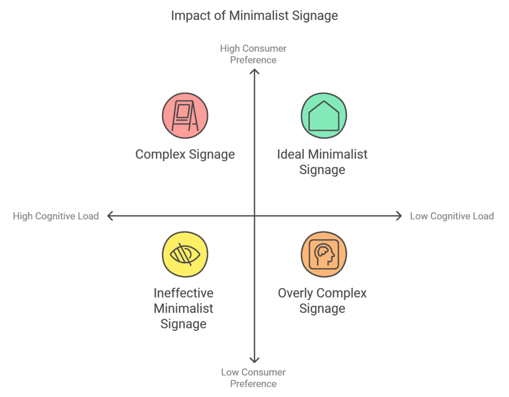
Minimalist signage resonates with consumers on a deeper level, providing a refreshing sense of clarity in today’s fast-paced, information-rich world. As people encounter a constant stream of digital and physical messaging, minimalist signage offers a clear and calming visual experience, focusing only on essential elements. This approach reduces cognitive load, making it easier for viewers to process and retain information—a benefit that aligns with consumer preferences for simplicity and ease.
Impact of Minimalist Signage
Additionally, minimalist signage reflects high-quality, intentional design, qualities that resonate strongly with audiences who value authenticity. Brands using minimalist signage are often seen as modern, trustworthy, and sophisticated, appealing especially to younger demographics who prioritize thoughtful, quality-driven branding. Minimalism allows brands to project a professional, intentional image that fosters customer trust and loyalty over the long term.
Benefits and Challenges of Minimalist Signage
Minimalist signage offers several advantages, making it a popular choice for industry brands. However, it also presents unique challenges that must be carefully considered:
Key Benefits
- Enhanced Clarity: With unnecessary elements removed, minimalist signage helps viewers focus on the core message.
- Modern Appeal: Its clean, contemporary design aligns with today’s design trends, helping brands appear relevant and forward-thinking.
- Cost-Effective Maintenance: Simpler designs are easier to clean and maintain, offering long-term savings.
- Streamlined Aesthetic: The cohesive, polished look of minimalist signage supports high-end branding and improves visual appeal.
Challenges
- Visibility in Low-Light Settings: Minimalist designs may require additional lighting or strategic placement for readability.
- Limited Space for Messaging: With an emphasis on simplicity, minimalist signage may struggle to convey complex messages.
- Risk of Misinterpretation: Extremely simple designs need careful planning to ensure clear communication and avoid ambiguity.
This balanced approach allows brands to weigh minimalist signage’s aesthetic and functional benefits while addressing practical considerations.
How to Design Minimalist Signage: Tips and Best Practices
Effective signage requires balancing simplicity with clarity. One key factor is legibility—using large, clear fonts with ample spacing makes the message easy to read, even from a distance. Limiting colors to two or three avoids clutter and enhances visual consistency, supporting a cohesive and polished look.
In addition, emphasizing negative space ensures minimalist signage remains uncluttered, drawing attention to the core message. Establishing a visual hierarchy also guides viewers’ eyes to the most crucial information first, enhancing readability and ensuring the design achieves its purpose. By following these principles, brands can create visually appealing and highly functional signage, enhancing brand communication.
Comparison with Traditional or Detailed Signage
Brands choosing between minimalist and traditional signage benefit from understanding their differences. Traditional signage, with its rich details and artistic elements, is ideal for brands with layered stories to tell. This style works well for businesses that want to convey heritage, craftsmanship, or elaborate design.
Minimalist signage, on the other hand, offers a sleek, modern, and clutter-free look that appeals to upscale and contemporary brands. Its simplicity conveys sophistication and professionalism, drawing in design-conscious audiences who value high-quality, straightforward branding. The choice between these styles ultimately depends on the brand’s values, audience, and desired image.
Impact of Minimalist Signage on Brand and Industry Trends
Minimalist signage represents a growing trend toward simplicity and sophistication in branding. Brands embracing minimalist design are viewed as modern and innovative, resonating with today’s consumers, who increasingly seek clarity and authenticity. Minimalist signage has become a quality marker, appealing to those who appreciate thoughtful, intentional design. As more industries adopt minimalist aesthetics, this style continues to shape the future of contemporary branding.
Technology and Future Trends in Minimalist Signage
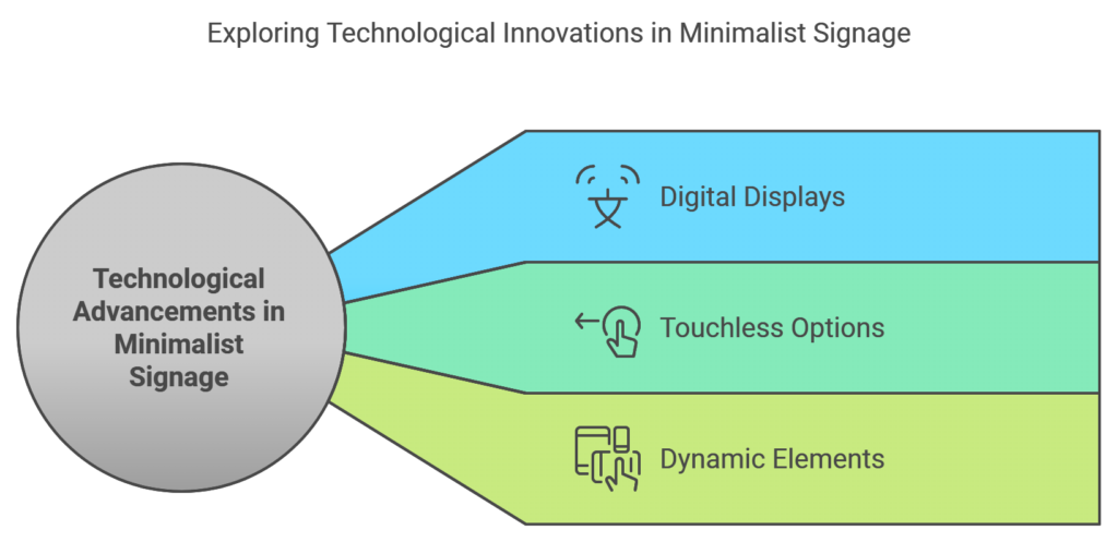
Advancements in technology have introduced exciting possibilities for minimalist signage, primarily through digital displays and touchless options. Digital signage allows for adaptable, interactive content, offering an engaging experience without sacrificing simplicity. Innovative technology enables minimalist signage to incorporate dynamic elements, adjusting to different contexts while maintaining a clean, cohesive look.
Technological Advancements in Minimalist Signage
As technology continues to evolve, minimalist signage is expected to integrate more smart features, further enhancing the user experience. Brands looking for innovative ways to connect with audiences will find minimalist signage valuable in building a streamlined, impactful visual identity.
FAQ’s
1. What is minimalist signage, and how can it benefit my business?
Minimalist signage focuses on clean, essential elements to communicate a brand’s message clearly and effectively. Blinksigns creates minimalist signage that enhances brand identity, promotes readability, and appeals to modern, design-conscious audiences.
2. Why should I choose Blinksigns for minimalist signage solutions?
Blinksigns creates impactful, high-quality signage that aligns with your brand’s values. Our minimalist designs prioritize clarity and sophistication, ensuring your brand stands out in any environment.
3. Which industries benefit most from minimalist signage by Blinksigns?
Blinksigns’ minimalist signage is ideal for a range of industries, including hospitality, healthcare, corporate offices, and retail. We design signage that fits your brand’s specific needs, whether for welcoming guests, aiding navigation, or enhancing store ambiance.
4. How does Blinksigns ensure that minimalist signage is sustainable?
Blinksigns offers eco-friendly options, such as recyclable materials and sustainable design practices. Our commitment to sustainability means your signage will be both visually appealing and environmentally responsible.
5. Can minimalist signage by Blinksigns improve customer experience?
Yes, minimalist signage by Blinksigns enhances the customer experience through clean, easy-to-read designs. Our signage aids navigation, reduces visual clutter, and aligns with your brand’s commitment to quality.
6. What materials does Blinksigns use for minimalist signage?
Blinksigns uses high-quality materials like brushed aluminum, acrylic, glass, and wood, which are selected for durability and aesthetic appeal. Our material choices ensure your signage is both stylish and long-lasting.
7. How can Blinksigns help make my brand’s signage unique?
Blinksigns tailors each signage solution to your brand’s unique identity. Our minimalist designs reflect your brand’s values, style, and goals, creating a memorable experience for customers.
8. Is minimalist signage suitable for outdoor environments?
Absolutely. Blinksigns designs durable, weather-resistant minimalist signage that is perfect for outdoor use. Our high-quality materials ensure your signage remains impactful in any setting.
9. Can Blinksigns integrate lighting into minimalist signage designs?
Yes, Blinksigns often uses subtle backlighting to enhance visibility and add sophistication to minimalist signage, ensuring your brand stands out in low-light and daytime settings.
10. How does Blinksigns incorporate brand identity into minimalist signage?
Blinksigns crafts minimalist signage that reflects your brand’s identity through thoughtful design choices—clean fonts, strategic color use, and tailored materials—ensuring your message is clear and memorable.
Conclusion
Minimalist signage is more than a design choice; it’s a strategic approach that aligns with today’s values of simplicity, clarity, and sustainability. Focusing on essential elements, minimalist signage allows brands to connect with audiences meaningfully and impactfully. As brands seek precise, effective communication methods, minimalist signage will remain a defining feature of high-quality brand identity.