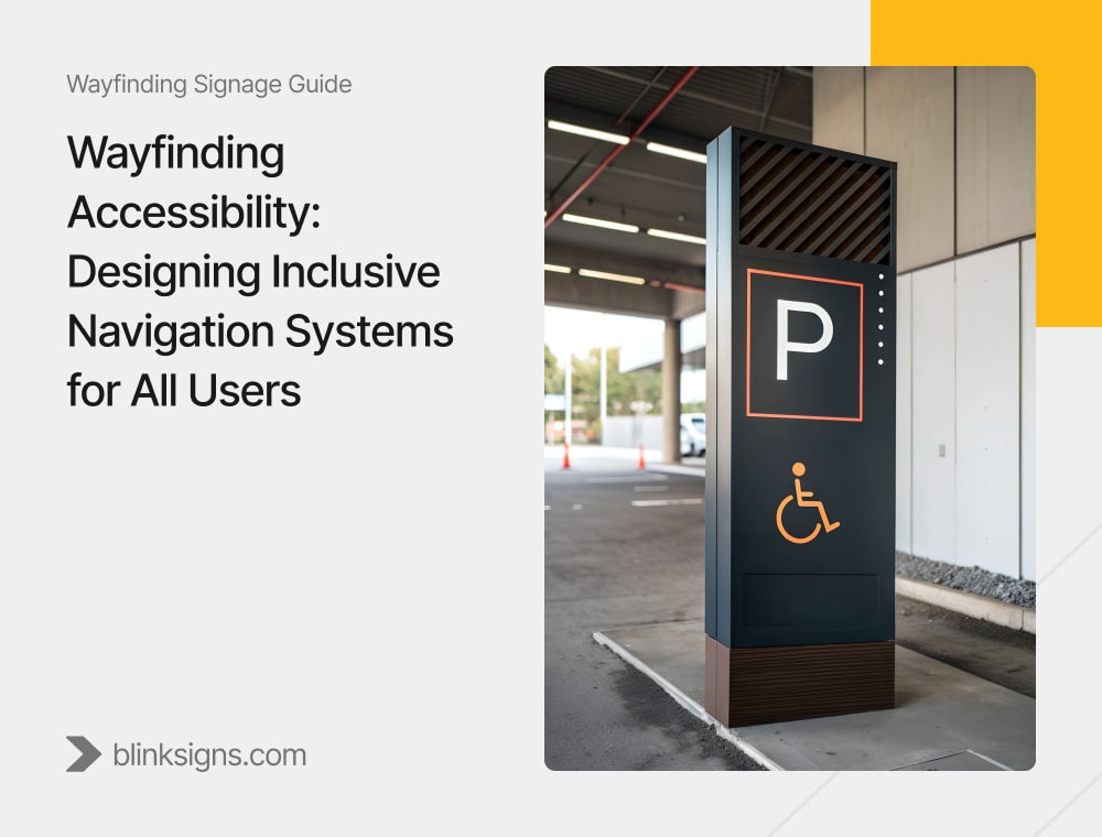
Wayfinding Accessibility: Designing Inclusive Navigation Systems for All Users
When “Good Enough” Wayfinding Quietly Fails 1 in 4 Visitors
Walk into any hospital, airport, campus, or public building, and you’ll see signs everywhere: arrows, icons, directories, and digital screens. On paper, many of these systems are considered “accessible” because they meet basic ADA requirements—such as tactile room numbers, Braille on restroom doors, and sufficient contrast.
Yet, behind the scenes, staff are still guiding confused visitors to their destinations, patients are arriving late or not at all, and anxious families are wandering through complex corridors, trying not to panic.
This isn’t a signage problem. It’s an accessibility problem.
Around one in four adults in the U.S. lives with some form of disability—including visual impairments, mobility limitations, hearing loss, cognitive disabilities, autism, ADHD, dyslexia, and age-related challenges. Most wayfinding systems were never truly designed for this reality. They were intended to pass inspection.
That “ADA checkbox” mindset creates three significant risks for facility owners and operators:
- Legal risk from non-compliance or incomplete compliance
- Operational drag when staff routinely stop work to guide lost visitors
- Experience damage when people associate your brand with stress, confusion, or embarrassment
At BlinkSigns, we u niquely approach wayfinding accessibility. We start with ADA 2010 standards as the baseline, then layer in:
- Neurodiversity-aware design (autism, ADHD, dyslexia, cognitive load)
- Multi-sensory navigation (visual, tactile, auditory, digital redundancy)
- User-centered testing with actual disabled and older users
- Measurable outcomes: fewer wrong turns, fewer assistance requests, lower stress
This guide walks through how to design wayfinding systems that don’t just “comply,” but truly help all users navigate complex environments with confidence, while also reducing legal risk and staff burden.
Understanding the Accessibility Landscape
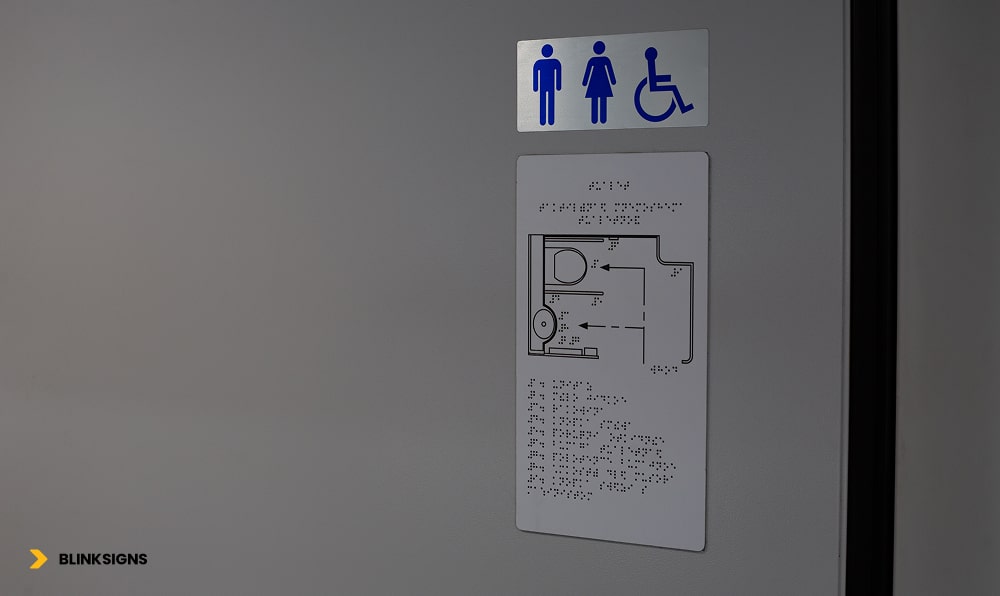
Accessible restroom Sign
Why Accessible Wayfinding Is About More Than “People With Disabilities.”
When most teams hear the term “accessible wayfinding,” they think of wheelchair symbols, Braille on signs, and ramps. All of that matters—but it’s only a fraction of the story.
Accessible wayfinding is about:
- People with permanent disabilities (blindness, deafness, mobility impairments, cognitive disabilities)
- People with temporary limitations (injuries, post-surgery, fatigue, concussion)
- People under situational stress (medical emergencies, tight flight connections, high anxiety)
- People with language barriers or limited literacy
In practical terms, that means your “accessibility” decisions affect:
- The visitor in a wheelchair who needs a clearly marked accessible route that actually works
- A parent holding a toddler’s hand with luggage in the other hand, who can barely look up at the signs
- An elderly person with reduced contrast sensitivity is trying to read a sign under harsh lighting.
- A non-native speaker who can’t decode text-heavy directions but can follow intuitive pictograms
- A neurodivergent visitor dealing with sensory overload and decision fatigue in a loud, busy space
When you design for these edge cases, you don’t just avoid complaints—you make the environment easier for everyone.
What Types of Disabilities Affect Navigation and Decision-Making?
Different disabilities show up in navigation in different ways:
- Visual impairment/blindness
- Needs tactile information, Braille, and audio cues
- Sensitive to glare and poor contrast
- Needs tactile information, Braille, and audio cues
- Low vision / aging eyes
- Needs larger text, stronger contrast, and simple layouts
- Needs larger text, stronger contrast, and simple layouts
- Mobility impairments/wheelchair users
- Need reliable, accessible routes, clear elevators, and realistic walking distances.
- Need reliable, accessible routes, clear elevators, and realistic walking distances.
- Deaf/hard-of-hearing users
- Rely heavily on visual information and clear, consistent signage.
- Rely heavily on visual information and clear, consistent signage.
- Autism & sensory processing differences
- Overloaded by noise, visual clutter, and flickering lights
- Overloaded by noise, visual clutter, and flickering lights
- ADHD and executive function challenges
- Struggle with multi-step instructions and complex decision points.
- Struggle with multi-step instructions and complex decision points.
- Dyslexia and reading challenges
- Take longer to process text and benefit from icons and short phrases.
- Take longer to process text and benefit from icons and short phrases.
- Mild cognitive impairment/dementia
- Need repeated reassurance, familiar landmarks, and simplified language,
- Need repeated reassurance, familiar landmarks, and simplified language,
An accessible wayfinding system doesn’t pick one of these groups, it builds redundant support so each type of user can get what they need, without depending on staff for help.
The Cognitive Curb-Cut Effect: Why Inclusive Design Helps Everyone
Curb cuts in sidewalks were initially introduced for wheelchair users. Today, everyone benefits from them, parents with strollers, travelers with rolling luggage, delivery workers, and people recovering from injuries.
The same “curb-cut effect” exists for cognitive accessibility in wayfinding:
- Clear pictograms and color coding help non-native speakers and tired travelers
- Short, one-step directions help people with ADHD and rushed executives racing to a meeting.
- Reduced visual clutter and consistent iconography help autistic visitors and anyone under stress.
- Reassurance signs along long corridors help people with memory challenges and anxious patients worried they’re lost.
Designing for neurodivergent and cognitively challenged users doesn’t add complexity; it removes friction. That friction removal shows up as:
- Fewer “I’m lost, can you help me?” interruptions
- Shorter time-to-destination for first-time visitors
- Lower reported stress and higher satisfaction in surveys
When done well, accessible wayfinding becomes one of the most cost-effective ways to enhance a facility’s experience.
ADA Compliance: The Baseline You Can’t Ignore
ADA compliance is not optional and it’s not something to “approximate.” Signage that appears fine to a designer can still fail in terms of height, contrast, tactile clarity, or Braille format, leaving you vulnerable to complaints and legal risk.
In this section, we treat the ADA 2010 Standards as the non-negotiable foundation on which everything else is built.
What Does the ADA Actually Require for Wayfinding?
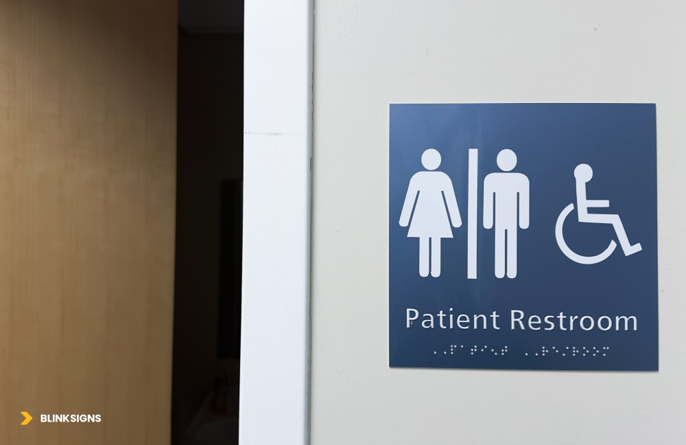
ADA Restroom sign with braille
At a minimum, an ADA-compliant wayfinding system must address:
- Tactile characters and Braille on permanent room identification signs
- Proper character height and stroke width for readability and tactile clarity
- Correct mounting heights so both wheelchair users and standing users can reach the signs
- Adequate luminance contrast between characters and background
- Non-glare finishes allow low-vision users to read signs in real-world lighting conditions.
- Standardized pictograms (such as the International Symbol of Accessibility) at required locations
Here is a practical summary your facilities or design team can use:
ADA Tactile Sign Requirements (Practical Summary)
| Requirement | Specification | Why it matters for accessibility |
| Tactile character height | 5/”” to ” “(measured using uppercase “X”) | Large enough to be felt and read consistently by touch and sight |
| Raised height | Minimum 1/3” above background | Ensures characters are distinguishable by touch for blind users |
| Font style | Sans serif, uppercase only; no decorative fonts | Cleaner edges improve tactile reading and legibility at a distance |
| Braille requirements | Grade 2 Braille, specific dot height and spacing | Matches the standard Braille most blind users are trained to read |
| Luminance contrast | ≥ 70% contrast between characters and background | Critical for low-vision users and aging eyes to distinguish letters and icons |
| Mounting height | 4”–6 “AFF from baseline of tactile characters | Reachable from a seated wheelchair position and comfortable for standing users |
| Pictogram field | Minimum” high field for symbols | Ensures pictograms are recognizable from a typical viewing distance |
| Surface finish | Matte or non-glare finish | Prevents reflections and glare that can make signs unreadable |
Even many “ADA” sign packages on the market fail to include one or more of these elements. Minor deviations, such as mounting at the wrong height or using glossy materials, can render signs functionally inaccessible and put you at risk of non-compliance.
Common ADA Wayfinding Mistakes That Create Risk
Some of the most frequent issues we see during audits:
- Mounting from the centerline, not the baseline of the tactile characters
- Contrast is judged “by eye”, instead of using actual luminance contrast measurements.
- Grade 1 Braille or incorrect Braille placement under tactile text
- Decorative fonts used for “branding” make tactile reading difficult.
- Glossy acrylic signs that look premium but reflect overhead lighting into users’ eyes
- Signs are installed on doors that swing, shift, or get blocked, instead of on the latch-side adjacent wall.
These aren’t design preferences; they are compliance failures that can lead to complaints, forced rework, and—if ignored—lawsuits.
Can You Stay On Brand and Still Be Fully ADA-Compliant?
Yes. Accessibility and brand don’t have to be at odds with each other.
A strong system:
- Uses your brand colors thoughtfully, while maintaining the required contrast on the sign face
- Incorporates brand typography in significant overhead or non-tactile signs, while using compliant fonts for tactile components
- Leans on brand shapes, framing, and layout instead of decorative fonts or low-contrast color combinations
- Keeps the sign face clean and functional, while expressing brand personality in support elements (panels, backers, materials, mounting details)
The principle is simple: form follows function. Your wayfinding system must first work for a blind visitor using touch, a low-vision elder reading from a distance, and a wheelchair user reaching from a seated position. Once you have met those needs, you can safely incorporate your visual identity.
Neurodiversity & Cognitive Accessibility: Designing for How Brains Actually Work
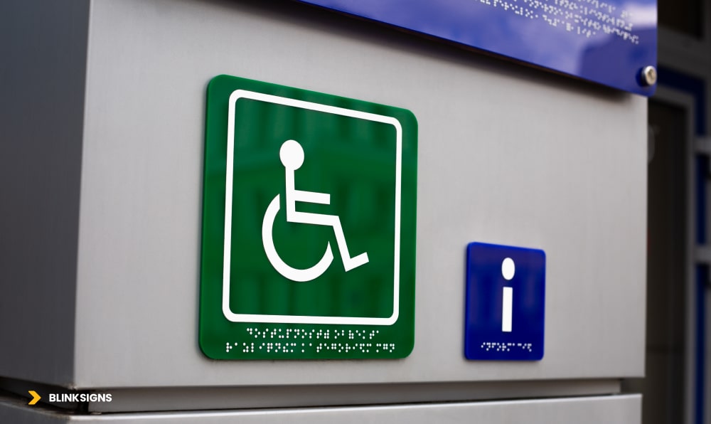
ADA sign with braille text and a informational sign for blind
Most competitors stop at ADA compliance and basic visual impairment. Almost nobody goes deep on neurodiversity: autism, ADHD, dyslexia, sensory processing differences, and cognitive impairments.
Yet, these users are often the ones who feel the most overwhelmed in complex environments, such as hospitals, airports, campuses, and large offices.
This section is where your wayfinding system can truly stand apart.
How Autism, ADHD, and Dyslexia Change the Way People Navigate
Different neurodivergent profiles experience built environments in markedly different ways:
- Autistic visitors may encounter sensory overload from bright lights, crowded corridors, flashing digital signage, and overlapping audio announcements. In this state, filtering out relevant information (like a directional arrow) becomes very difficult.
- People with ADHD may understand directions at the front desk—but lose track halfway through a three-step instruction, such as “Take the elevator to Level 3, turn right, then follow signs to Imaging.”
- People with dyslexia may be competent readers, but they tend to take 2–3 times longer to process dense text. In a busy corridor, that delay can mean missing a turn or feeling rushed and embarrassed.
- People with mild cognitive impairment or memory issues might forget the destination name or path, even while standing in front of a directory sign.
If your wayfinding relies on dense text, inconsistent sign placement, visual noise, or multi-step instructions, you’re unintentionally designing against these users.
How Signage Can Reduce Sensory Overload and Decision Fatigue
You can’t remove all stress from a hospital visit or a tight flight connection, but you can meaningfully reduce cognitive load by following a few core principles:
- Limit choices at each decision point to 2–3 options, not six different arrows
- Use one clear focal sign at a junction instead of a wall filled with posters and mixed messages.
- Keep color palette restrained and consistent (e.g., one color per department, used consistently)
- Place signs in predictable locations (e.g., always on the right-hand wall at corridor junctions)
- Use plain language (“Heart Care” instead of “Interventional Cardiology”)
- Reinforce directions along the path with minor reassurance signs (“Radiology → You’re still on the right route”)
These adjustments dramatically help autistic, ADHD, and cognitively impaired users—but they also help tired parents, anxious patients, and anyone rushing under time pressure.
Neurodivergent-Friendly Design Principles (Practical Framework)
To make this actionable for design and facilities teams, here is a practical framework summarizing common navigation challenges and how signage can respond.
Neurodivergent-Friendly Design Principles
| Challenge (Disability) | How it shows up in navigation | Design solution | Example in practice |
| Autism: Sensory overload | Too much noise, light, and visual clutter make it hard to see which sign matters | Reduce competing signage; one primary sign per junction; neutral backgrounds; no flashing content | Hospital corridor with a single, high-contrast “Radiology →” sign and no posters near the decision point |
| ADHD: Loses track mid-instruction | Forgets step 2 or 3 of a long set of directions | Break navigation into single-step decisions at each junction; progressive disclosure | Front desk: “Take the elevator to Level 3.” At Level 3: “Turn right for Imaging →.” |
| Dyslexia: Text processing difficulty | Takes longer to read; may avoid reading dense text under time pressure | Prioritize clear pictograms; keep text to 3–5 words; use dyslexia-friendly fonts where possible | Restroom sign: large universal icon + “Restrooms” (not “Public Restroom Facilities Available Ahead”) |
| Sensory Processing Disorder | Overwhelmed by fluorescent lights, PA systems, and busy digital screens, can’t focus on the content | Matte finishes; avoid flashing digital content at decision points; mark quieter routes and zones | Digital directories placed away from high-glare areas; “Quiet Route to Lobby →” signage |
| Cognitive / memory impairment | Forgets route, destination name, or doubts they’re still on track | Reassurance signs every 50–75 feet; repeated destination names; simple, consistent messaging | Long corridor: “Cafeteria: 200 ft ahead” → “Cafeteria: 100 ft ahead” → “Cafeteria: You’re almost there →” |
Designing with this matrix in mind creates a wayfinding system that “feels kinder” to neurodivergent users and noticeably easier for everyone else.
How the Cognitive Curb-Cut Effect Shows Up in Real Facilities
When you apply neurodivergent-friendly principles, you typically see:
- Faster decisions at junctions (less lingering, fewer lost expressions)
- Fewer staff interruptions for simple directions (“Where is X again?”)
- Lower reported stress in visitor surveys, especially in healthcare and transportation environments
- Fewer wrong turns and backtracking, which directly affects time to check in, appointments, or gates
That’s the cognitive curb-cut effect in action: the same changes that help a visitor with ADHD or autism also help the sleep-deprived parent, the international traveler, and the overworked nurse rushing between departments.
Multi-Sensory Wayfinding Integration
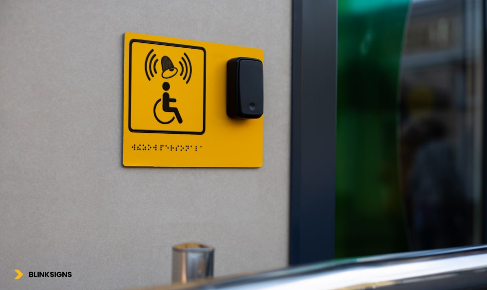
ADA sign with braille and Call button
Most wayfinding systems rely heavily on visual information, including arrows, maps, and color coding. That’s essential—but for many users, visual alone is not enough. Visually impaired visitors, deaf users, people with cognitive challenges, and those in high-stress situations all benefit from redundant, multi-sensory cues.
A robust accessible system treats each wayfinding message as a multi-channel signal: something you can see, feel, hear, or access digitally, depending on your needs.
Why Every Critical Message Needs Redundancy
Think about a simple instruction like “Restrooms this way.” In a multi-sensory system, that message can be:
- Seen on a high-contrast sign with a clear pictogram
- Felt on a tactile sign with raised letters and Braille
- Heard as an audio beacon or smartphone voice prompt
- Accessed digitally via NFC tag, QR code, or indoor navigation app
If one channel fails—glare on a sign, noise drowning out announcements, a dead phone—the others carry the message. Redundancy isn’t overkill; it’s a form of resilience.
Physical Layers: Visual and Tactile Working Together
The physical foundation of multi-sensory wayfinding includes:
- High-contrast directional signs with clear arrows and icons
- Tactile room IDs and level identifiers with Grade 2 Braille
- Tactile or embossed maps at entrances and major junctions
- Detectable warnings (truncated domes) and textured flooring changes at hazards and decision points
When these are designed together—not as separate “regular” and “accessible” systems—they create a coherent experience for both sighted and visually impaired users.
Digital and Auditory Layers: Audio Beacons, NFC, QR, and Apps
Digital and auditory tools extend accessibility without replacing physical signage:
- Audio beacons at key destinations (restrooms, elevators, exits, information desks) can guide visually impaired users with simple, location-based messages.
- Bluetooth Low Energy (BLE) beacons enable indoor positioning and turn-by-turn navigation in a mobile app.
- NFC tags embedded behind tactile signs let users tap their phone to hear an audio description or directions.
- QR codes offer quick access to maps, multilingual directions, and accessibility-friendly routes.
The goal is not to “go digital” for its own sake, but to give users options. A blind visitor might prefer audio via smartphone; a hard-of-hearing traveler might rely on visual maps and notifications; an anxious patient might appreciate seeing walking times and reassurance messages.
Multi-Sensory System Components (Practical Overview)
Multi-Sensory Wayfinding Components
| Component | Sensory channel(s) | Typical locations | Primary users, it helps | Approx. cost range* |
| High-contrast directional signs | Visual | Corridors, junctions, lobbies | Low-vision users, elderly, stressed visitors | ~$150–$300 per sign |
| Tactile room IDs with Braille | Tactile + visual | Room doors, elevators, stairwells | Blind/visually impaired users, wheelchair users | ~$100–$200 per sign |
| Tactile/embossed maps | Tactile + visual | Main entrances, major intersections | Blind/visually impaired users, spatial learners | ~$2,000–$5,000 per map |
| Audio beacons (fixed messages) | Auditory | Restrooms, exits, elevators, information desks | Visually impaired users, multilingual visitors | ~$500–$1,000 per location |
| NFC tags / QR codes on signs | Digital (triggers audio/visual) | Major directional signs, directories | Smartphone users, visually impaired (screen readers), and non-native speakers | ~$2–$5 per NFC tag; QR minimal |
| Accessible mobile wayfinding app | Digital (visual + audio) | User smartphones (building-wide coverage) | All users; filters routes by accessibility needs | ~$25,000–$75,000 (project-based) |
| BLE beacon network (indoor positioning) | Digital (proximity-based) | Throughout the facility (every 30–50 ft) | All users: real-time guidance and alerts | ~$5,000–$20,000 (scale-dependent) |
*Indicative ranges, actual budgets vary by scope and environment.
A multi-sensory system is considered successful when:
- Every critical destination can be reached using at least three sensory channels
- A visually impaired user can navigate using tactile + audio only.
- A deaf user can navigate using visual + tactile only.
- Technology enhances, but never replaces, physical accessibility.y
A User-Centered Accessible Wayfinding Design Process
Buying “ADA signs” and installing them in approximate locations is not a strategy. To truly serve all users, wayfinding accessibility needs a structured, user-centered process.
At BlinkSigns, we use a phased approach that combines compliance, co-design, testing, and continuous improvement.
Discovery and Needs Assessment (2–3 Weeks)
The process starts with understanding your current reality:
- User interviews and observation
- Engage with visitors, patients, staff, and, most importantly, individuals with disabilities.
- Shadow first-time visitors trying to reach key destinations.
- Document time-to-destination, wrong turns, assistance requests, and visible stress
- Engage with visitors, patients, staff, and, most importantly, individuals with disabilities.
- Facility audit
- Map existing decision points, entrances, elevators, and major destinations.
- Assess current signage condition, placement, contrast, and readability.
- Identify accessibility barriers such as poor lighting, narrow corridors, and visual clutter.
- Map existing decision points, entrances, elevators, and major destinations.
- Compliance review
- Check your system against ADA 2010 signage requirements.
- Note gaps in tactile signs, Braille, height, contrast, and routing
- Check your system against ADA 2010 signage requirements.
The output is a baseline report: where people get stuck, where signs fail, and where the highest risks and opportunities lie.
Co-Design and Prototyping (4–6 Weeks)
Instead of designing in isolation, you bring the people affected into the process:
- Inclusive workshops with facility leaders, frontline staff, and a small group of users with diverse disabilities
- Journey mapping exercises: “What actually happens when you enter and try to find X?”
- Pain point prioritization: Which problems cause the most stress or delay?
- Co-creation of concepts: Users react to early layout ideas, icon sets, color coding, phrasing, and map designs
From there, the design team develops:
- Full-scale mockups of key sign types
- Prototype tactile maps and room IDs
- Draft placement plans for corridors, elevators, entrances, and junctions.
These are tested on-site, allowing stakeholders to experience them in context, not just on a screen.
Testing, Iteration, Rollout, and Training (5–9+ Weeks)
Good accessible wayfinding is tested, not assumed.
- Usability testing
- Recruit 20–30 participants: visually impaired, wheelchair users, neurodivergent visitors, older adults, non-native speakers.
- Give them everyday navigation tasks (“Find Radiology from Entrance A”) and measure:
- Time-to-destination
- Wrong turns
- Assistance requests
- Self-rated stress and ease-of-use
- Time-to-destination
- Recruit 20–30 participants: visually impaired, wheelchair users, neurodivergent visitors, older adults, non-native speakers.
- Iteration and refinement
- Identify failure patterns (where people consistently hesitate or get lost)
- Adjust sign content, placement, contrast, or route logic.
- Re-test critical problem areas until metrics meet agreed targets
- Identify failure patterns (where people consistently hesitate or get lost)
- Installation and staff training
- Implement the system in phases to minimize disruption.
- Train reception, security, and frontline staff on:
- Accessible routes and features
- How to assist visually impaired, deaf, neurodivergent, and mobility-impaired visitors respectfully
- How to use any digital tools (apps, kiosks) to support visitors
- Accessible routes and features
- Implement the system in phases to minimize disruption.
- Ongoing monitoring
- Review wayfinding-related complaints and assistance requests every quarter to ensure timely resolution.
- Conduct annual accessibility audits to keep up with changes in layout, tenants, or regulations.
- Review wayfinding-related complaints and assistance requests every quarter to ensure timely resolution.
Typical timelines range from 11 to 18 weeks, from discovery to full implementation, depending on the facility size and complexity.
Healthcare and High-Stress Environments: Where Accessibility Matters Most
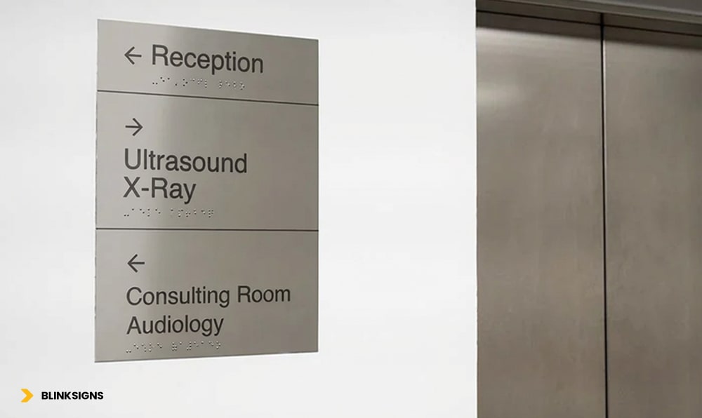
Accessible wayfinding signage
Some environments penalize poor wayfinding more harshly than others. Hospitals, large clinics, airports, and major transit hubs are at the top of that list.
In these spaces, people are often:
- In pain, anxious, or emotionally overloaded
- Carrying luggage, medical devices, or children
- Under severe time pressure (appointments, flight departures)
- Navigating unfamiliar buildings with complex layouts
Accessible wayfinding here is not a “nice to have.” It directly impacts patient safety, operational efficiency, and reputation.
Healthcare Facilities: Reducing Stress in a High-Anxiety Environment
- Visitors may be dealing with bad news, pain, or fear
- Elderly patients and those with cognitive impairments are common.
- Clinical terminology, such as “Interventional Radiology,” often confuses non-medical visitors.
An inclusive healthcare wayfinding system:
- Uses plain language (“Imaging & Scans” rather than “Interventional Radiology”)
- Deploys department-based color coding with non-color redundancy (icons, numbers, names)
- Highlights accessible routes and elevators clearly from every entrance
- Mark’s family waiting areas, quiet zones, and restrooms in ways that are easy to spot under stress
- Integrates emergency routes and areas of refuge into maps and signage
When patients and families can focus on care—not navigation—satisfaction scores rise, and staff spend far less time escorting lost visitors.
Airports and Transportation Hubs: High Volume, High Stakes
Airports and transit hubs add their own challenges:
- International travelers with many languages and cultural expectations
- Passengers under time pressure, jet lag, and fatigue
- Dense crowds and constant background noise
Effective accessible wayfinding in these environments:
- Relies heavily on universal pictograms (restrooms, gates, baggage claim, security, transportation) that work across languages
- Offers walking time estimates (“Gate A4 – 7 minutes”) to reduce anxiety
- Provides multilingual digital kiosks with visual maps and directions
- Offers real-time updates for gate changes and disruptions in visual and app-based formats
- Mark’s quiet areas and sensory-friendly spaces for those who need a break
For both healthcare and airports, minor improvements in wayfinding can translate into fewer missed appointments or flights, fewer complaints, and higher satisfaction scores.
Measuring Accessibility Success
If you can’t measure it, you can’t manage it—and you certainly can’t justify continued investment. Accessible wayfinding is no exception.
The most successful organizations treat wayfinding like any other critical system: they define KPIs, baselines, and targets, then monitor performance over time.
What Should You Measure?
At a minimum, you should track:
- Time-to-destination for first-time visitors
- Wrong-turn rate at key junctions
- Number of assistance requests (“Can you show me where X is?”)
- Wayfinding-related complaints and reviews mentioning confusion
- ADA compliance score from an audit
- Satisfaction and stress levels reported by visitors, especially those with disabilities
These metrics convert “I think it’s better” into “We know it’s better—and by how much.”
Accessibility Performance Metrics (Practical Framework)
Accessibility Performance Metrics
| Metric | How to measure | Target benchmark | Data source |
| Time-to-destination | Ask first-time visitors to navigate to 3–5 key destinations; time them | ≥ 30% faster than baseline after implementation | Observation studies; app analytics |
| Wrong-turn rate | Record how often people take incorrect routes at major junctions | < 10% of visitors make wrong turns | Observations: app “re-route” events |
| Assistance request rate | Track “direction” questions at desks, phones, and help points | < 5 requests per 100 visitors (down from baseline) | Helpdesk logs; staff tallies |
| Wayfinding-related complaints | Monitor feedback forms and online reviews mentioning being “lost.” | ≥ 75% reduction vs baseline; < 2% of feedback overall | Customer feedback tools; review monitoring |
| Wayfinding ease satisfaction | Survey: “How easy was it to find your destination?” (1–10 scale) | Average ≥ 8/10 | Exit surveys; patient/visitor feedback |
| ADA compliance score | Audit against a 50-point ADA signage checklist | 100% compliance with permanent signage | Professional audit reports |
| Accessibility-specific satisfaction | Ask disabled users if the system met their needs (1–10 scale) | Average ≥ 9/10 | Targeted surveys; accessibility advisory groups |
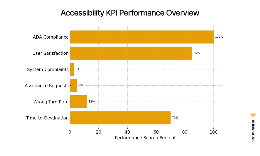
Accessibility KPI Performance Overview
When you tie these metrics into a simple dashboard and review them quarterly, accessibility stops being a one-time project and becomes an ongoing performance discipline.
Cost-Benefit & ROI: Why Accessibility Often Pays for Itself
Decision-makers rightly ask: “What will this cost—and what do we get back?”
Accessible wayfinding is one of the rare investments that can:
- Reduce legal and compliance risk
- Save staff time
- Recover lost revenue from missed appointments or confusion.
- Improve satisfaction scores that affect funding, referrals, and loyalty.
Levels of Investment: From Basic Compliance to Fully Inclusive
A typical medium-to-large facility might consider three levels of investment:
- Basic ADA Compliance
- Minimum tactile/Braille signs for required locations
- Correct mounting heights and contrast
- Limited directional improvement
- Investment: roughly $3,750–$7,500
- Impact: meets legal minimums, does little to reduce staff burden or confusion
- Minimum tactile/Braille signs for required locations
- Enhanced Accessibility
- Comprehensive tactile/Braille system
- Clear color coding and iconography
- Some tactile maps and basic staff training
- Investment: roughly $28,000–$70,000
- Impact: significant improvement for visually impaired and mobility-impaired users, moderate reduction in assistance requests
- Comprehensive tactile/Braille system
- Fully Inclusive Multi-Sensory System
- All enhanced features
- Multi-sensory integration: audio beacons, NFC/QR, accessible app, BLE beacons
- User testing and iteration are baked into the project.
- Investment: roughly $83,000–$235,000 (depending on scale)
- Impact: significant reductions in staff time spent redirecting visitors, fewer missed appointments, stronger legal protection, and better satisfaction scores
- All enhanced features
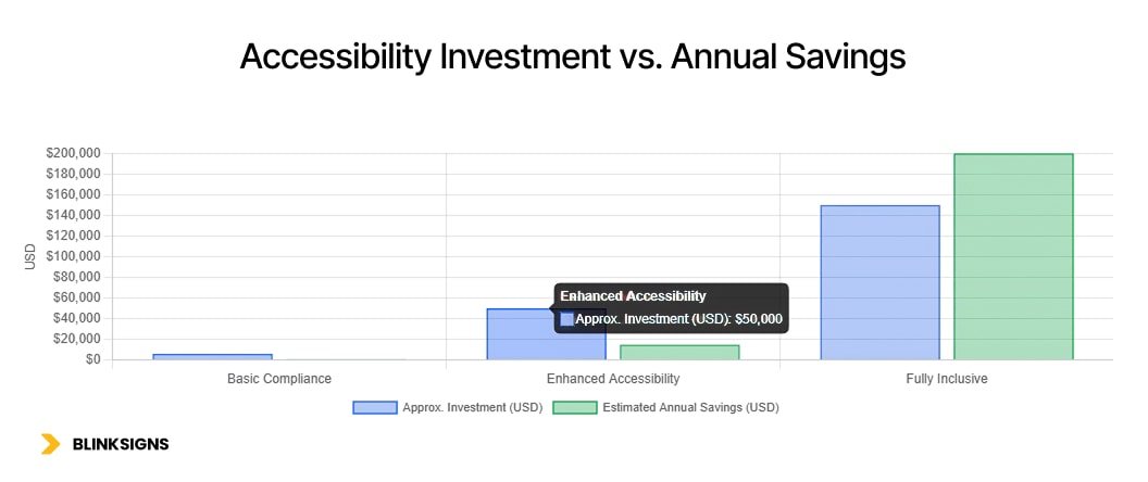
Accessibility Investment vs. Annual Savings
8.2 ROI Example: Medium-Sized Healthcare Facility
Consider a 500-bed regional hospital:
- Investment in a fully inclusive system: ~$150,000
- Staff time savings:
- Before: 150 direction requests per week × 3 minutes each = 450 minutes (7.5 hours) per week
- At $25/hour, that’s ~$9,750 per year.
- After improvements, direction requests drop by 70% → annual savings of about $6,800–$7,000
- Before: 150 direction requests per week × 3 minutes each = 450 minutes (7.5 hours) per week
- Reduced appointment no-shows and late arrivals:
- If improved wayfinding reduces no-shows and late arrivals by just 5 per day at an average value of $200 per appointment, that’s:
- 5 × $200 × 260 working days ≈ $260,000 per year in recovered value
- 5 × $200 × 260 working days ≈ $260,000 per year in recovered value
- If improved wayfinding reduces no-shows and late arrivals by just 5 per day at an average value of $200 per appointment, that’s:
- Legal risk avoided:
- One ADA-related complaint or lawsuit can easily cost $50,000 to $ 100,000 or more in settlements and legal fees.
- One ADA-related complaint or lawsuit can easily cost $50,000 to $ 100,000 or more in settlements and legal fees.
Even with conservative assumptions, the system can pay for itself in under a year and continue generating benefits for a decade or more with proper maintenance.
Over a 10–15-year horizon, it’s common for the ROI to reach four figures in percentage terms.
Frequently Asked Questions
1. What’s the difference between ADA-compliant and truly inclusive wayfinding?
ADA-compliant wayfinding meets the legal minimums: sure signs have tactile characters and Braille, contrast ratios are sufficient, and signs are mounted at the correct heights. Inclusive wayfinding goes further. It considers neurodiversity, aging, language barriers, sensory overload, and cognitive load, then designs multi-sensory, low-stress navigation paths for everyone. At BlinkSigns, we design systems that exceed compliance so nobody is left out.
2. Do we really need to think about neurodivergent users? Aren’t they a small minority?
Neurodivergent visitors—people with autism, ADHD, dyslexia, or sensory processing differences—are more common than many teams realize. But even if they weren’t, the cognitive curb-cut effect means that designs that help them also help stressed, tired, or distracted visitors. Neurodiversity-friendly wayfinding is not a niche feature; it’s a practical way to reduce confusion and frustration for everyone.
3. How do we know if our current wayfinding system is failing accessibility standards?
Warning signs include frequent “I’m lost” comments, staff constantly escorting visitors, negative reviews mentioning confusing layouts, and visible hesitation at junctions. From a compliance standpoint, missing Braille, glossy sign faces, poor contrast, and incorrect mounting heights are common red flags. A structured accessibility audit will give you a concrete score and a prioritized improvement plan.
4. Is multi-sensory wayfinding only relevant for visually impaired users?
No. Visually impaired and blind users benefit hugely from tactile maps, audio beacons, and smartphone guidance—but multi-sensory design helps others too. Deaf users rely on visual cues when audio breaks down, neurodivergent users benefit from redundant reassurance, and international visitors benefit from icons, audio, and translated digital information. Multi-sensory simply means you’re not betting everything on a single channel.
5. Our building is older. Can we still achieve meaningful accessibility improvements?
Absolutely. Many of the most impactful changes—such as improved sign placement, more explicit language, added tactile signs, enhanced contrast, and tactile maps at entrances—are feasible in existing buildings without requiring major structural modifications. In older facilities, the key is to prioritize high-traffic routes and high-risk areas first, then phase improvements over time. A phased plan can keep budgets manageable while steadily improving accessibility.
6. Does accessible wayfinding always require a custom mobile app?
Not necessarily. For many facilities, a robust physical system combined with simple digital enhancements—such as QR-coded floor plans, NFC tags on key signs, and a mobile-friendly map page—can deliver substantial benefits. Custom indoor navigation apps make sense for large hospitals, campuses, and airports, but they should augment, not replace, physical accessibility.
7. How long does it typically take to plan and implement an accessible wayfinding upgrade?
Timelines vary with facility size and scope, but a typical project follows this pattern:
- Discovery and audit: 2–3 weeks
- Co-design and prototyping: 4–6 weeks
- Testing, iteration, and final design: 3–4 weeks
- Fabrication, installation, and staff training: 4–6 weeks
In total, most organizations see full implementation within 11–18 weeks, with early wins appearing as soon as pilot areas go live.
8. How do we justify going beyond basic ADA compliance to our leadership?
Frame it in terms that leadership understands: risk, cost, and outcomes. Accessible wayfinding reduces legal exposure, cuts staff time spent redirecting visitors, and recovers revenue lost to missed appointments or confusion. It also supports better satisfaction scores, which affect referrals, funding, and tenant or patient loyalty. When you show that a system can often pay for itself in under a year, the conversation shifts from “nice to have” to “smart investment.”
9. Do staff need special training once a new wayfinding system is installed?
Yes—though it doesn’t have to be complicated. Staff should know:
- The main accessible routes and features (elevators, tactile maps, quiet zones)
- Basic etiquette when assisting blind, deaf, neurodivergent, or mobility-impaired visitors
- How to use any digital tools (kiosks, apps) to support visitors who need extra guidance
A brief training module can significantly enhance the performance of your new system in real-world applications.
10. How often should we audit our wayfinding for accessibility?
A good rule of thumb is:
- Full accessibility audit every 1–2 years, or after major renovations
- Quarterly reviews of assistance requests, complaints, and wayfinding-related feedback
- Annual tune-up to address issues like blocked signs, lighting changes, or department relocations
Regular audits prevent gradual degradation and ensure you stay ahead of changing regulations and user needs.
11. How do we balance brand expression with strict accessibility standards?
Brand and accessibility are not opposites. You can express brand through materials, shapes, framing, and layout while keeping tactile components, contrast, and fonts compliant. The key is to make accessibility requirements the non-negotiable core, then design brand elements around them. Done well, the result feels cohesive, on-brand, and genuinely user-friendly.
12. Where should we start if we’ve never formally addressed wayfinding accessibility?
The best starting point is a structured accessibility audit focused on signage, routes, and user experience. From there, you can prioritize quick wins—such as addressing mounting heights and contrast—while mapping out a longer-term roadmap for neurodiversity, multisensory integration, and digital enhancements. You don’t have to solve everything at once; you just have to start with the areas where confusion and risk are highest.
Accessibility That Works for Everyone, Not Just “Some Users.”
Accessible wayfinding is much more than compliant signage. It’s the difference between:
- A hospital where anxious families wander in circles and miss appointments
- And a hospital where people arrive at the right door, at the right time, with less stress
Between:
- An airport where non-native speakers feel lost and overwhelmed
- And an airport where clear, multi-sensory cues quietly guide everyone to their gate
Designing for disabilities—visual, mobility, hearing, cognitive, and neurodivergent—doesn’t narrow your audience. It widens the circle so that nobody has to rely on luck, guesswork, or constant staff rescue just to move through a building.
If you’re ready to move beyond ADA checklists to a system that truly supports all users, BlinkSigns can help you:
- Audit your current wayfinding for accessibility gaps
- Co-design a multi-sensory, neurodiversity-aware system.
- Build a roadmap that balances compliance, experience, and ROI
Next steps you can take:
- Schedule an accessibility wayfinding audit to understand your current risks and opportunities
- Discuss a phased, budget-conscious plan with our team for your facility or campus.
When navigation becomes easier for your most vulnerable visitors, it becomes easier for everyone—and that’s the kind of change people remember.