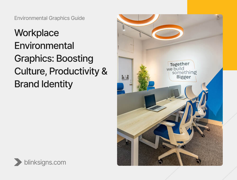
Workplace Environmental Graphics: Boosting Culture, Productivity & Brand Identity
Your office already tells a story.
Bare walls, mismatched artwork, and improvised wayfinding convey a different message.
Intentional brand moments, straightforward navigation, and spaces that feel alive convey a distinct message.
Employees, candidates, and clients read that story long before they read your values statement. If the environment feels generic or disconnected from what you say about your culture, people quietly downgrade their expectations—and sometimes your offer.
Workplace environmental graphics change that. Done well, they transform your office into a physical representation of your culture, a productivity tool, and a recruiting asset—especially in a hybrid world where people have a genuine choice about whether coming in feels worthwhile.
This article walks through a complete strategy for using environmental graphics as a business tool:
- What they are (and what they’re not),
- the hidden costs of doing nothing,
- How they actually drive culture, productivity, and brand,
- What good vs. weak workplace graphics look like,
- The psychology behind designs that work,
- And how to plan graphics across your space, culture, and hybrid reality.
What Are Workplace Environmental Graphics?
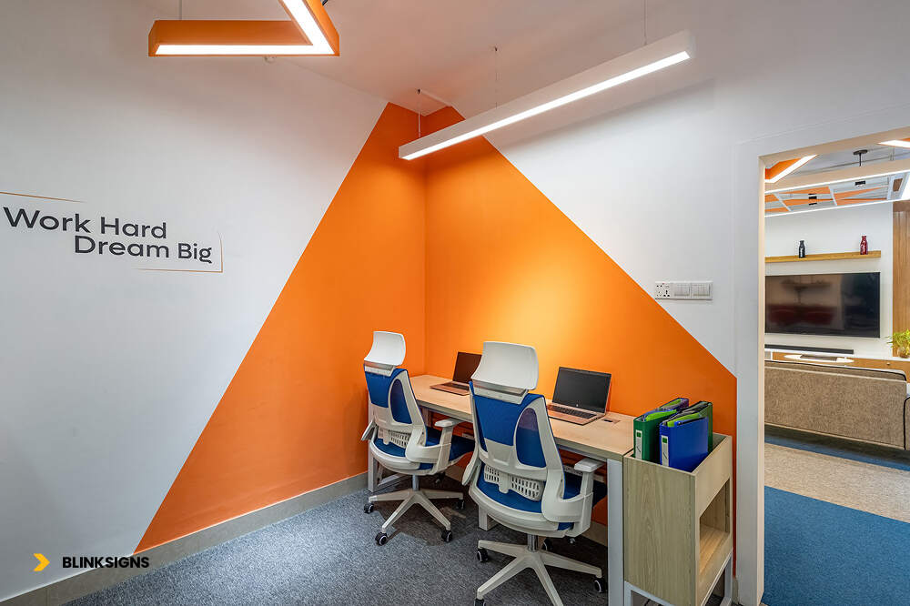
Workplace Environmental Graphics
Workplace environmental graphics are the visual, branded, and functional elements that shape how people experience your office every day. They sit at the intersection of architecture, interior design, brand, and wayfinding.
They include things like:
- Large-scale brand walls and murals in reception or town hall spaces
- Values walls that show how culture actually looks in action
- Wayfinding systems with icons, color coding, and floor/zone identifiers
- Conference room glass graphics for privacy and brand consistency
- Biophilic graphics—nature-inspired imagery and textures that soften hard surfaces
- Recognition and achievement walls that celebrate teams and milestones
- Amenity and wellness zone graphics that make those spaces easy to find and comfortable to use
They’re not:
- Random canvas Art ordered in bulk
- Motivational posters with stock photography
- A logo slapped on every available surface.
Those things might fill walls. They rarely move the needle on culture, productivity, or brand.
Strategic workplace graphics are designed around:
- Who uses the space (employees, leaders, clients, recruits, partners)
- What they’re trying to do (focus, collaborate, meet, relax, learn)
- How you want them to feel and behave (connected, confident, clear, energized)
When graphics are planned through that lens, they move from “decor” to “infrastructure for culture and performance.”
The Hidden Cost of Doing Nothing
Most companies don’t intentionally undermine their culture—they simply don’t reinforce it physically. That absence has measurable consequences.
Below are the four silent costs companies pay when they neglect workplace graphics.
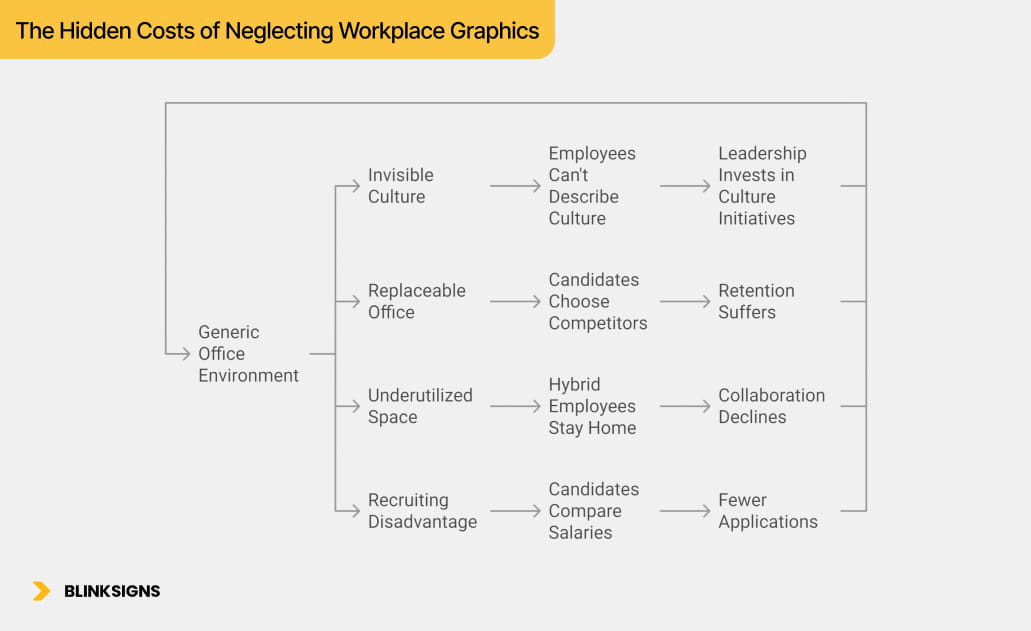
The Hidden Costs of Neglecting Workplace Graphics
1. Your Culture Becomes Invisible—and Eventually Unbelievable
The problem:
If your office resembles every other office, your values remain abstract.
Employees see:
- Blank walls
- Generic conference rooms
- No visual reinforcement of what the company stands for
Impact:
- 43% of employees say they can’t describe their company culture beyond generic terms.
- New hires take 25–40% longer to internalize values when they aren’t visually reinforced.
Cost:
Leadership invests in “culture initiatives,” but the space erases them.
2. Your Office Feels Replaceable—and So Do Your People
The problem:
A generic environment communicates a generic experience.
Employees think:
“Nothing about this space tells me why this company is special.”
Recruiting impact:
- 68% of Millennials and 54% of Gen X look for workplace images on social media before applying.
- Candidates choose competitors with more distinctive environments.
Retention impact:
Without place-attachment, employees feel less loyal—and are easier to poach.
3. Hybrid Employees Have No Reason to Come In
This is the single most underestimated cost in modern workplaces.
If the office looks and feels similar to a home setup, people ask:
“Why commute for the same experience?”
The result:
- Office occupancy stagnates at 40–60%
- Collaboration suffers
- Mentorship and learning decline
- New hires feel disconnected.
Environmental graphics can turn the office into a destination—something that feels meaningfully different from remote work.
4. Recruiting Suffers Because Candidates Can’t “See” Your Culture
During office tours, candidates instinctively look for:
- Who this company is
- What it values
- How people collaborate
- Whether the environment feels energizing
When the space offers no visual story, your culture becomes invisible. Candidates default to comparing salaries rather than experiences.
Research shows:
- Companies that invest in employer-brand environments see up to 140% more applications.
- Acceptance rates rise by 15–25% when office environments clearly communicate identity.
COST SUMMARY — Doing Nothing Costs Far More Than Doing Something
| Consequence | Annual Cost | 3-Year Cost | Investment to Solve |
| Invisible Culture | $50K–$100K | $150K–$300K | $25K–$50K |
| Forgettable Office | $30K–$60K | $90K–$180K | $25K–$50K |
| Underutilized Space | $180K–$300K | $540K–$900K | $40K–$75K |
| Recruiting Disadvantage | $40K–$80K | $120K–$240K | $25K–$50K |
3-Year Cost of Doing Nothing: $900K–$1.62M
Strategic Graphics Investment: $25K–$75K
Environmental graphics don’t cost money—they stop money from leaking.
How Environmental Graphics Support Culture, Productivity & Brand Identity
Environmental Graphics Support Brand Identity
You can think of workplace graphics through an EGD Impact Triangle—three mutually reinforcing outcomes:
- Culture – how people understand “who we are” and “how we work here.”
- Productivity – how easily people navigate, focus, and collaborate
- Brand – how clearly your value and personality show up in the space
When you design graphics with all three in mind, you move from “nice visuals” to a strategic system.
Culture: Making Values Tangible
Culture is hard to measure partly because it’s invisible.
Graphics give it form:
- Values and behaviors walls show real stories of how teams live the values
- Recognition walls celebrate people who embody what “great” looks like internally.
- Heritage timelines connect current employees to the company’s journey and future.
Impact:
- Employees can describe culture without needing to read a slide.
- New hires align more quickly because expectations are clearly visible.
- Leaders have daily physical reinforcement for the behaviors they ask for
Productivity: Reducing Friction and Cognitive Load
Too often, mentally taxing workplaces have nothing to do with the work and everything to do with the environment:
- People waste time finding rooms, amenities, and colleagues
- Spaces aren’t clearly marked for focus vs. collaboration.
- Visual noise makes concentrating more complicated than it needs to be
Environmental graphics reduce friction through:
- Clear wayfinding systems with icons, color coding, and consistent signage
- Zone markers (“Silent Focus Zone”, “Collaboration Hub”, “Social Space”)
- Biophilic and calming visuals in heads-down areas
When navigation becomes intuitive and zones are clearly signaled, people reclaim time and mental energy for actual work.
Brand: Turning the Office into a Living Brand Story
Brand isn’t just a logo. It’s what people feel and remember after interacting with you.
Workplace graphics help by:
- Translating your brand narrative into visual storytelling across the space
- Using color, typography, and imagery to create a coherent, recognizable environment
- Highlighting customer stories, impact metrics, and innovation milestones in client-facing areas
Result:
- Visitors and candidates walk away with a clear, emotional sense of who you are
- Social media content from the office feels on-brand without heavy scripting.
- Your office becomes part of your marketing and employer branding strategy, not just a cost center
What Good Workplace Graphics Look Like (And What Doesn’t Work)
A quick way to sharpen your strategy is to examine patterns—what typically fails versus what consistently works.
Pattern 1: Generic Motivational Quotes vs. Real Value Stories
Weak pattern:
- “TEAMWORK MAKES THE DREAM WORK” in big letters
- Stock photo of people on a mountain peak
- No connection to your company, your work, or your people
Why it fails:
- It could belong to any company on earth
- Doesn’t show what “teamwork” actually means in your context
- Employees tune it out as corporate wallpaper.
Stronger pattern:
- Headline in your voice: “We Ship Together” or “We Solve Problems in Teams.”
- Photos of actual employees on real projects
- 2–3 short stories: “When X happened, this team did Y. That’s what ownership looks like here.”
Why it works:
- Specific, not generic
- Models real behavior for new hires
- Signals authenticity, this is who we actually are, not who we wish we were
Pattern 2: Logo Overload vs. Rhythmic Brand Expression
Weak pattern:
- Logo on every wall, every glass panel, every corner
- The same lockup is repeated so often that it becomes visual noise.
Why it fails:
- People stop seeing it—habituation kicks in
- Feels insecure, like the company doesn’t trust people to remember where they work
- Competes with wayfinding and other important information
Stronger pattern:
- One or two hero brand moments (e.g., reception, town hall) with bold logo use
- Secondary brand elements (color, patterns, typography)are used more subtly elsewhere.
- Quiet zones with minimal branding to allow for focus
Why it works:
- Brand moments feel intentional and memorable
- The environment has rhythm—some loud moments, some calm ones.
- Wayfinding and functional information stay clear and legible.
Pattern 3: Department Silos vs. Unity with Variation
Weak pattern:
- Every department designs “its own” look and feel
The sales floor resembles a sports bar, the engineering department resembles a lab, and the marketing department resembles an Art gallery.
- Little visual coherence across the office
Why it fails:
- Signals “we’re separate tribes,” not one company
- Confuses visitors and new hires
- Makes cross-team movement feel like visiting a different organization each time
Stronger pattern:
- Shared backbone: core brand colors, fonts, and layout logic consistent everywhere
- Local flavor: each team zone has 20–30% unique content (team mission, achievements, inside jokes)
- Movement through the space still feels like one company, just with a different neighborhood.
Why it works:
- Balances unity and individuality
- Reinforces one brand while letting teams see themselves in the environment
- Supports collaboration instead of reinforcing silos
The Psychology Behind Effective Environmental Graphics
Compelling graphics aren’t just “good taste.” They work because they respect how the brain processes space, color, stories, and social cues.
Here are five principles worth designing around.
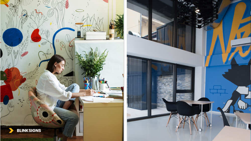
Effective Environmental Graphics
1. Color and Cognitive Performance
Different colors nudge the brain in different directions:
- Cool blues and soft greens help with focus and reduce stress
- Warm reds, oranges, and yellows energize and stimulate social interaction or short bursts of creative thinking.
- Neutrals (greys, beiges, soft whites) provide the eye with a place to rest, allowing attention to remain focused on the content and people.
Research on lighting and biophilic elements in offices suggests that spaces with natural tones and nature-linked elements can enhance productivity and wellbeing—some studies report gains of up to 8–15% in performance and 13% improvements in wellbeing when biophilic elements are used effectively.
Practical takeaway:
- Focus zones → more fabulous, calmer palettes
- Collaboration zones → warmer, more energetic accents
- Don’t flood an entire floor with high-energy colors; use them where you want energy, not everywhere.
2. Scale and Visual Hierarchy
The brain gives priority to:
- Larger shapes over small details
- High-contrast elements over subtle ones
- Clean figure/ground relationships (clear foreground vs. busy background)
For workplace graphics, that translates to:
- A few large-scale pieces (8–15 ft) to set tone and tell big stories
- Medium-scale pieces for navigation and zone markers
- Small-scale pieces for instructions, room capacities, and micro-messages
If everything is loud, nothing is audible.
A simple rule:
20% of surfaces deliver 80% of the visual impact.
The rest should be calmer, supporting space and function.
3. Stories Beat Slogans
People remember stories far more easily than abstract words.
On a wall, “INTEGRITY” is a word.
A short story about a team doing the right thing for a customer, even at a personal cost, is a powerful mental image. And that movie sticks.
Practical applications:
- Replace one-word value walls with mini case-studies in plain language
- Use real names and photos where appropriate (with permissions)
- Turn “Innovation” into “Here are three examples of how we shipped something better for customers this year.”
Graphics then become a living library of culture, not just a list of virtues.
4. Biophilic Design and Stress Recovery
Brains are not built for endless screens and hard surfaces.
Even simple references to nature—such as forest imagery, water, organic patterns, and wood-like textures—help people recover from mental fatigue and focus for longer. Studies show that workplaces with natural elements can lead to better well-being and noticeable increases in productivity.
You don’t need to start with living walls and indoor forests. A practical progression:
| Level | Application | Investment Range | Impact & Complexity |
| 1 | Printed nature imagery | Low | Easy, low maintenance |
| 2 | Natural textures/patterns in graphics | Low–Medium | Warmer, less clinical feel |
| 3 | Moss / small living features + signs | Medium–High | Strong impact, needs care |
| 4 | Full living walls + integrated brand | High | Flagship spaces, high upkeep |
Most offices see strong gains starting with Levels 1–2 in focus areas, break rooms, and circulation paths.
5. Social Proof and Behavioral Modeling
People watch other people to learn “how we do things here.”
Graphics can accelerate that learning by making positive norms visible:
- Peer recognition walls showing people who live the values
- Team achievement walls explaining how cross-functional wins happened
- “We work this way” walls with real photos and captions about meeting habits, collaboration, or customer interactions.
These elements:
- Give new hires instant cues on expected behavior
- Normalize collaboration and recognition.
- Reinforce that culture isn’t just what leaders say—it’s what colleagues actually do.
Mapping the Employee Journey Through Space
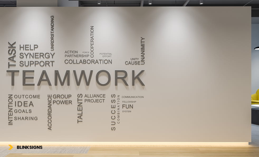
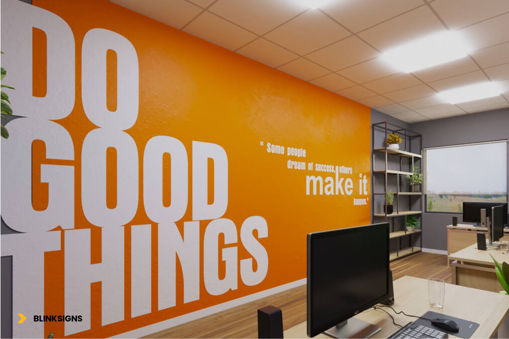
A wall with motivational graphics
Before deciding where graphics should be placed, it’s helpful to understand how people navigate your workplace on a typical day.
Think of one employee and follow their journey:
- Arrival & Entry
- Parking, lobby, security, reception
- First impressions, emotional temperature, sense of welcome
- Parking, lobby, security, reception
- Orientation
- “Where am I?” “Where are my people?” “Where do I sit today?”
- Wayfinding, floor directories, zone identifiers
- “Where am I?” “Where are my people?” “Where do I sit today?”
- Team & Project Work
- Desks, squad areas, shared project walls.
- Day-to-day culture, how work actually happens
- Desks, squad areas, shared project walls.
- Focus & Deep Work
- Quiet rooms, focus pods, library-like spaces
- Need for calm, minimal distraction, clear expectations
- Quiet rooms, focus pods, library-like spaces
- Collaboration & Meetings
- Huddle rooms, conference rooms, war rooms
- Need for clarity, energy, and purpose.
- Huddle rooms, conference rooms, war rooms
- Breaks & Recovery
- Kitchen, café, lounges, wellness rooms, outdoor terraces
- Social connection, decompression, recharge.
- Kitchen, café, lounges, wellness rooms, outdoor terraces
- Moments of Pride & Storytelling
- Town halls, client visits, internal events
- Places where you talk about wins, impact, and plans
- Town halls, client visits, internal events
Each stage is a graphics opportunity:
- Welcome and orient
- Explain and reinforce
- Calm or energize
- Celebrate and remember
Mapping this journey with your team (HR, Facilities, Marketing, leaders) often reveals “silent” moments where you want the environment to speak more clearly.
Planning Workplace Environmental Graphics by Zone
Once you understand the journey, you can group your space into zones and decide what each zone needs to do for people.
Typical zone categories:
- Welcome & Brand Zones
- Lobby, reception, main entries, key corridors
- Goal: first impressions, brand story, sense of arrival
- Lobby, reception, main entries, key corridors
- Collaboration Zones
- Meeting rooms, project areas, open collaboration hubs
- Goal: clarity of purpose, energy, shared information
- Meeting rooms, project areas, open collaboration hubs
- Focus Zones
- Quiet rooms, libraries, and individual work nooks
- Goal: calm, concentration, reduced visual noise
- Quiet rooms, libraries, and individual work nooks
- Amenity & Social Zones
- Kitchens, cafés, lounges, terraces, and game areas
- Goal: connection, community, decompression
- Kitchens, cafés, lounges, terraces, and game areas
- Support & Transition Zones
- Stairwells, lift lobbies, hallways, back-of-house corridors.
- Goal: subtle reinforcement, wayfinding, light storytelling
- Stairwells, lift lobbies, hallways, back-of-house corridors.
For each zone, you can answer:
- Who uses this space most?
- What should they feel here?
- What should they understand or do more easily?
- What brand and culture messages belong here—if any?
The Graphics Prioritization Matrix: Where to Invest First
Most organizations can’t (and shouldn’t) wrap every wall on day one.
To decide where to start, consider two axes:
- Business impact (recruiting, retention, productivity, client perception)
- Implementation cost and complexity
Represented as a simple 2×2:
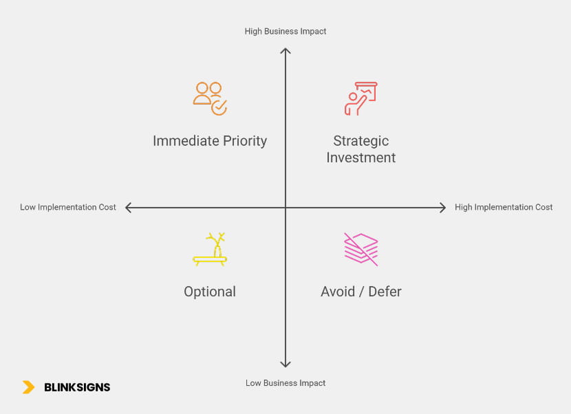
Vehicle Wrap ROI_ Graphics Prioritization Matrix
Immediate priority (Phase 1) – high impact, lower–medium cost:
- Reception/lobby
- Main circulation corridors
- Primary wayfinding
- One signature culture wall
- Conference room glass and key client-facing rooms
Strategic investment (Phase 2–3) – high impact, higher cost/complexity:
- Complete conference room suites and themed neighborhoods/floors
- Digital displays with ongoing content
- Living walls and more complex biophilic installations
Optional/quick wins – lower impact, low cost:
- Break room accent walls
- Stairwell graphics
- Floor numbers and simple zone IDs
- Restroom entry graphics
Avoid/defer – low impact, higher cost:
- Over-designed individual offices
- Storage and rarely used spaces
- Extensive garage/basement graphics (beyond basic wayfinding)
Simple Scoring Tool
For each potential zone, score 1–5 on:
- Employee traffic
- Client/candidate visibility
- Culture reinforcement potential
- Functional/wayfinding value
- Cost (reverse scored: 1 = very expensive, 5 = low cost)
Then apply this formula:
(Traffic × 3) + (Visibility × 2) + (Culture × 2) + (Function × 1) – (Cost × 1)
Rough thresholds:
- 40–50 → Do first (Phase 1)
- 30–39 → Plan for Phase 2–3
- 20–29 → Optional
- <20 → Defer
This turns subjective debates (“the stairwell looks boring”) into structured decisions tied to impact.
Designing for People: Culture, Inclusion & Psychological Safety
Workplace graphics should support the people you actually have, not just the brand you want to project.
That means thinking about:
- Authentic culture, not just aspirational words
- Use phrases teams actually say
- Spotlight real stories and examples from across departments, levels, and locations
- Inclusion and representation
- Ensure imagery and stories reflect the diversity of your workforce and customers.
- Avoid tokenism—one “diversity poster” in a corner doesn’t signal genuine inclusion.
- Ensure imagery and stories reflect the diversity of your workforce and customers.
- Psychological safety
- Graphics can normalize learning, experimentation, and honest feedback.
- Walls that share “lessons learned” and “what we changed” send a powerful signal that mistakes are part of progress
- Graphics can normalize learning, experimentation, and honest feedback.
- Accessibility
- Font sizes and contrast that work for a wide range of eyesight
- Clear symbols, not just English text, for key functions
- Thoughtful placement of wayfinding, so people don’t have to hunt for information
- Font sizes and contrast that work for a wide range of eyesight
When you design with culture, inclusion, and safety in mind, graphics stop being mere decoration and become support structures for how you want people to feel and behave at work.
Designing for All Minds: Neurodiversity-Inclusive Graphics
A significant share of your team will be neurodivergent—ADHD, autism, dyslexia, sensory processing differences, and more—even if they never use those labels publicly.
Graphics can either help them thrive or quietly exhaust them.
1. Visual Complexity Zoning
Different zones can handle different levels of visual stimulation:
| Zone Type | Visual Elements / 100 sq ft | Palette & Pattern | Why |
| Focus / Quiet | 1–2 (minimal) | Soft, analogous colors, low texture | Reduces cognitive load, easier to focus |
| Transition spaces | 3–4 (moderate) | 2–3 colors, simple geometry | Helps orientation without overload |
| Collaboration | 5–7 (rich but controlled) | Full brand palette, more variety | Energy and engagement |
| Social / break | 8–10 (highest) | Warmer, more playful | Conversation, relaxation |
Key idea:
- Turn down visual intensity where people need deep focus
- Turn up the intensity where you want social interaction and creative energy.
2. Predictability and Navigation
Neurodivergent colleagues often benefit from clear, consistent cues. Graphics can provide:
- Wayfinding that looks and behaves the same on every floor
- Zone names and icons that match what people actually use spaces for
- Clear room labels with capacity and etiquette (“Silent room”, “Video calls allowed”, “Collaboration space”)
Predictability reduces anxiety: people know what to expect in each zone before entering.
3. Sensory-Friendly Choices
Some design moves that look impressive in a rendering can be overwhelming in real life. For example:
- Highly glossy finishes that reflect overhead lights
- Very high-contrast, busy patterns in narrow corridors
- Large areas of neon or very saturated color in focus spaces
Better options in most workplaces:
- Matte or satin finishes that cut glare
- Softer gradients or subtle textures
- Biophilic imagery in spaces where people need calm and recovery
4. Clear Options and Expectations
One of the most supportive things you can do is make choices explicit:
- Mark zones clearly: “Quiet Focus”, “Open Collaboration”, “Social Lounge.”
- Use graphics to explain what behavior is expected where
- Let people choose environments that match their nervous system and work mode.
This helps neurodivergent employees—and, if we’re honest, almost everyone else.
Environmental Graphics for Return-to-Office (RTO) Strategy
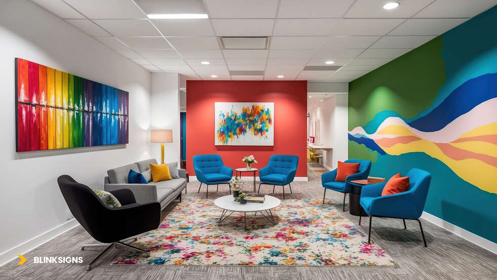
Environmental Graphics for Office
Returning to the office is not just a policy challenge. It’s an experience challenge.
If employees come back to the same office they left in 2020—same blank walls, same beige corridors, same confusing wayfinding—policy alone won’t win hearts.
Graphics play a key role in making the office feel like an upgrade, not a regression.
1. Make the Office Visibly Better Than Home
Home offers comfort, flexibility, and control.
The office should offer:
- Spaces that look and feel special—places people want to photograph and share
- Visible cues that this is a place where vital work and connection happen
- Environments that feel energising but not chaotic
How graphics help:
- Signature brand walls and collaboration hubs that feel “worth the commute.”
- Interactive elements—writeable walls, idea boards, recognition zones
- Instagram-ready corners that naturally generate internal and external employer branding content
2. Clarify Work Modes Through Space
Remote work blurred boundaries between focus, meetings, and social time.
In the office, graphics can help people answer:
- Where do I go when I need deep focus?
- Where do we go when we want to solve something as a team?
- Where do I go when I just want to reconnect with people?
Design moves include:
- Clear colour and graphic language for focus, collaboration, and social zones
- Simple, repeated messaging that defines expectations in each area
- Wayfinding that routes people naturally to the correct type of space for their day
The more quickly people can find the right environment for their work mode, the more likely they are to feel the office genuinely supports them.
3. Create “Only in the Office” Rituals and Stories
RTO works best when the office becomes the natural home for:
- Key celebrations and all-hands moments
- Visible recognition and “wins walls.”
- Community boards, learning walls, and shared rituals
Graphics reinforce these rituals visually:
- A “This Month’s Wins” wall updated regularly with photos and short stories
- A “New Faces” board where new hires introduce themselves visually
- Rotating walls for internal events, learning weeks, or CSR initiatives
When employees can see these stories evolve week by week, the office stops being “the place I’m required to go” and starts becoming “the place where things happen.”
From Idea to Implementation: A Practical, Real-World Process
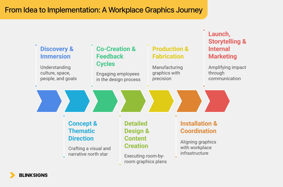
Even the strongest workplace graphics strategy can fail without precise execution. The most successful projects follow a predictable rhythm—one that blends brand, architecture, culture, and change management. Think of it as a 7-stage path, from the initial conversation to the final impact assessment.
From Idea to Implementation_ A Workplace Graphics Journey
1. Discovery & Immersion
The process begins with understanding four things:
- Your culture — not just what leadership says, but what employees feel every day
- Your space — architecture, materials, lighting, traffic flow, pain points
- Your people — their work modes, frustrations, rituals, and aspirations
- Your goals — recruiting advantage? Retention? Hybrid engagement? Brand consistency?
Discovery typically includes:
- Shadowing employees through the space
- Reviewing brand, mission, values, and employer branding
- Interviews with HR, Facilities, Marketing, and department leads.
- Employee surveys about space satisfaction and culture visibility
- Architecture and floor plan analysis
This phase uncovers gaps between intended culture and experienced culture—and reveals where graphics can have a meaningful impact on behavior, pride, and clarity.
2. Concept & Thematic Direction
Once insights are gathered, designers begin crafting a visual and narrative north star. This includes:
- A core concept based on your culture typology (e.g., Innovation, Heritage, Human-Centered, High-Performance, Collaborative)
- A visual language (color, pattern, scale, texture, typography) tied to the brand
- Early example mockups for key zones—reception, corridors, collaboration areas, culture walls
- A high-level zoning strategy (what goes where, and why)
- A storytelling approach (heritage timeline? values in action? team stories? customer impact? employee recognition?)
The goal:
Give leadership and employees a clear sense of how the future environment will feel, not just what it will look like.
3. Co-Creation & Feedback Cycles
The most successful workplace graphics programs involve employees directly in the process. This increases ownership, authenticity, and adoption. Intense co-creation cycles include:
- Short surveys (“Which values stories resonate with you most?”)
- Creative workshops with cross-functional teams
- Voting rounds on thematic directions
- Story submissions for values, achievements, or team moments
- Visibility into early designs
When people see their own words, photos, and stories on the walls, the environment feels theirs, not corporate-owned.
4. Detailed Design & Content Creation
With concept alignment secured, design moves into execution-level detail:
- Room-by-room and zone-by-zone graphics plans
- Exact measurements, materials, and finishes
- ADA-compliant maps, door signs, and wayfinding systems
- Story-based content for values, achievements, history, or culture
- Photography planning (actual employees, real work moments)
- Material optimization for durability and cost
This is where the environment takes shape in absolute scale—and where decisions about texture, hierarchy, color balance, and spatial psychology become critical.
5. Production & Fabrication
Manufacturing environmental graphics requires precision and expertise. Mistakes at this stage can lead to costly rework.
Key elements include:
- Color matching across substrates
- Material selection based on traffic level (laminated vinyl vs. rigid panels vs. acrylic vs. fabric)
- Finishes chosen for glare control, durability, and cleaning
- Pre-installation tests in high-touch areas
- Packaging and logistics for multi-site distribution
This phase is where a vendor’s technical competence becomes the difference between flawless results and ongoing headaches.
6. Installation & Coordination
Installation must align tightly with architecture, construction, IT, and facilities work. The best implementations coordinate:
- Wall painting schedules
- Furniture placement
- Glass cleaning cycles
- Lighting adjustments
- Carpenters, electricians, and AV teams
- Weekend or after-hours installs to avoid disruption
A strong graphics partner synchronizes all stakeholders, ensuring that the environment comes together without operational chaos.
7. Launch, Storytelling & Internal Marketing
Environmental graphics lose their impact if they appear without explanation.
A proper launch amplifies impact:
- Guided team tours to explain the “why” behind design decisions
- Leadership walkthrough videos
- Social media content for employer branding
- Storytelling emails highlighting culture walls, recognition pieces, and new wayfinding
- New-hire orientation updates to reflect new visual language.
When employees understand the design logic and stories embedded in the environment, engagement skyrockets.
Choosing the Right Environmental Graphics Partner
Workplace environmental graphics require a holistic approach that encompasses branding, interior design, materials engineering, ADA compliance, manufacturing, and installation. A low-bid print shop rarely delivers the consistency, insight, or longevity required for a workplace.
Use the following criteria to evaluate partners:
1. Experience With Workplace Strategy
Ask:
- “Do you design for corporate offices, not just retail or events?”
- “Can you show projects where graphics supported culture, hybrid engagement, or RTO goals?”
Workplaces require different thinking than trade shows or retail environments.
2. ADA, Fire Code & Landlord Compliance
Ask:
- “How do you ensure all wayfinding meets ADA requirements?”
- “Do you coordinate with fire marshals on corridor graphics?”
- “How do you address restrictions on older or historic buildings?”
A compliant partner protects you from liability and delays.
3. Multi-Site Rollout Capability
Ask:
- “Can you manage consistent rollout across multiple offices or states?”
- “Do you have local installation partners in major metros?”
Consistency across locations is essential for employer brand trust.
4. Material Expertise & Durability
Ask:
- “Which materials hold up in high-traffic corridors?”
- “How do you manage glare near windows?”
- “What are sustainable substrate options?”
Incorrect material selection can lead to peeling, fading, and costly reprints.
5. Architectural & Construction Integration
Ask:
- “Do you work alongside architects and GCs?”
- “Can you read construction plans and proactively flag issues?”
This prevents scenarios where:
- Graphics are installed before the paint dries
- 3D elements are mounted on structurally weak walls
- AV or furniture blocks visibility
6. Employee Co-Creation Support
Ask:
- “Do you offer surveys or workshops for employee input?”
- “Do you help collect stories and achievements authentically?”
Co-created environments drastically outperform top-down designs.
7. Post-Installation Maintenance & Warranty
Ask:
- “What is your warranty on installation and materials?”
- “Do you offer yearly maintenance plans?”
- “How quickly can you respond to damage or urgent fixes?”
Workplaces are living environments—graphics must stay pristine.
8. Measurement & ROI Tracking Support
Ask:
- “Do you help measure impact through surveys, utilization metrics, or recruiting data?”
- “Do you provide a post-installation review at 3, 6, or 12 months?”
A partner who helps you measure results enables you to secure future budget.
Measuring the Impact: Financial ROI + Engagement Metrics
Environmental graphics offer tangible business ROI when appropriately measured. The companies that win CFO buy-in early do it through quantification.
Here’s what to track:
1. Recruitment Metrics
Environmental graphics enhance the employer brand, boosting candidate enthusiasm.
Track:
- Time-to-fill before and after installation
- Acceptance rates
- Candidate feedback from onsite tours
- Social media shares of office spaces
A strong brand environment can reduce hiring friction by 10–25%.
2. Retention & Engagement
Graphics that clarify culture and celebrate people increase emotional attachment.
Track:
- Employee engagement surveys
- Satisfaction with workspace
- Voluntary turnover
- “Pride in workplace” scores
- Participation in recognition or storytelling initiatives
Even a 5–10% reduction in voluntary turnover can result in annual savings of hundreds of thousands.
3. Productivity & Space Utilization
Clear wayfinding and zoning reduce friction and cognitive overload, enhancing the overall user experience.
Track:
- Meeting room availability and booking patterns
- Collaboration vs. focus space usage
- Badge swipes and occupancy in hybrid models
- Time spent searching for rooms or amenities
- Reported confusion about space functions
Improvements in daily navigation accumulate into real productivity gains.
4. Culture Visibility & Behavioral Signals
Graphics turn abstract ideas into visible norms.
Track:
- Whether employees can articulate the company values
- New hire ramp-up time
- Participation in team achievements and recognition walls
- Observed adoption of desired behaviors (ownership, collaboration, customer-centricity, etc.)
Culture becomes self-reinforcing when it is visible and understood.
5. CFO-Level Financial Summary
Environmental graphics drive financial results through:
- Reduced turnover
- Improved recruiting
- Better real estate utilization
- Higher employee engagement and productivity
- Stronger client perception and sales enablement
A typical ROI window:
- Payback period: 8–18 months
- 3-year ROI: 4×–10× initial investment
Few workplace investments deliver this level of cultural and financial impact.
Budgeting & Phased Rollouts
A strategic approach avoids overwhelm and ensures sustainable progress.
Phase 1 — High-Impact Foundations ($25K–$65K)
- Reception
- Main corridors
- Primary wayfinding
- One culture/values wall
- Key conference room glass
This phase establishes legitimacy, builds employee trust, and proves ROI.
Phase 2 — Strategic Enhancements ($40K–$120K+)
- Themed floors
- Full conference room systems
- Digital displays and content
- Expanded storytelling (customer impact, innovation, heritage)
These elements deepen the narrative and scale the experience.
Phase 3 — Optional Add-Ons ($10K–$30K)
- Break room accents
- Stairwell graphics
- Detailed amenity signage
- Rotating walls for events
Perfect for annual refresh cycles.
Phase 4 — Deferred or Low-ROI Zones
- Private offices
- Low-traffic back-of-house corridors
- High-cost, low-visibility areas
Use the budget where it makes a difference.
Messaging the Business Case to Leadership
Each executive thinks differently—and graphics speak to them in different ways.
To the CEO:
Environmental graphics are the physical expression of strategy.
They align behaviors, accelerate culture, and differentiate your brand.
To the CFO:
Graphics reduce turnover, improve recruiting efficiency, and maximize real estate ROI.
The cost of doing nothing is 12–21× the price of a strategic installation.
To the COO:
Graphics resolve functional friction—enabling navigation, clarity, and efficient space usage—and support hybrid work.
To HR:
Graphics reinforce values, accelerate onboarding, and improve employee belonging.
To Marketing:
The office becomes a brand asset—photogenic, shareable, cohesive, story-driven.
Scaling Across Multiple Offices
Multi-site organizations face a unique challenge:
How do you ensure that brand and culture are consistently represented, while respecting local needs?
Use a system-based approach:
- A global graphics playbook with templates, colors, typography, and wayfinding logic
- A tiered system for required vs. optional elements
- Modular storytelling formats that adapt across sites
- Local co-creation for employee stories, achievements, and photos
- National installation partners to ensure quality and speed
Consistency builds brand trust, while local customization maintains authenticity.
Materials, Sustainability & Designing for Change
The modern workplace must be both environmentally responsible and future-friendly.
Sustainable Material Options
- Low-VOC inks
- PVC-free vinyl
- Recycled PET substrates
- Water-based printing processes
- Reusable hardware systems
Durability Considerations
- Heavy traffic areas → textured laminates or rigid panels
- Sunlit corridors → UV-resistant inks and anti-glare finishes
- Glass → optically clear PET with removable adhesives
Future-Proofing
Use modular systems for areas where content changes regularly:
- Achievement walls
- Event boards
- Employee recognition
- Product innovation timelines
This avoids costly reprints and keeps spaces feeling fresh.
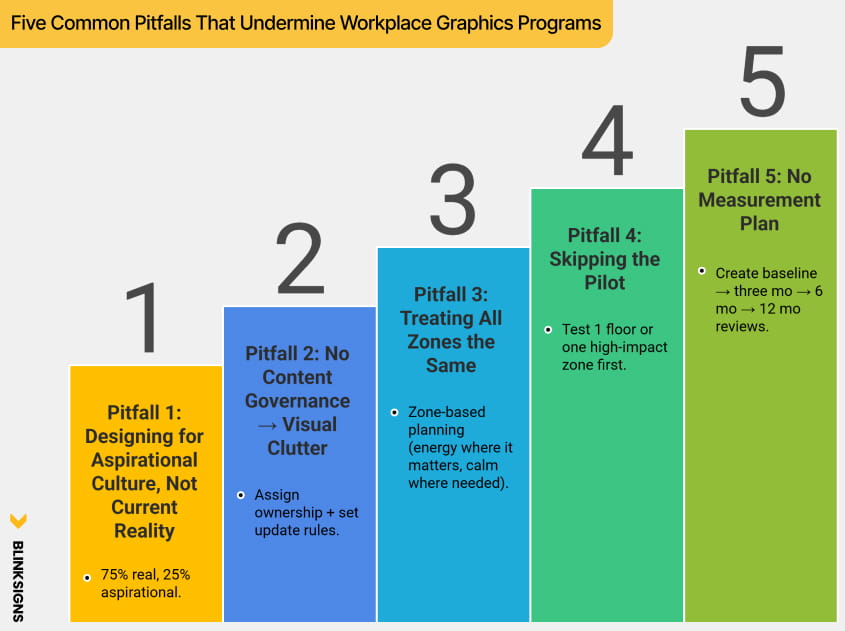
Five Common Pitfalls That Undermine Workplace Graphics Programs
Five Common Pitfalls That Undermine Workplace Graphics Programs
Pitfall 1: Designing for Aspirational Culture, Not Current Reality
Solution: 75% real, 25% aspirational.
Pitfall 2: No Content Governance → Visual Clutter
Solution: Assign ownership + set update rules.
Pitfall 3: Treating All Zones the Same
Solution: Zone-based planning (energy where it matters, calm where needed).
Pitfall 4: Skipping the Pilot
Solution: Test 1 floor or one high-impact zone first.
Pitfall 5: No Measurement Plan
Solution: Create baseline → three mo → 6 mo → 12 mo reviews.
How BlinkSigns Supports Workplace Environmental Graphics Projects
BlinkSigns brings a multidisciplinary approach to workplace branding—helping organizations navigate strategy, design, compliance, fabrication, installation, and multi-site rollout with a single partner.
What BlinkSigns delivers:
1. Strategic Discovery & Culture Mapping
Understanding your brand, your people, and the behaviors your workplace must support.
2. Experience-Led Design
Creating environments grounded in psychology, storytelling, and authenticity.
3. ADA-Compliant Wayfinding Systems
Clear, consistent, and legally compliant navigation across floors and buildings.
4. High-Quality Materials & Fabrication
Durable, color-accurate, sustainable production tailored to each zone’s traffic and lighting.
5. Professional Installation Nationwide
Expert coordination across construction, facilities, and IT teams.
6. Multi-Site Scaling
Ensuring consistent brand identity across regional, national, or global offices.
7. Lifecycle Support
Maintenance, refresh planning, and content updates throughout the entire lifecycle of your space.
BlinkSigns doesn’t just decorate workplaces—we help organizations transform the way employees experience culture, brand, and purpose every day.
Your Workplace Environmental Graphics Strategy Checklist
A final at-a-glance tool to ensure your program is positioned for success:
Strategy & Planning
- Clear goals (recruiting, RTO, culture, productivity)
- Defined success metrics
- Stakeholder alignment (HR, Marketing, Facilities, Leadership)
- Approved budget with ROI case
Design & Content
- Priority zones mapped
- Brand and culture storytelling are defined.
- Employee co-creation included
- Neurodiversity and accessibility are considered.
- ADA compliance checked
Vendor Selection
- Workplace strategy experience
- Material expertise
- Multi-site capability
- Maintenance and warranty
- Measurement support
Installation & Launch
- Sequenced with construction
- Clear internal communications plan
- Tours and storytelling to explain the meaning
- Photography for employer branding
Measurement & Iteration
- Surveys at 1, 3, 6, and 12 months
- Recruiting and turnover metrics tracked
- Space utilization measured
- Annual refresh plan in place
If 90% of this checklist is completed, your project is ready to launch with high confidence.
FAQs
1. What exactly qualifies as “environmental graphics” in the workplace?
Environmental graphics encompass murals, wayfinding, branded glass films, floor graphics, recognition walls, culture walls, zone identifiers, biophilic graphics, digital displays, and experiential elements that influence how people perceive, navigate, and work within a space.
2. How are environmental graphics different from interior decoration?
Decoration is visual.
Environmental graphics are strategic, meaning they reinforce culture, guide behavior, improve productivity, support well-being, and deliver measurable business outcomes (recruitment, retention, RTO success).
3. How much do workplace graphics typically cost?
Budgets vary by scale:
- Lean Pilot: $8K–$15K
- Strategic Investment: $25K–$50K
- Full transformation: $75K–$200K+
Most companies phase in graphics over multiple quarters.
4. What’s the ROI of environmental graphics?
ROI appears across three measurable layers:
- Recruitment: More applications, faster hiring, fewer declined offers
- Retention: Higher pride, belonging, and cultural alignment
- Productivity: Clearer wayfinding, reduced stress, and more collaboration
Most organizations recover their investment in 8–24 months.
5. Do these graphics actually improve culture?
Yes—when done correctly.
Culture becomes real when employees see it, recognize it, and interact with it on a daily basis. Visual reinforcement increases cultural adoption by 25–40%.
6. How do graphics support hybrid or return-to-office initiatives?
Graphics make the office feel like an experience—not just a workspace. They:
- Clarify zones for focus vs. collaboration
- Create moments employees want to be around.
- Reinforce team identity and connection.
- Make in-office days feel meaningful.
7. Can environmental graphics help with employee onboarding?
Absolutely.
New hires absorb culture visually, reducing orientation time and helping them understand norms, behaviors, and company values within the first week, not months.
8. How do I know which walls or zones to prioritize first?
Start with areas that influence:
- First impressions (reception, corridors)
- Daily flow (meeting rooms, break spaces)
- Culture communication (values walls, recognition)
A graphics prioritization matrix helps determine the sequencing of tasks.
9. Are environmental graphics suitable for neurodiverse-friendly workplaces?
Yes. The right graphic strategy reduces visual overstimulation, improves navigation, and supports psychological safety. BlinkSigns’ approach uses visual complexity zoning, sensory-friendly palettes, predictable wayfinding, and clear behavior cues.
10. What materials last the longest in office environments?
Durable options include:
- High-traffic vinyl films
- Laminate-protected murals
- Anti-glare finishes
- Architectural films
- Sustainable substrates depending on ESG goals
BlinkSigns selects materials based on traffic, lighting, humidity, and wall conditions.
11. What’s the installation timeline?
Most workplace graphics projects take:
- 2–4 weeks for discovery + design
- 1–2 weeks for production
- 1–5 days for installation, depending on scale
Phased rollouts are recommended for active offices.
12. How do we measure the success of an environmental graphics project?
Measurement includes:
- Pre/post employee surveys
- Culture visibility scores
- Space utilization patterns
- Recruiting metrics
- Turnover trend improvement
- Visitor/candidate impressions
- RTO participation
13. Do we need landlord approval?
If you’re in a leased building, yes.
BlinkSigns helps obtain approvals by providing diagrams, material specs, and compliance details.
14. Can graphics be removed later without damaging the walls?
Yes—when proper materials are used. We select films designed for clean removability, especially in leased buildings.
15. What makes BlinkSigns different from local printers?
BlinkSigns is not a print shop—we are a strategic workplace experience partner, offering:
- Culture modeling
- Employee journey mapping
- Zone-based planning
- ADA-compliant wayfinding
- Multi-site consistency
- HR + marketing + facilities collaboration
- ROI measurement frameworks
- Long-term lifecycle support
This transforms graphics from “wall décor” into business infrastructure.
Conclusion
A modern workplace isn’t defined by furniture, paint, or floor plans—it’s determined by the experiences it creates. Environmental graphics transform ordinary offices into spaces where culture becomes visible, productivity feels natural, and employees feel connected to something larger than the work itself.
When companies invest in strategic workplace graphics, they’re not buying murals—they’re building alignment, clarity, pride, and purpose. They’re giving employees a reason to look forward to being on-site. They’re strengthening recruiting narratives. They’re removing friction from daily work. They’re transforming unused space into high-value zones that support real business outcomes.
The organizations that win in the next decade will be the ones that shape environments with intention—not just for aesthetics, but for measurable cultural and operational impact.
And that’s where BlinkSigns stands apart.
From strategy to design to installation, we help teams bring their culture to life across every floor, every corridor, and every zone—building workplaces people remember, love, and choose.
Ready to transform your workplace into a strategic asset?
Our team is here to help you design what your employees and brand deserve.