World Braille Day 2026: People Behind the Signs
You arrive at a new office building for the first time. You know there’s a directory somewhere near the entrance—there has to be. Your hand traces along the wall, following the expected path from the door toward where information should live.
Nothing.
You move left—still nothing. You move right, widening your search. Finally—eight feet from where you started—you find it. Mounted at the correct height. Grade 2 Braille is verified. ADA-compliant.
However, it was not located where your hand would naturally search. Not where logic said it should be. Not where hundreds of other buildings taught you to look.
This is the gap between compliance and usability. The difference between a building that merely passes inspection and one that truly functions is significant.
World Braille Day, observed annually on January 4, honors the birthday of Louis Braille and celebrates an invention that has unlocked literacy, education, and independence for millions of people who are blind or visually impaired. However, it also asks us to confront a harsher truth: accessibility often exists on paper far more often than it does in practice.
The scenarios presented in this article represent common patterns reported by individuals who are blind or have low vision as they navigate public spaces. Details are composites based on accessibility feedback and user research.
Why World Braille Day Matters (And Who It’s For)
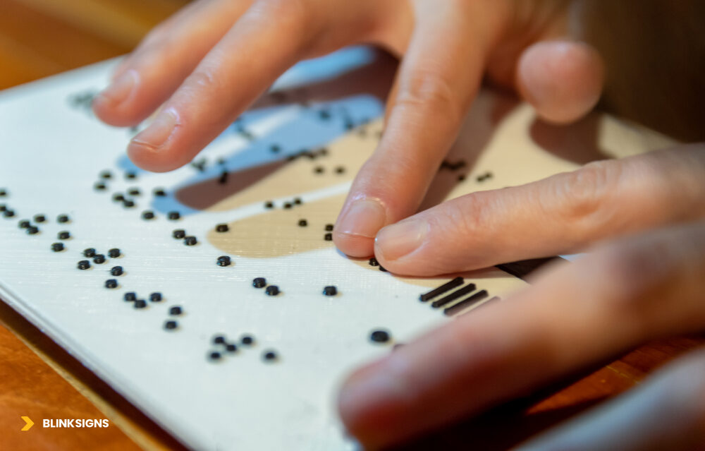
World Braille Day_ Celebrating the 6-dot cell that unlocked independence.
World Braille Day isn’t just a moment of awareness—it’s a reminder that accessibility is not abstract. Hallways, entrances, restrooms, elevators, and emergency exits are where accessibility either succeeds or fails. It affects how people move independently, how long tasks take, and whether assistance is required for something that should be simple.
This conversation matters to more people than many organizations realize: facility managers responsible for compliance, architects shaping built environments, employers building inclusive workplaces, and advocates pushing for dignity beyond minimum standards.
The Invention That Opened a World
Louis Braille, born January 4, 1809, lost his sight as a child and developed the Braille system as a teenager. Louis Braille’s six-dot tactile cell revolutionized written language, enabling blind individuals to access education, employment, and culture independently.
In 2018, the United Nations General Assembly officially recognized World Braille Day , with the first observance held in 2019. The intent was clear: acknowledge Braille as a fundamental tool for communication and inclusion, not a niche accommodation.
Braille works because it is physical. It doesn’t require power, connectivity, or interpretation. It provides immediate, tactile confirmation—something digital tools still struggle to replicate consistently in physical environments.
By the Numbers: Visual Impairment in Context
Vision impairment affects people across age groups, geographies, and life stages:
- Globally, the World Health Organization estimates that 2.2 billion people have near or far vision impairment.
- In the United States, data from the American Foundation for the Blind and the DC suggest that more than 8–12 million Americans live with significant visual impairments, depending on the definition and study.
- Approximately 1 to 2 million Americans are classified as legally blind.
- Most vision loss occurs after age 40, with prevalence increasing sharply as populations age.
- Braille literacy varies widely. Research suggests that 10–25% of blind adults read Braille fluently, with the rate heavily influenced by the age of vision loss and access to education.
Figures vary depending on the methodology, population, and reporting year. Sources commonly referenced include AFB, NFB, WHO, and CDC publications.
The takeaway is not a single number—it’s scale. Accessible wayfinding isn’t about serving a tiny edge case. It’s about serving a growing portion of the population.
What Braille Signage Actually Does (And Why It’s Irreplaceable)
Braille signage plays a role that no single technology can fully replace:
- Room identification: Restrooms, offices, exits, stairwells.
- Permanent wayfinding: Directories, room numbers, floor identifiers.
- Safety information: Emergency exits, refuge areas, hazard warnings.
Digital tools can be helpful, but their effectiveness depends on various factors, including battery life, connectivity, device ownership, and technical proficiency. Braille signage works immediately, passively, and universally. It remains one of the few accessibility features that requires no onboarding to function.
The People Behind the Signs: Real Navigation Experiences
Accessibility discussions often focus on standards and specifications. What’s missing is how those decisions feel in use.
Based on accessibility feedback and user research, several recurring patterns emerge.
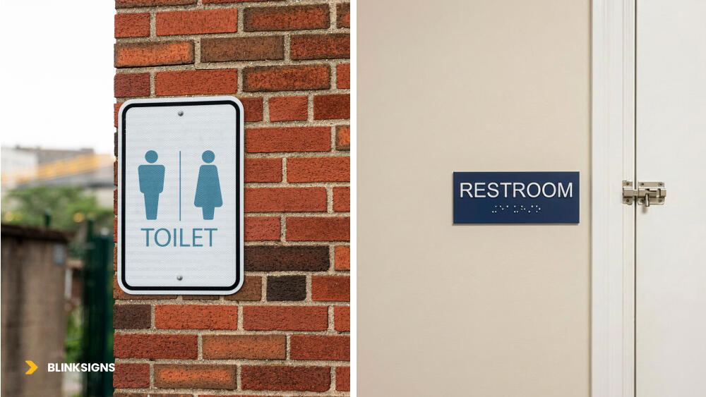
Proper signs and their placements
Common Navigation Challenges in Everyday Spaces
Office buildings
Signs are mounted at technically correct heights but positioned away from natural hand-search zones. Directories may be located several feet from entrances, rather than adjacent to door frames. Users search longer than necessary or require assistance for basic orientation.
Healthcare facilities
Stress amplifies navigation failure. Restroom signage may be consistent on one floor and inconsistent on another. Emergency exits are marked visually but not integrated into tactile paths, increasing anxiety in time-sensitive situations.
Transit hubs
Crowds, noise, and time pressure compete with tactile navigation. Platform edge markers wear smooth from foot traffic. Audio announcements may be mistimed or drowned out, leaving users to rely on incomplete cues.
These are not edge cases. They are patterns.
What Makes Tactile Navigation Work (From a User Perspective)
When tactile wayfinding succeeds, it’s rarely because of a single sign. It’s because of systems thinking:
- Predictable placement: Same side, same height, same distance—every time.
- Logical sequencing: Signs appear where hands naturally search, not where walls happen to be empty.
- Maintained tactile quality: Raised dots stay raised; characters remain distinct.
- Multi-cue integration: Tactile elements work in conjunction with contrast, sound, and spatial logic to enhance the overall experience.
Consistency reduces cognitive load. Inconsistency forces relearning—and dependence.
The “Compliant but Useless” Problem
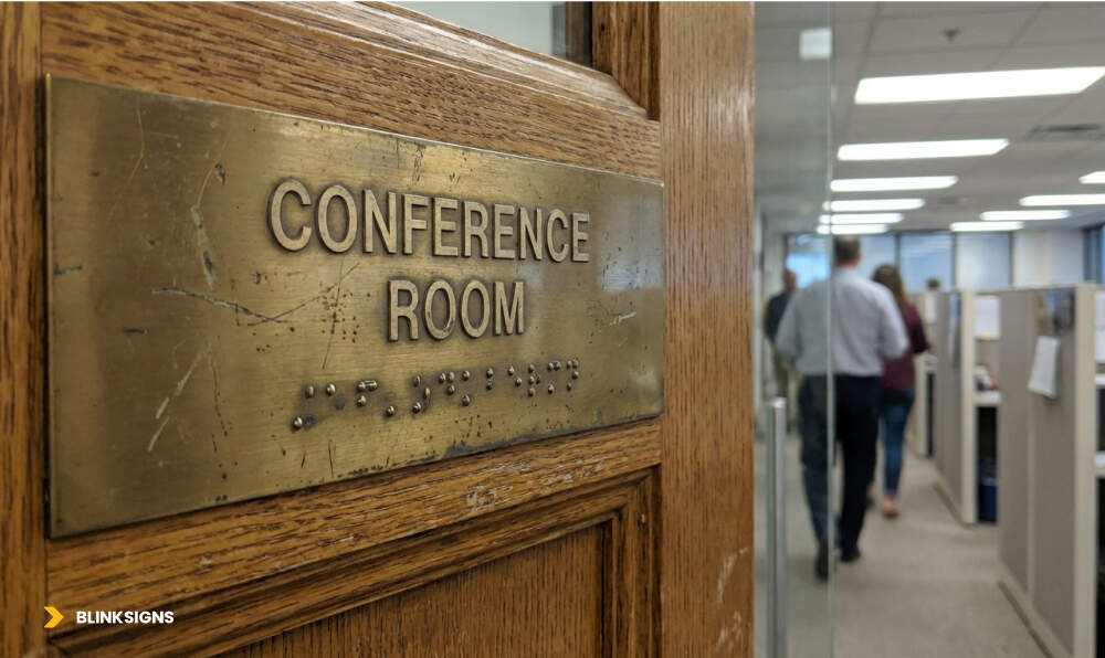
Old damaged conference room sign
This is where many buildings fail.
When Accessibility Exists on Paper but Not in Practice
Common failure patterns include:
- Technically correct mounting height—but positioned far from approach paths.
- Accurate Braille translation—placed on decorative wall panels that users can’t locate.
- High-contrast design at installation—finish worn smooth or faded within a few years.
- Required pictograms—tactile relief too shallow to read after repeated touch.
Each of these passes inspection. None of them reliably supports independent navigation.
The Findability → Readability → Reliability Framework
Usability beyond compliance depends on three elements working together.
- Findability
Can someone locate the sign by touch without prior knowledge? Is it positioned where hand-search patterns naturally lead? Are there tactile cues directing users to it?
Blind users approach doors from predictable angles. Hands trace walls near door frames—especially on the latch side. Signs placed outside these zones are effectively hidden.
- Readability
Are Braille dots fully raised and distinct? Is tactile contrast sufficient? Is visual contrast still usable for individuals with low vision?
A sign that exists but can’t be read—by touch or by sight—has failed its purpose.
- Reliability
Will the sign still work after years of daily use? Are materials durable enough for high-touch environments? Is there a maintenance plan in place to detect wear before it leads to failure?
High-traffic signs experience thousands of touches each year. Without durability and inspection, usability erodes silently.
Together, these three factors form a simple truth: a sign is only accessible if it can be found, read, and relied upon over time.
Barrier #1: Cost and Budget Constraints
Accessibility is often framed as a cost problem. In reality, it’s a planning problem.
The Cost Drivers Behind Accessible Signage
Accessible signage investment varies based on several factors:
- Material selection: Durable substrates last longer but incur higher upfront costs.
- Quantity: A single sign versus a complete building system.
- Customization: Standard sizes versus custom dimensions or finishes.
- Environment: Exterior exposure demands higher-grade materials.
- Jurisdictional requirements: Local amendments may exceed federal baselines.
The most common mistake is evaluating cost in isolation rather than considering the price over the life of the signage system.
Low-quality solutions may appear economical initially, but they require frequent replacement, repeated labor, and recurring disruptions. Over time, they become more expensive—and deliver less.
The False Economy of Cheap Signage
- Adhesive-applied Braille dots detach in high-touch areas.
- Inferior substrates crack, fade, or delaminate.
- Frequent replacement undermines trust in the navigation system.
- Users stop relying on signage that fails unpredictably.
Accessibility that degrades teaches people not to trust it.
Making the Business Case Beyond Cost
Organizations that invest in durable, usable accessibility reduce risk across multiple dimensions:
- Legal risk: Complaints, lawsuits, and mandated remediation often exceed the cost of proactive investment.
- Reputational risk: Accessibility failures spread quickly through reviews and social platforms.
- Market opportunity: Aging populations increasingly value accessible environments.
- Workplace culture: Inclusive spaces support recruitment, retention, and employee confidence.
Accessibility done right is not just compliant—it’s resilient.
Barrier #2: Poor Quality and Maintenance Neglect
Even well-designed signage fails without upkeep.
What Happens When Braille Wears Out
Over time, tactile elements degrade:
- Raised dots smooth down in high-touch zones.
- UV exposure fades contrast.
- Cleaning chemicals damage finishes.
- Physical impact cracks or loosens substrates.
The result is signage that looks fine at a glance but is unreadable by touch.
The Maintenance Gap
Most facilities teams are trained to inspect visually, rather than tactually. Replacement cycles are often tied to aesthetics, rather than usability. Cleaning protocols prioritize appearance over preservation.
And often, there’s no feedback loop—blind users don’t know where to report issues, so problems persist unnoticed.
Facilities Inspection Checklist (Resource)
Quarterly tactile inspections should verify:
- Braille dots remain raised and distinct.
- Visual contrast is still evident.
- Finish remains non-glare.
- No physical damage or loosening.
- Placement remains unobstructed.
- Tactile approach paths are clear.
(A complete inspection worksheet with examples and replacement triggers is available in the Accessibility Planning Toolkit.)
Barrier #3: Inconsistent Standards and Placement
Even compliant buildings can feel unpredictable.
The “Every Building Is Different” Problem
- Restroom signs shift sides between floors.
- Mounting height varies within allowable ranges.
- Directories are located in various places within similar areas.
Users must relearn navigation logic every time.
Why Latch-Side Placement Logic Matters
The latch side requirement exists for good reason:
- People approach doors from the side with the handle on the right.
- The latch side is safer, as it avoids door swing.
- Consistent placement builds reliable search habits.
- Movement toward the handle naturally intersects with signage.
This is not arbitrary code—it’s human behavior translated into design.
Designing Beyond Compliance: What “Getting It Right” Looks Like
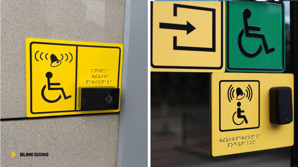
Signage with braille and audio speakers
Minimum compliance answers one question: Will this pass inspection?
User-centered design answers a different one: Will this actually work when someone needs it?
The difference becomes clear when accessibility is evaluated as a system rather than a checklist.
Healthcare Facilities: High-Stakes, Time-Sensitive Navigation
Healthcare environments amplify every wayfinding failure. People arrive stressed, often for the first time, and may be navigating under physical or emotional strain.
Common challenges include:
- Complex multi-floor layouts with similar corridors
- Time-sensitive destinations such as labs, imaging, or emergency departments
- High noise levels that interfere with auditory cues
Thoughtful, accessible wayfinding in healthcare environments typically includes:
- Tactile paths leading from entrances to key destinations
- Braille and raised-character signage are placed consistently at every door.
- High-contrast, large-print visual signage supporting low-vision users
- Audio kiosks or staffed information points for orientation
- Staff trained to assist without removing independence.
Design principle: In healthcare, wayfinding failure isn’t inconvenient—it has consequences. Systems must be designed to accommodate first-time users under pressure.
Corporate and Office Environments: Daily, Repeated Navigation
Office environments serve two distinct audiences: daily users building mental maps and visitors navigating for the first time.
Common challenges include:
- Large campuses with multiple buildings
- Conference rooms and spaces that change function frequently
- Inconsistent room numbering or naming conventions
Effective systems tend to focus on:
- Organization-wide placement standards applied across all buildings
- Tactile maps at primary entrances and elevator lobbies
- Predictable room numbering logic aligned with floor layouts
- Accessibility walkthroughs included in employee orientation
Design principle: Consistency reduces cognitive load. When environments behave consistently every day, independence increases.
Transit Hubs: Fast-Paced, Crowded, Safety-Critical
Transit environments are unforgiving. Crowds move quickly, noise levels are high, and safety risks are real.
Common challenges include:
- Platform edges and moving vehicles
- Competing sensory inputs
- Dynamic schedules and route changes
Practical design elements often include:
- Detectable warning surfaces at platform edges
- Raised tactile markers for stairs, escalators, and boarding zones
- Audio announcements synchronized with visual displays
- Staff training focused on safe, respectful assistance.
Design principle: In transit, systems must work under pressure—without explanation.
7 Reasons Braille Signage Fails in Real Buildings
These failures appear repeatedly across building types—and nearly all are preventable.
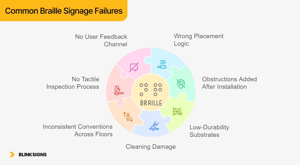
Common Braille Signage Failures
- Wrong Placement Logic
Signs meet height and side requirements, but are positioned far from natural hand-search zones.
- Obstructions Added After Installation
Furniture, equipment, or décor blocks access to previously usable signs.
- Low-Durability Substrates
Adhesive-applied dots detach; poor-quality materials crack, fade, or delaminate.
- Cleaning Damage
Harsh chemicals and abrasive methods wear down tactile relief and finishes.
- Inconsistent Conventions Across Floors
Signs switch sides or heights, forcing users to relearn navigation patterns.
- No Tactile Inspection Process
Visual walk-throughs miss worn or flattened Braille.
- No User Feedback Channel
Problems persist because there’s no clear way to report them.
The good news is that every one of these failures can be prevented through thoughtful design, material selection, and effective maintenance planning.
Implementation Guide for Facilities Teams
Accessibility succeeds when it’s managed like infrastructure—not decoration.
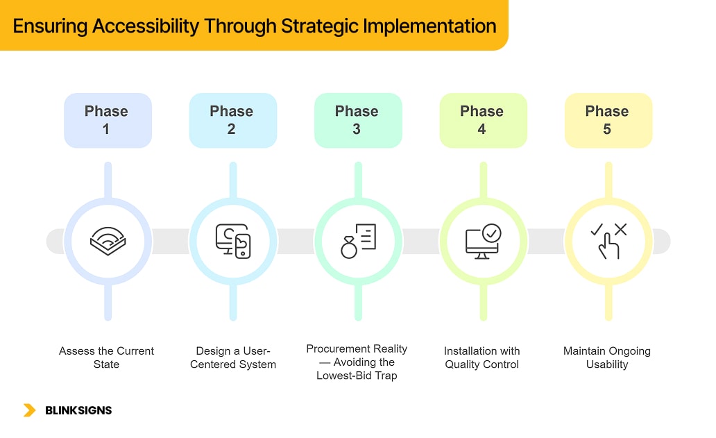
Ensuring Accessibility Through Strategic Implementation
Phase 1: Assess the Current State
- Conduct an accessibility audit of existing signage
- Identify gaps in coverage and consistency.
- Prioritize high-traffic areas (entrances, restrooms, exits)
- Gather feedback from blind or low-vision users where possible.
Phase 2: Design a User-Centered System
- Consult Orientation & Mobility specialists or accessibility professionals.
- Create a placement standards document applied across all spaces.
- Select materials designed for long-term tactile durability and reliability.
- Design with maintenance and inspection in mind
Phase 3: Procurement Reality — Avoiding the Lowest-Bid Trap
Lowest bids often produce:
- Inconsistent tactile quality
- Incorrect placement
- No documentation for maintenance teams
Smarter procurement includes:
- Placement drawings before fabrication
- Braille verification processes
- Defined material specifications
- As-built location documentation
- Maintenance and inspection guidance
Phase 4: Installation with Quality Control
- Verify mounting accuracy against standards.
- Confirm tactile readability, not just visual appearance.
- Document final locations for future reference
- Train facilities staff on inspection and upkeep
Phase 5: Maintain Ongoing Usability
- Schedule quarterly tactile inspections.
- Establish clear replacement triggers.
- Provide a visible feedback channel for users.
- Plan for long-term refresh cycles
ADA Tactile Signage Standards: Reference Summary
This summary reflects standard provisions from the ADA Standards for Accessible Design (2010) and ABA Architectural Standards. Requirements vary by jurisdiction and building type. Always verify local code.
- Mounting height: 48–60 inches from floor to baseline of raised characters
- Door placement: Latch side of door, clear of door swing
- Braille format: Grade 2 (contracted Braille)
- Character height: Raised characters 5/8” to 2.”
- Finish: Matte or eggshell, non-glare
- Pictograms: Raised and high-contrast where required
This information is for planning and education—not legal advice.
Material Selection: Planning Considerations
Durability matters more than appearance.
- Photopolymer: Long lifespan, precise tactile quality, suitable for high-traffic areas
- Cast acrylic: Reliable interior option with strong tactile definition
- Metal: Durable for exterior or architectural environments
- Adhesive-applied Braille: Not recommended for permanent installations
Actual performance depends on environment, traffic, and maintenance practices.
Beyond Braille: Technology as a Complement
Digital tools can support navigation, but they cannot replace physical signage.
Emerging tools include:
- Smartphone apps with indoor positioning
- QR-triggered audio descriptions
- AI-assisted navigation systems
- Hybrid tactile–digital maps
Physical signage remains essential because:
- Technology fails
- Not all users carry or trust devices.
- Tactile confirmation provides immediate certainty.
Redundancy is resilience.
What to Do on World Braille Day 2026
For Facilities Managers
- Conduct a tactile walkthrough
- Inspect Braille by touch, not sight.
- Speak with users where possible.
- Review maintenance plans
For Architects and Designers
- Include accessibility expertise early.
- Design placement systems, not one-off signs
- Specify durable materials explicitly.
- Plan for long-term usability
For Advocates and Allies
- Report issues constructively
- Amplify real user experiences.
- Support Braille literacy and accessibility training
- Push for excellence beyond compliance.
BlinkSigns: Designing Wayfinding That Works for Everyone
At BlinkSigns, accessibility is approached as a system, not a checkbox.
Our work emphasizes:
- Usability-informed design principles
- Standards-plus thinking
- Durable material recommendations
- Maintenance-aware planning
- Continuous learning in inclusive design
We also provide free planning resources, including:
- Facilities Braille Inspection Checklist
- Placement Standards Worksheet
- Material Selection & TCO Guide
- Procurement Buyer Checklist
╰┈➤Download the Complete Accessibility Planning Toolkit
╭┈➤Request a Wayfinding Plan Review
Frequently Asked Questions
When is World Braille Day?
World Braille Day is observed annually on January 4, commemorating the birthday of Louis Braille and highlighting the significance of Braille in promoting accessibility and inclusion.
Do all blind people read Braille?
No. Studies suggest 10–25% of blind adults read Braille fluently. Multi-modal wayfinding is essential to serve everyone.
Why do compliant signs still fail to meet user needs?
Compliance prioritizes specifications over findability, readability, and long-term reliability.
Can technology replace Braille signage?
No. Digital tools can assist, but physical signage provides immediate, universal access without barriers.
How often should tactile signage be inspected?
Quarterly tactile inspections are recommended to ensure Braille remains readable and usable.
Final Note
World Braille Day 2026 isn’t just a celebration of an invention—it’s an opportunity to rethink how accessibility actually works in the spaces people move through every day.
Compliance is the starting point. Usability is a responsibility.